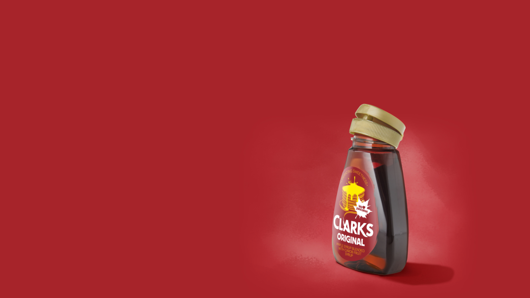
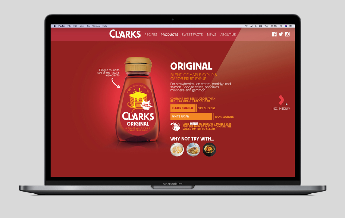
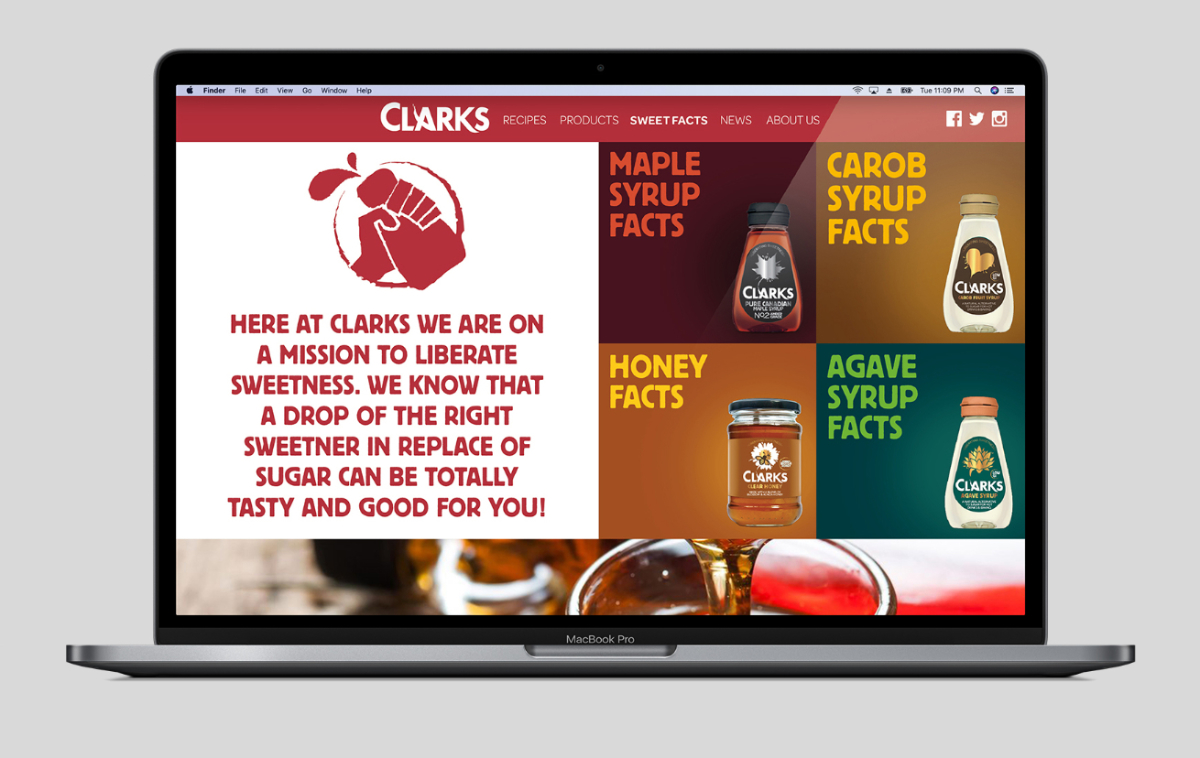
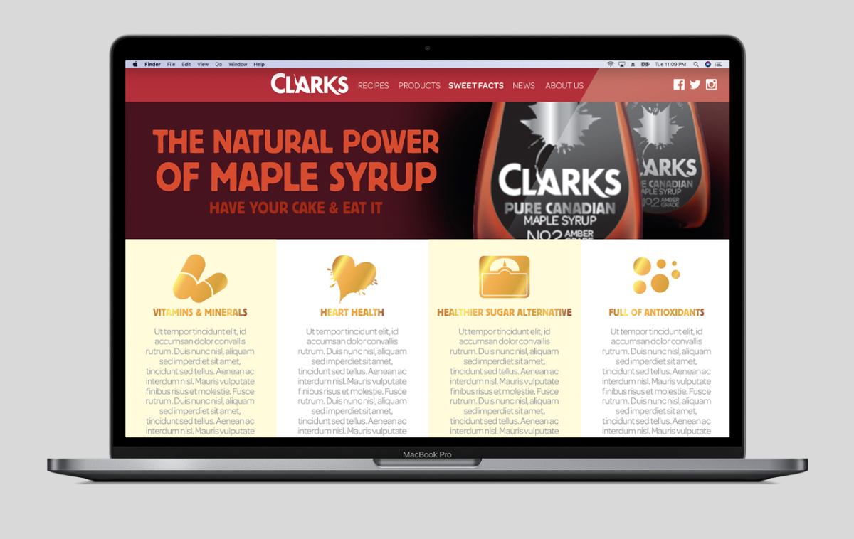
With sugar seen as the devil, Bob Clark believed that 'sweetness should be accessible to everyone' and strived to develop natural sweeteners that are made healthier and more affordable for all.
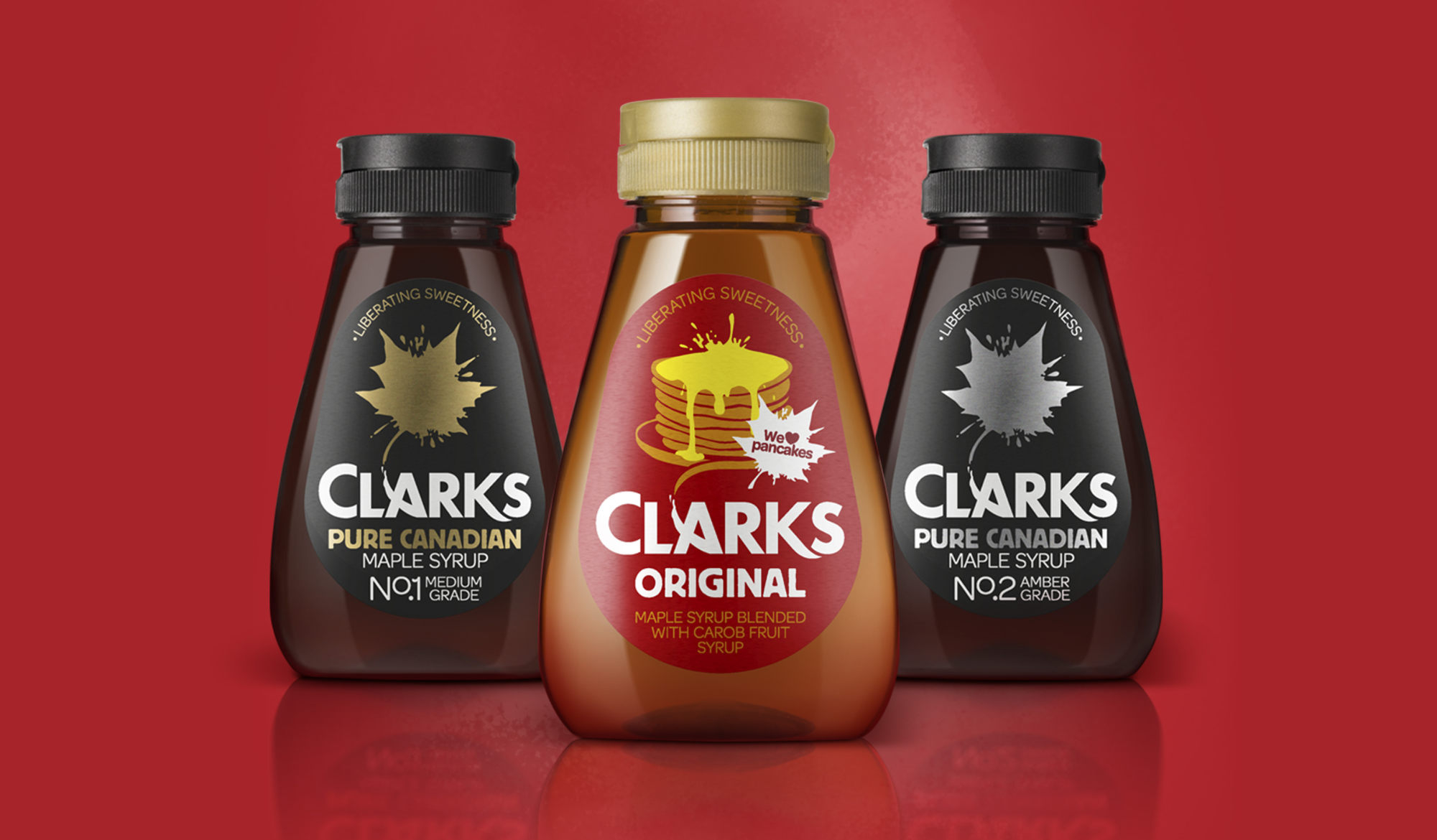
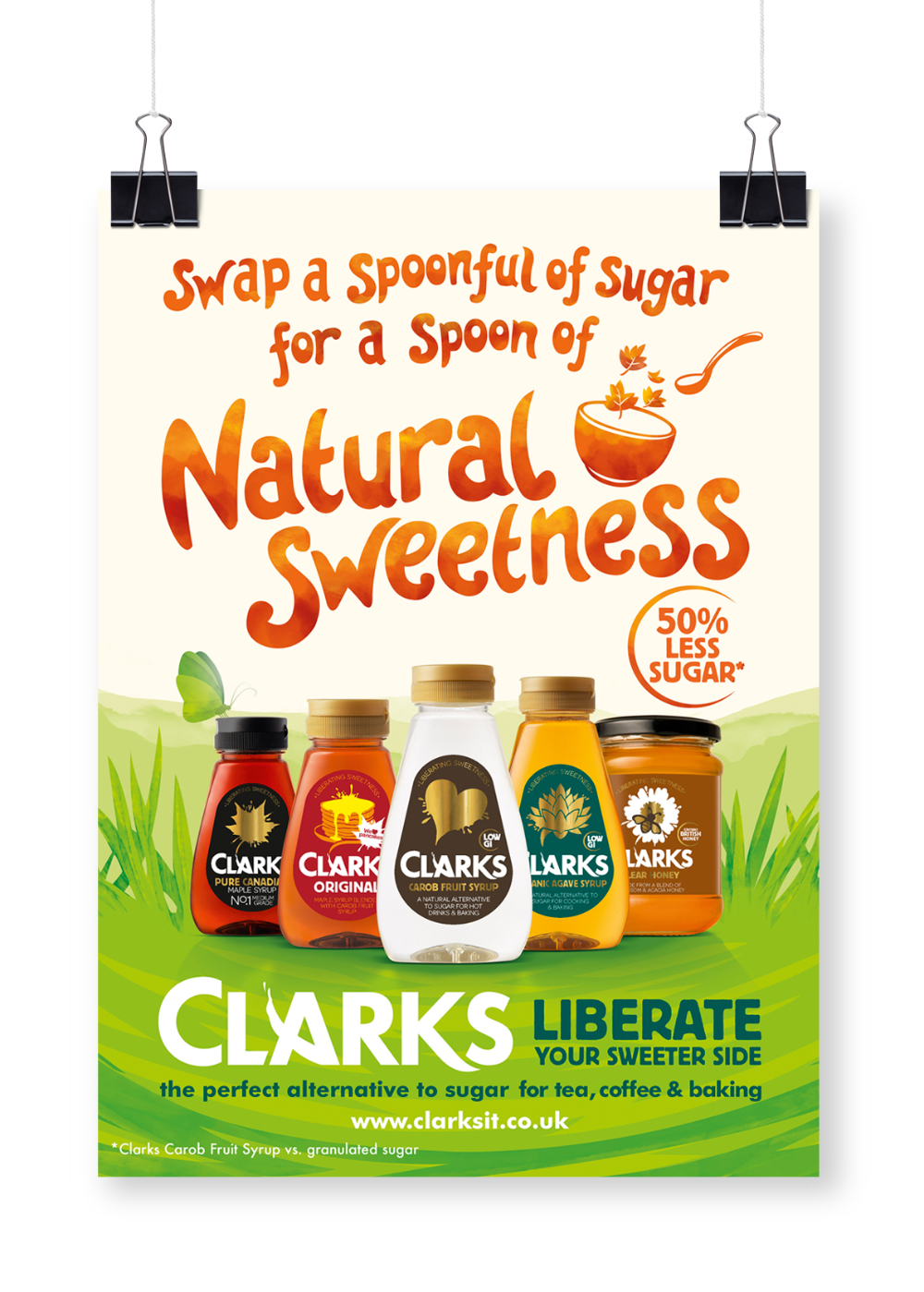
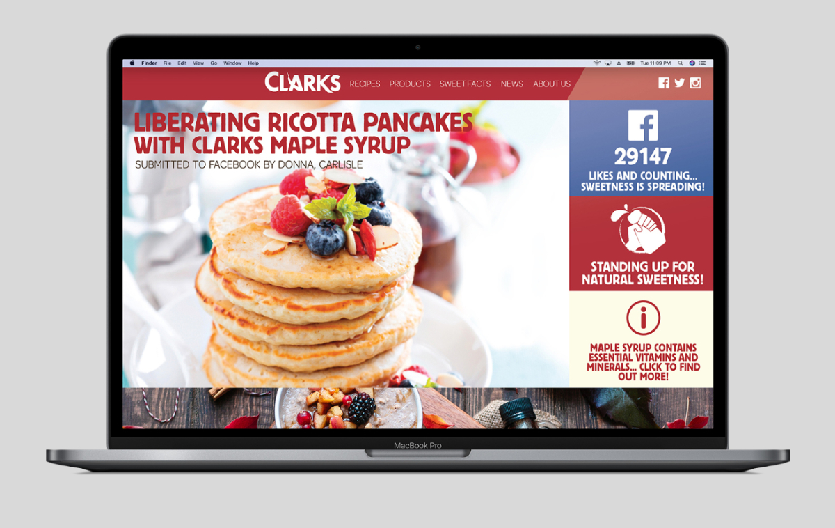
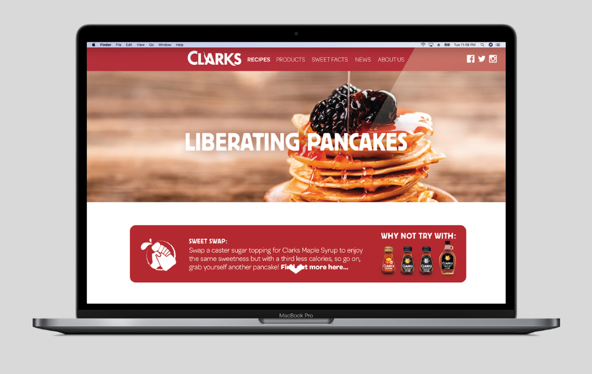
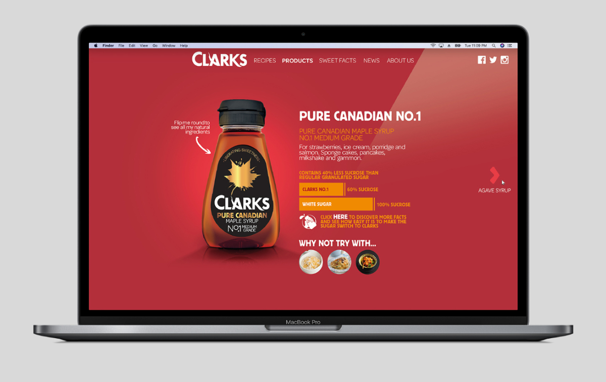
Working from the new proposition 'a touch of natural magic from the sweeter side of life' the branding evolved to bring the iconic maple leaf-splash closer to the heart of the brand linking it more intrinsically with a new brand logo and introducing the line 'liberating sweetness' across the entire portfolio of natural sweeteners.
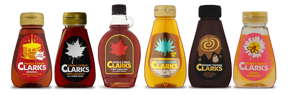
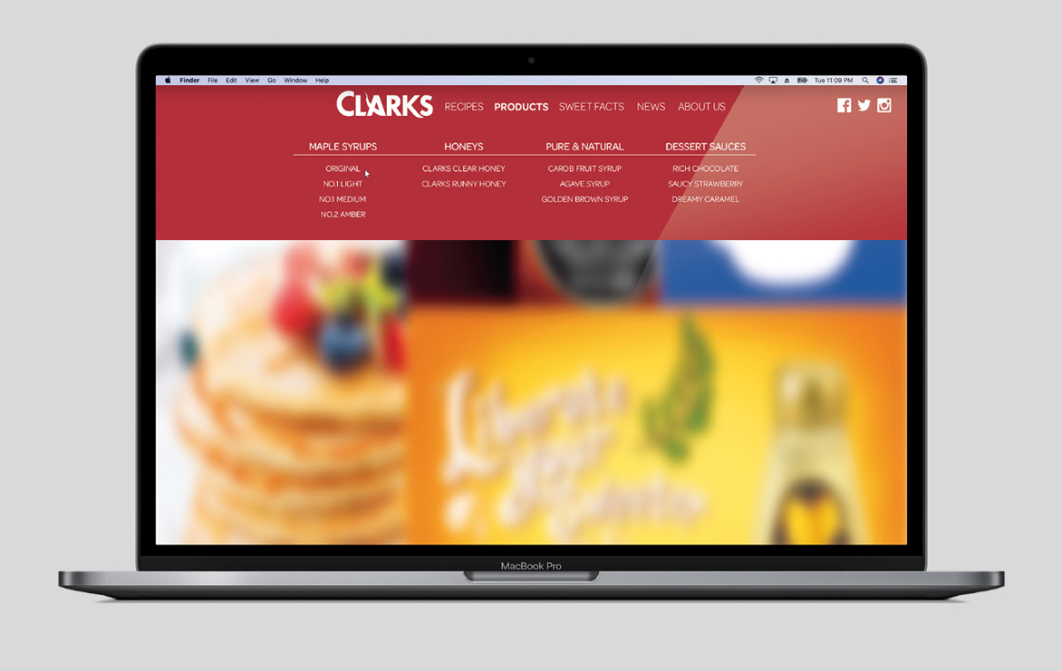
The existing design had evolved organically struggling to accommodate NPD extensions and leaving the branding to develop an inconsistent approach to iconography and a confused communications hierarchy.
Within 2 years of the rebrand Clarks Natural Sweeteners had seen an uplift of 5817.9%, up from a value of £7,792 to £461,124. Overall brand growth saw 23% volume and 22% value growth.
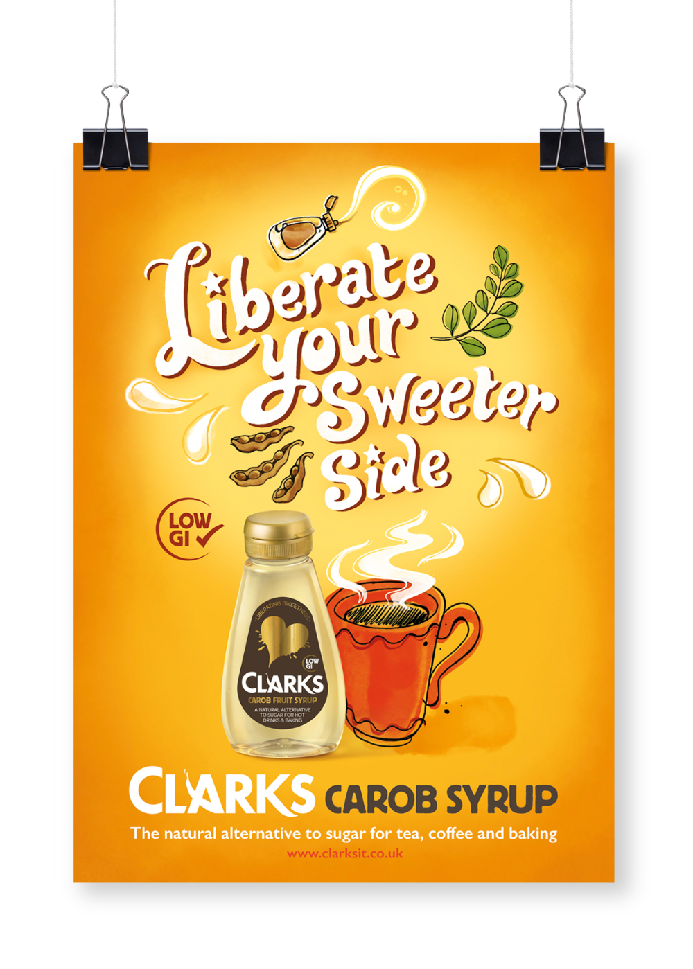
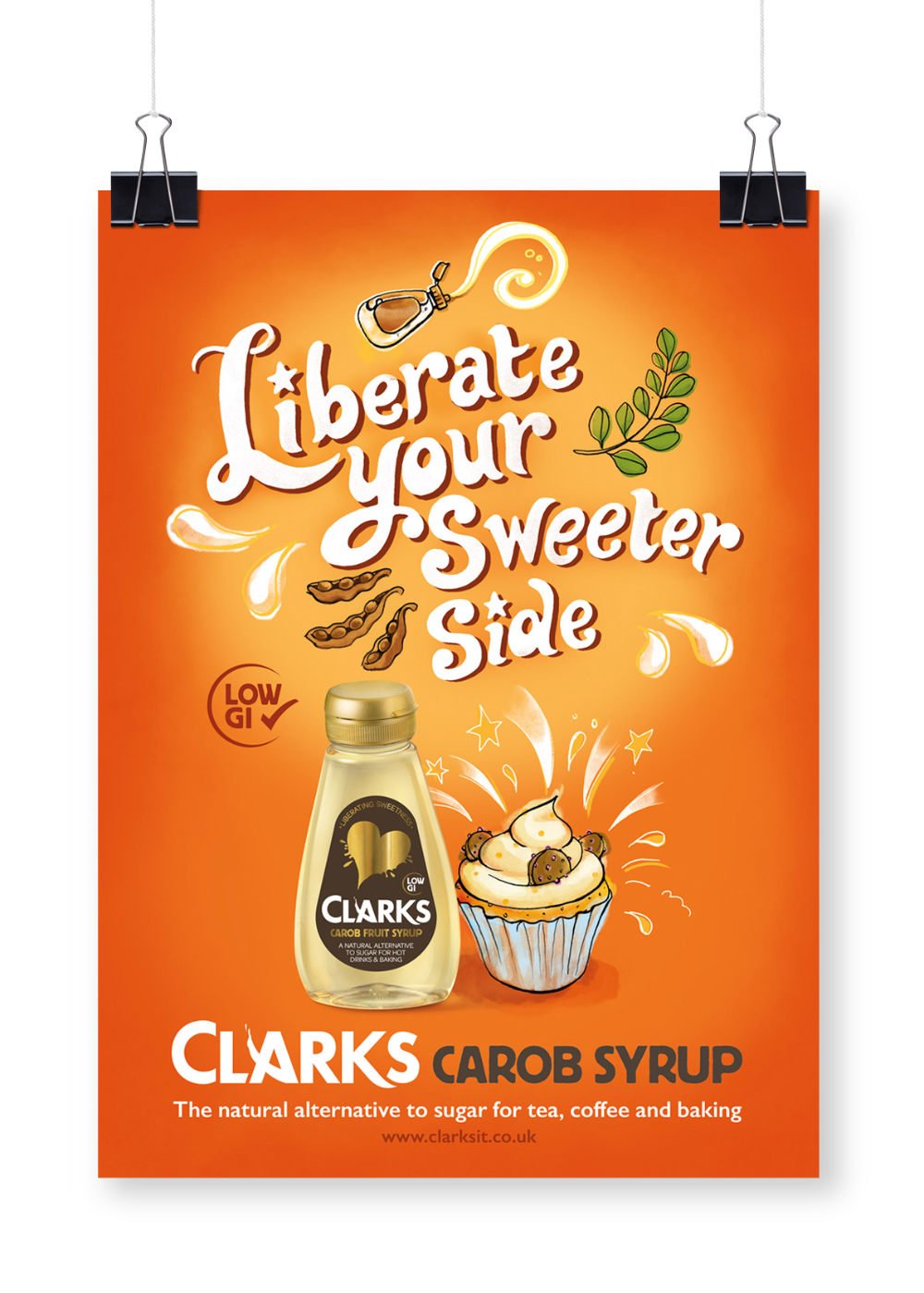
Liberating Your Sweeter Side
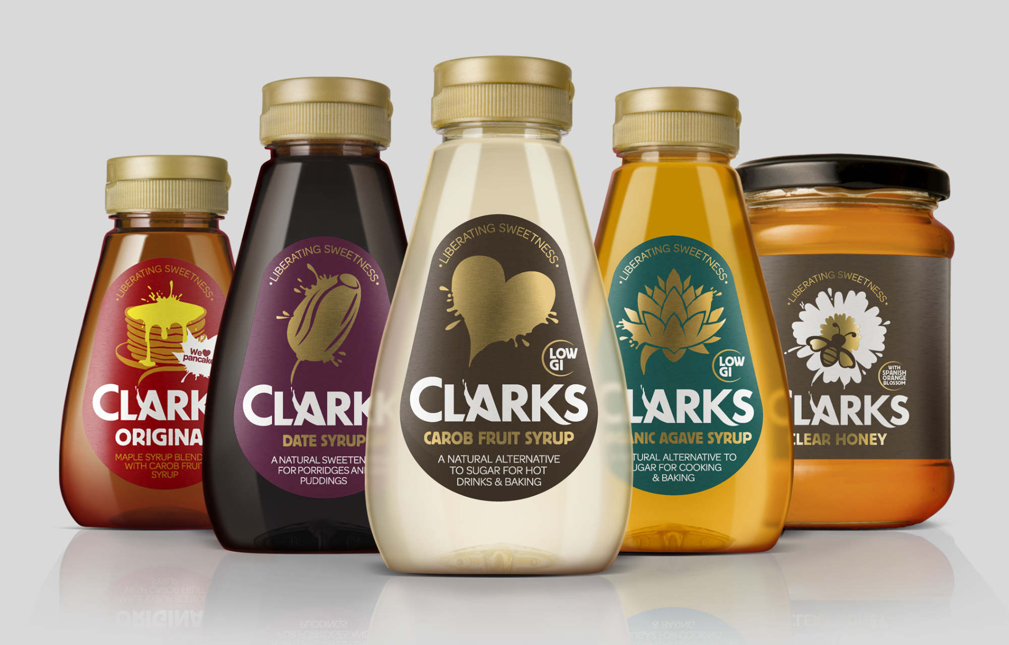
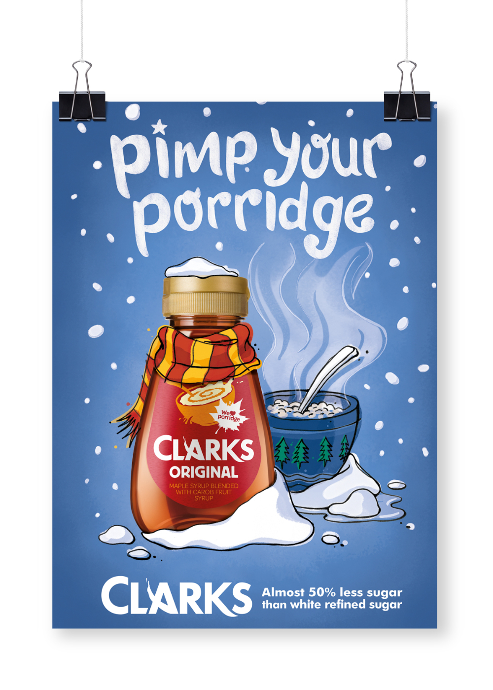
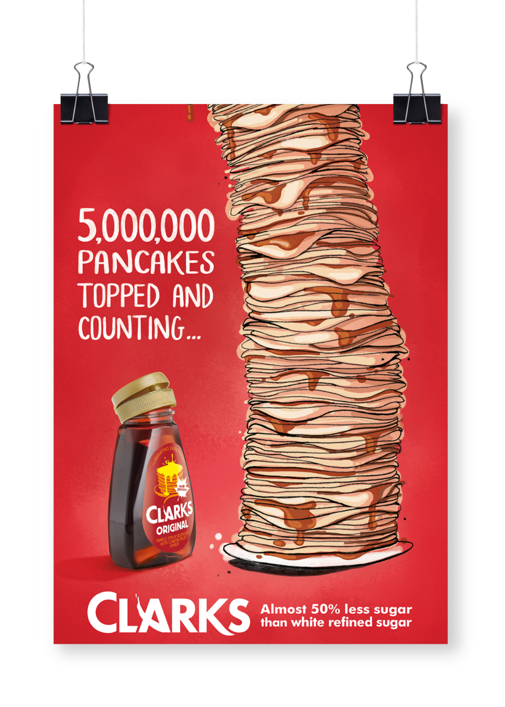
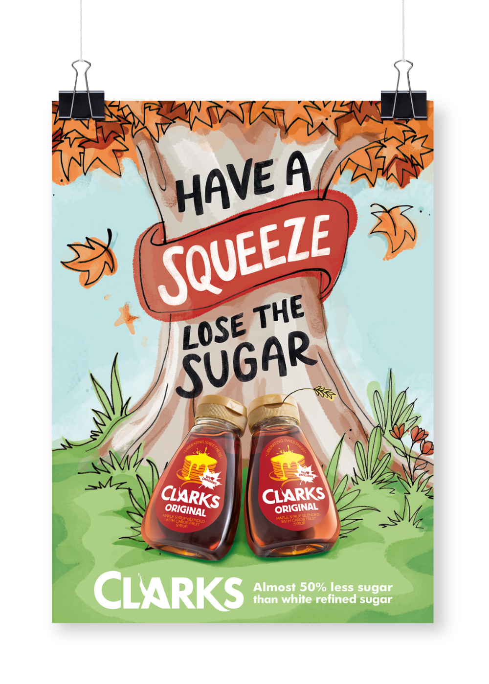
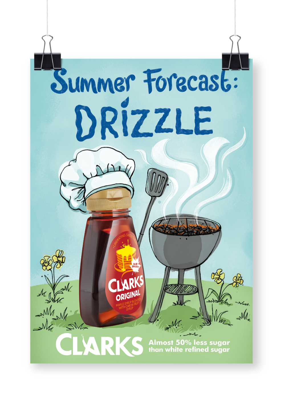
A series of new print campaigns introducing Clarks magic natural sweeteners, including Carob Syrup as a direct alternative to processed sugars.
- Photoshop
- Illustrator
- InDesign
- Art Direction
- Branding
- Packaging
- Digital Illustration
- Retouching
- Typography
- Graphic Design
My Role: Designer, Design Director & Account Director.
Team Credits: Springetts Brand Design Consultants: Sophie Burt ‐ Senior
Designer. Chris Redford ‐ Designer & Illustrator. Max Ostler ‐ Designer
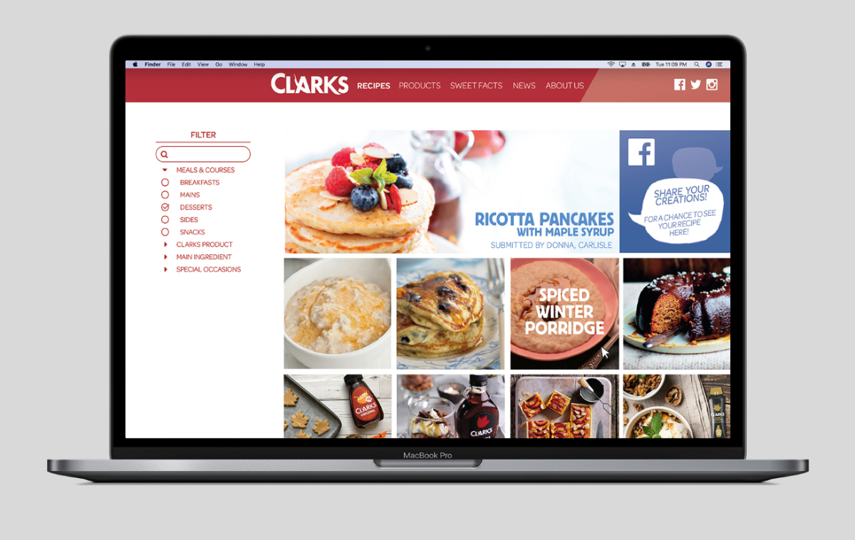
(Website).