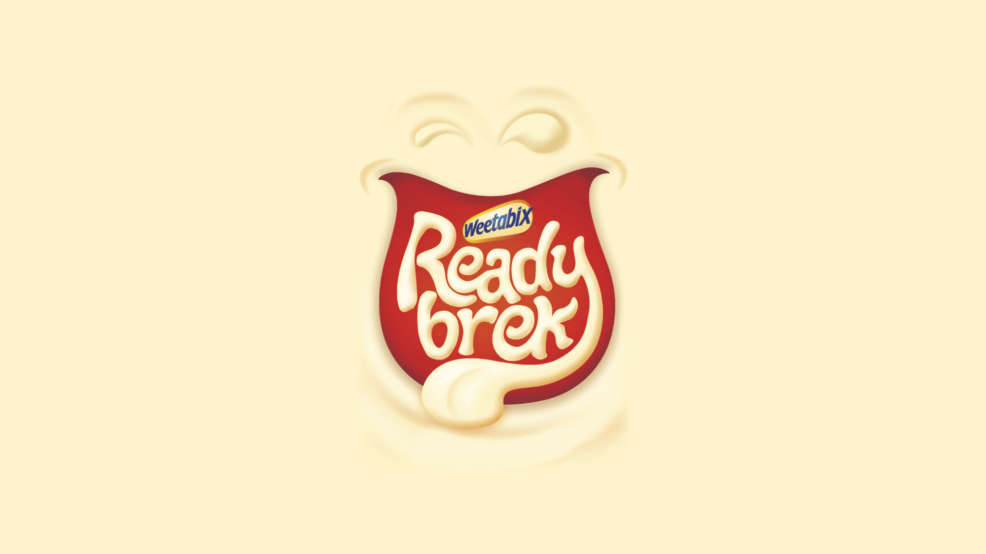
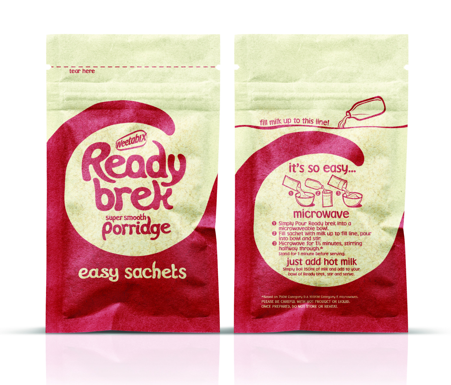
READY BREK
Dive Into Smooth
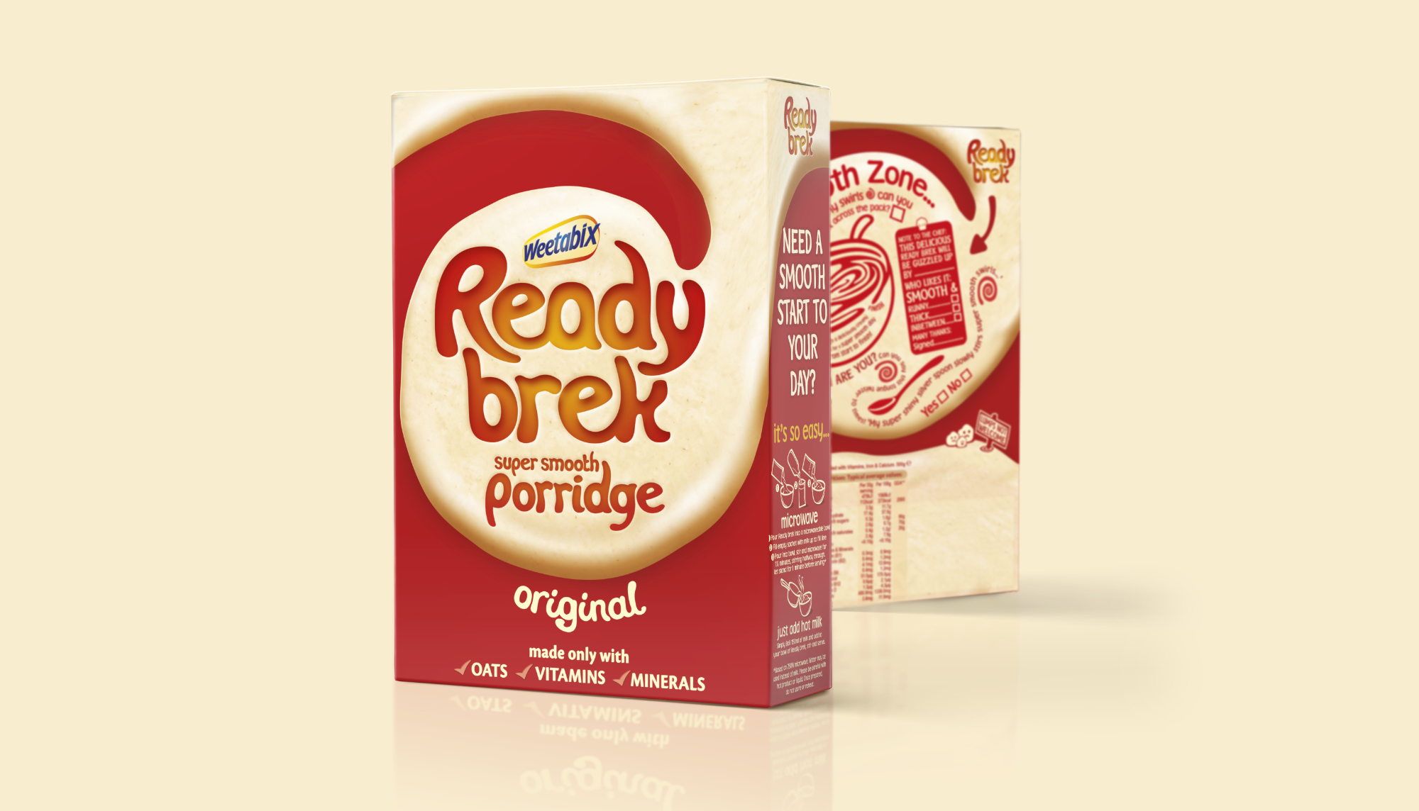
The new identity had to engage with an older audience of
6‐10‐year‐olds through a compelling take on the latest brand proposition
"Super‐smooth porridge for kids", whilst also continuing to acknowledge mum as
gatekeeper, and being careful not to damage its current role & relevance with mums of younger
kids (0‐5yrs).
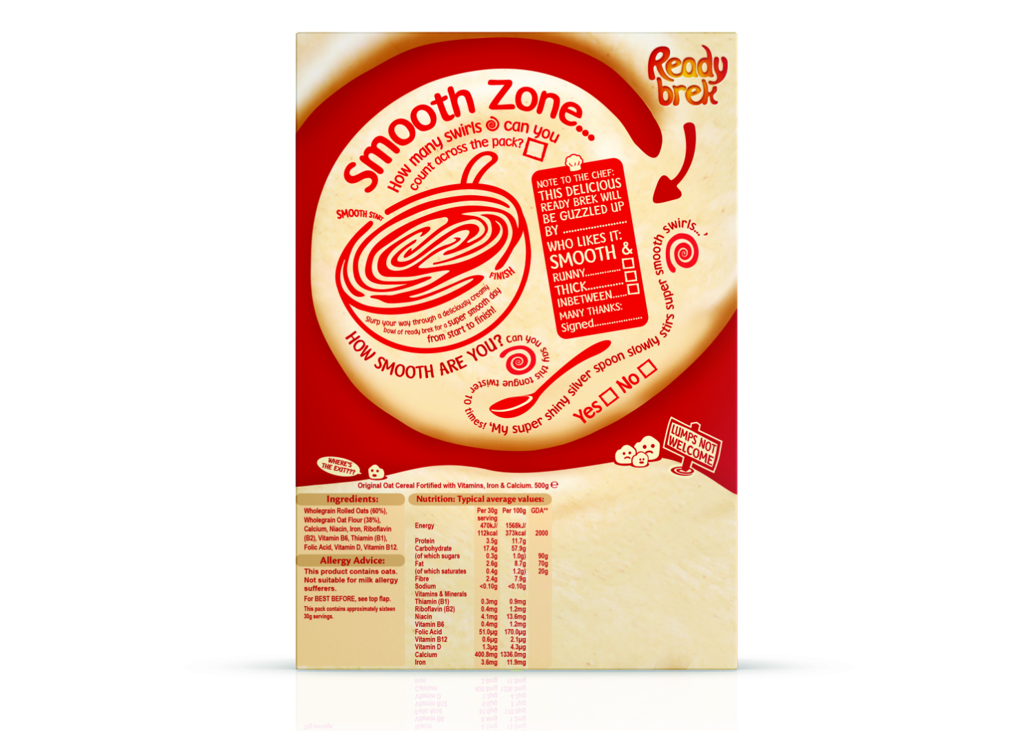
It's Super‐smooth!
We would need to overcome Mum's reluctance to buy and prepare Ready Brek by
reassuring her that it is not only natural and nutritious but also a tasty product that kids will love
and move the perceptions of lapsed users from Ready Brek being "lumpy, horrid tasting and
uncool" to "a great tasting breakfast, made for me".
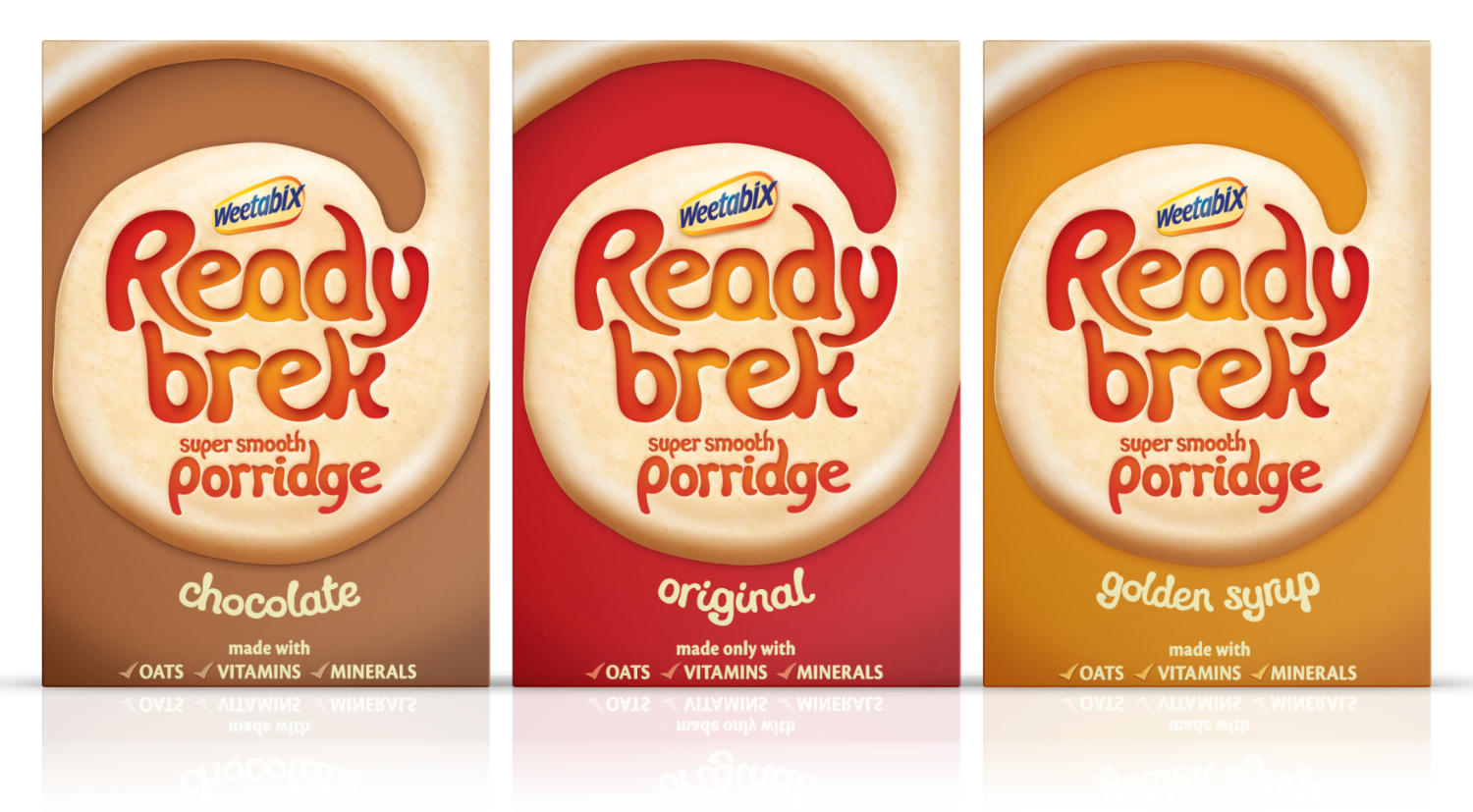
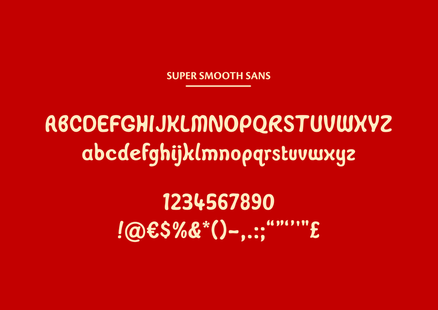
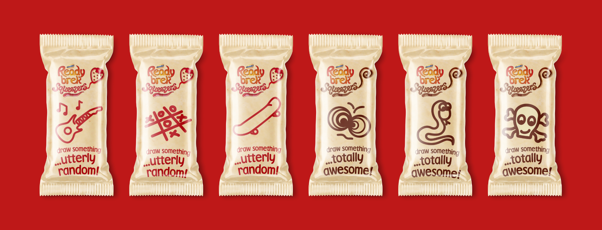
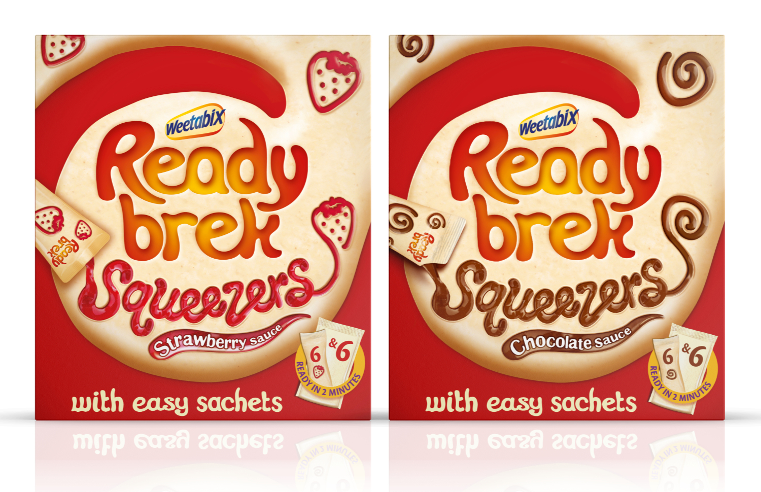
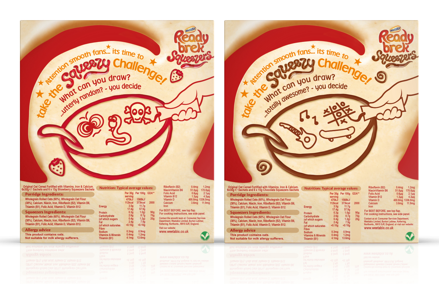
The brand architecture had to be adaptive, allowing for distinctive NPD and having
scope to be used beyond packaging, on promotional initiatives such as sticker inserts.