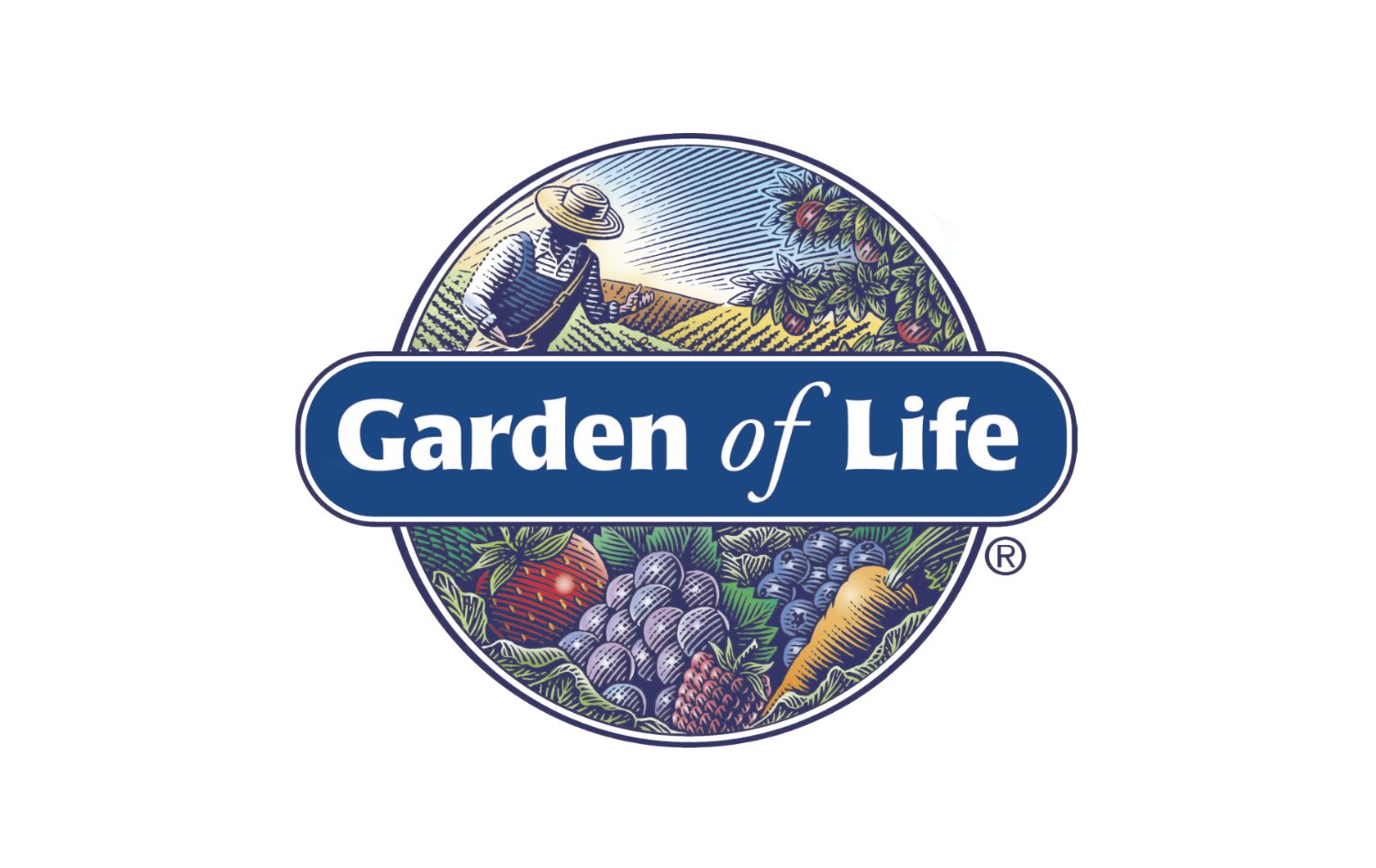
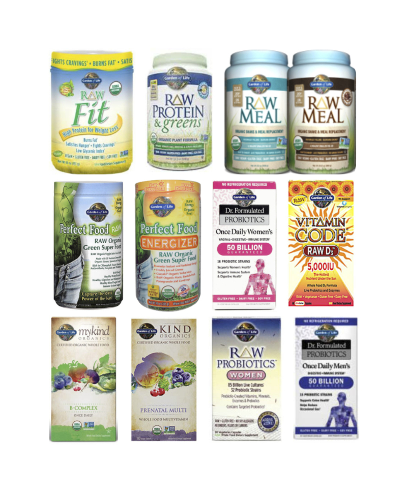
Garden of Life approached us, from across the pond, to reposition and rebrand
their North American health supplement brand in preparation for launch into the UK market.
We needed to build on the Garden of Life brand promise and create a brand identity
and packaging that would allow the brand to compete in both the UK and European markets, and clearly
demonstrate a point of difference and reason for being to both consumers and the trade.
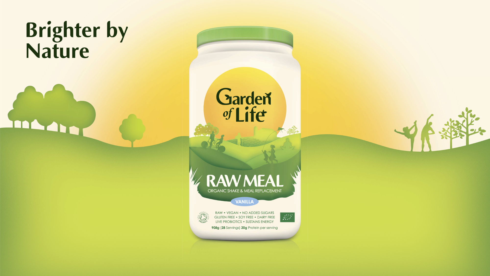
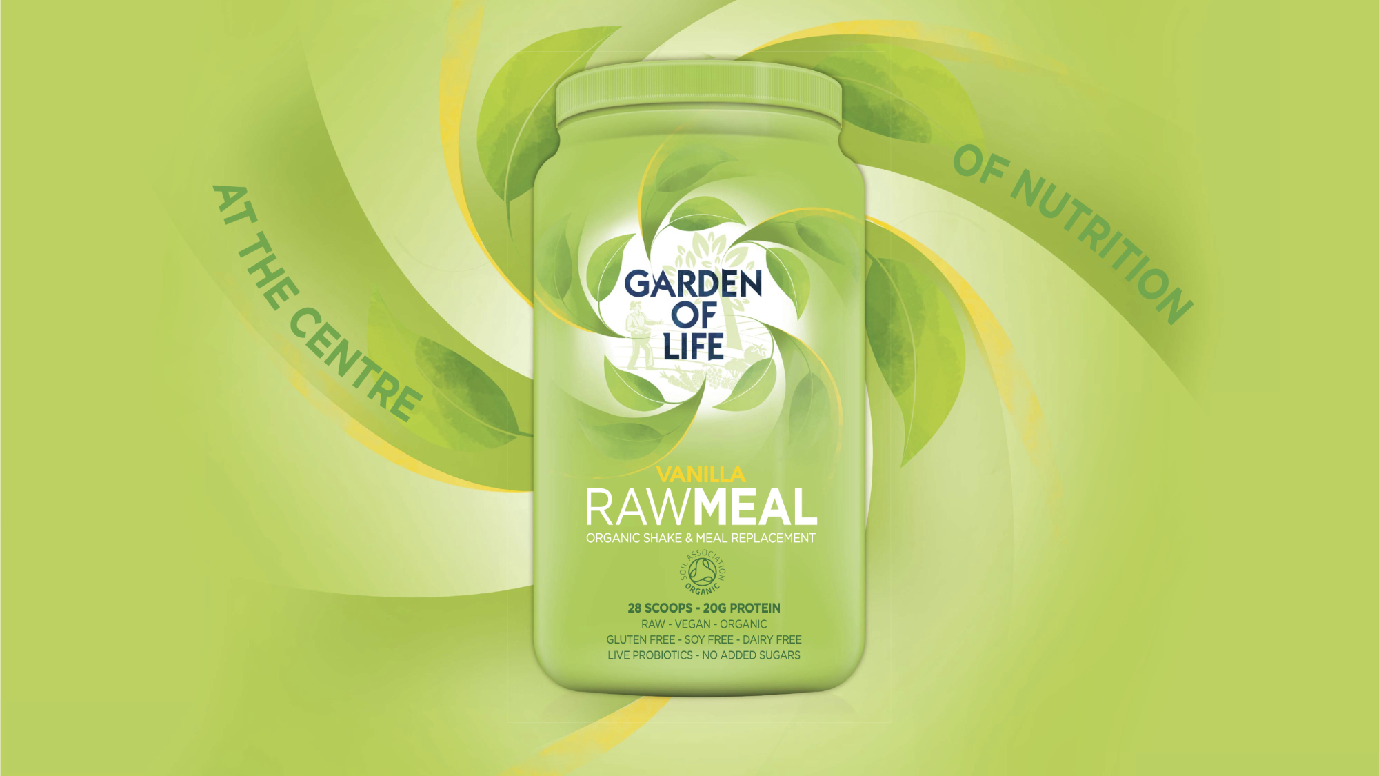
REBRAND FOR THE UK MARKET
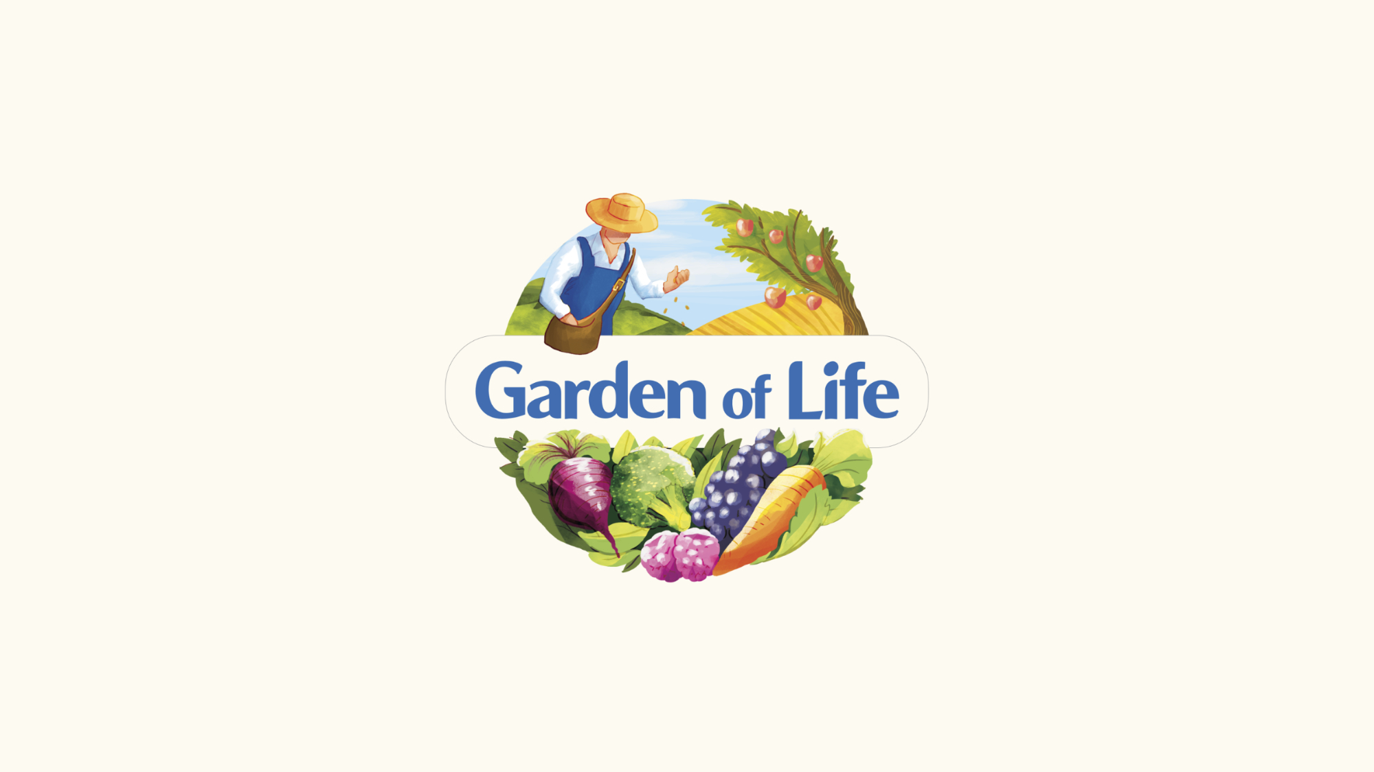
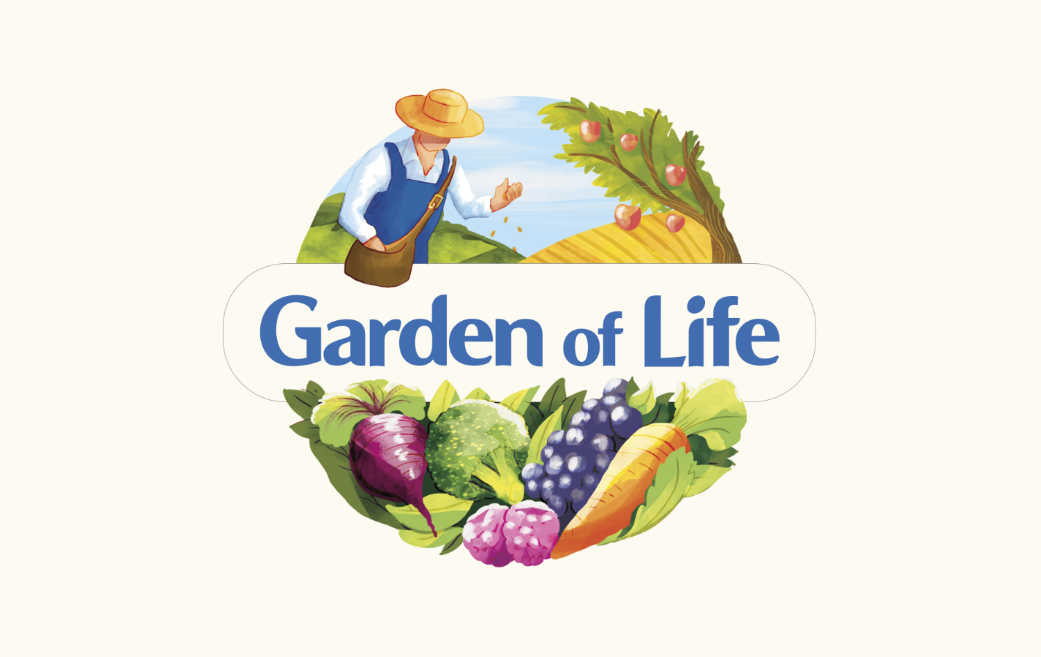
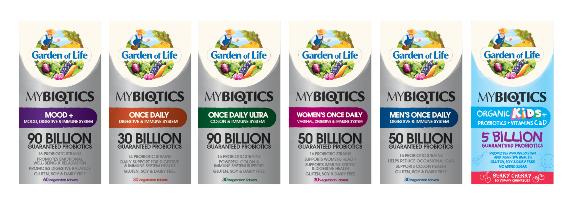
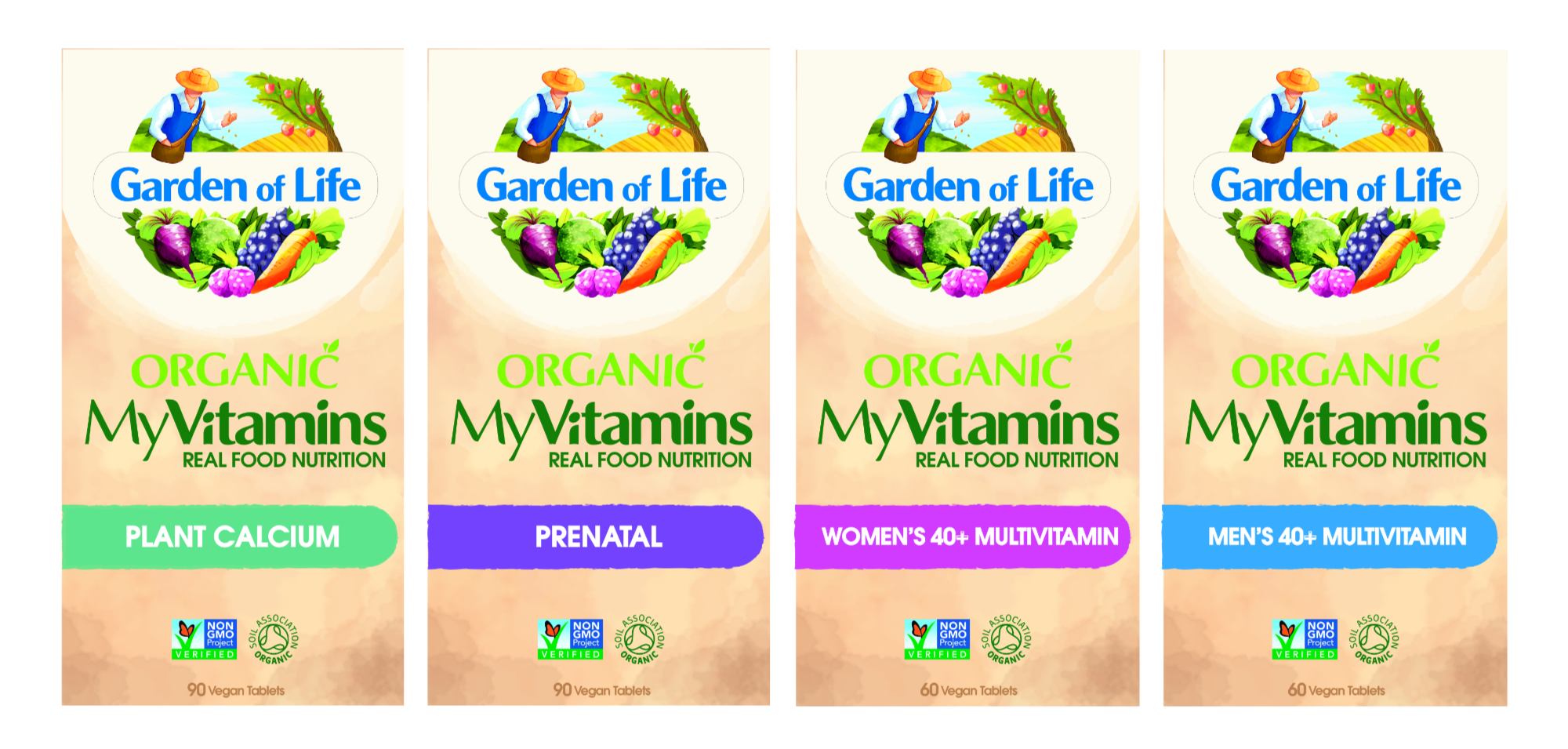
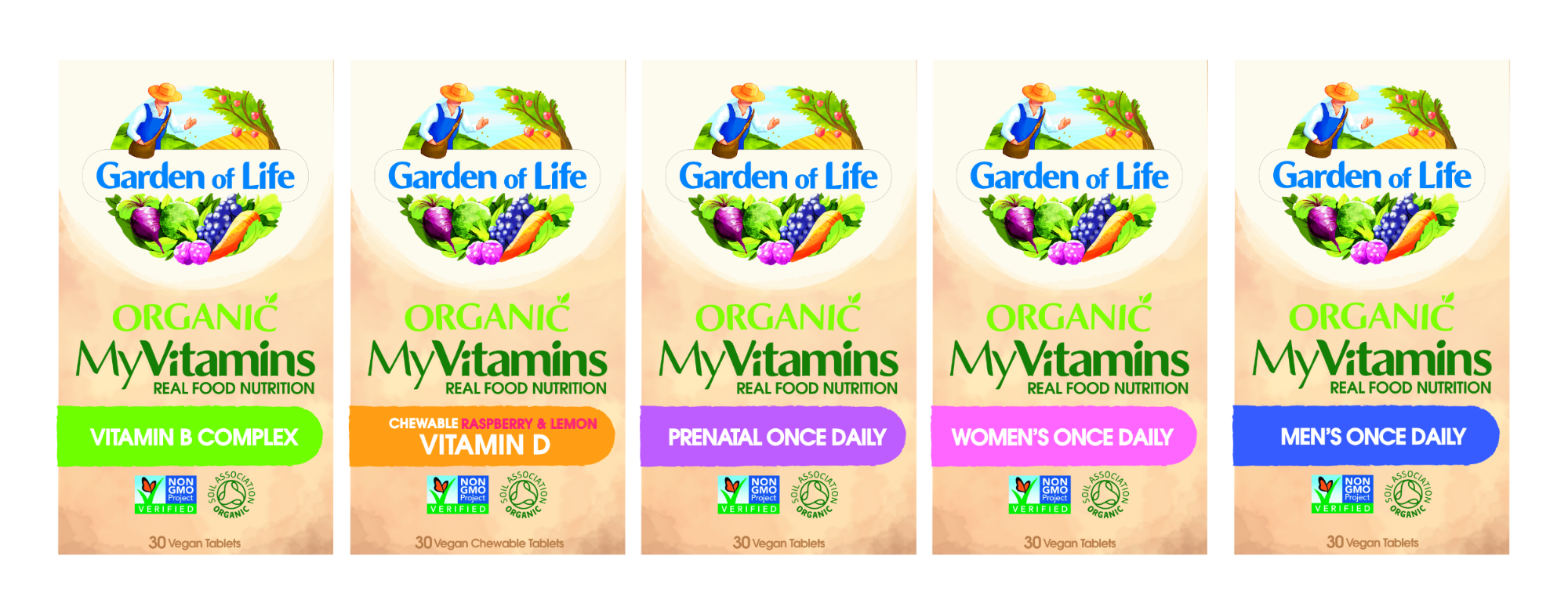
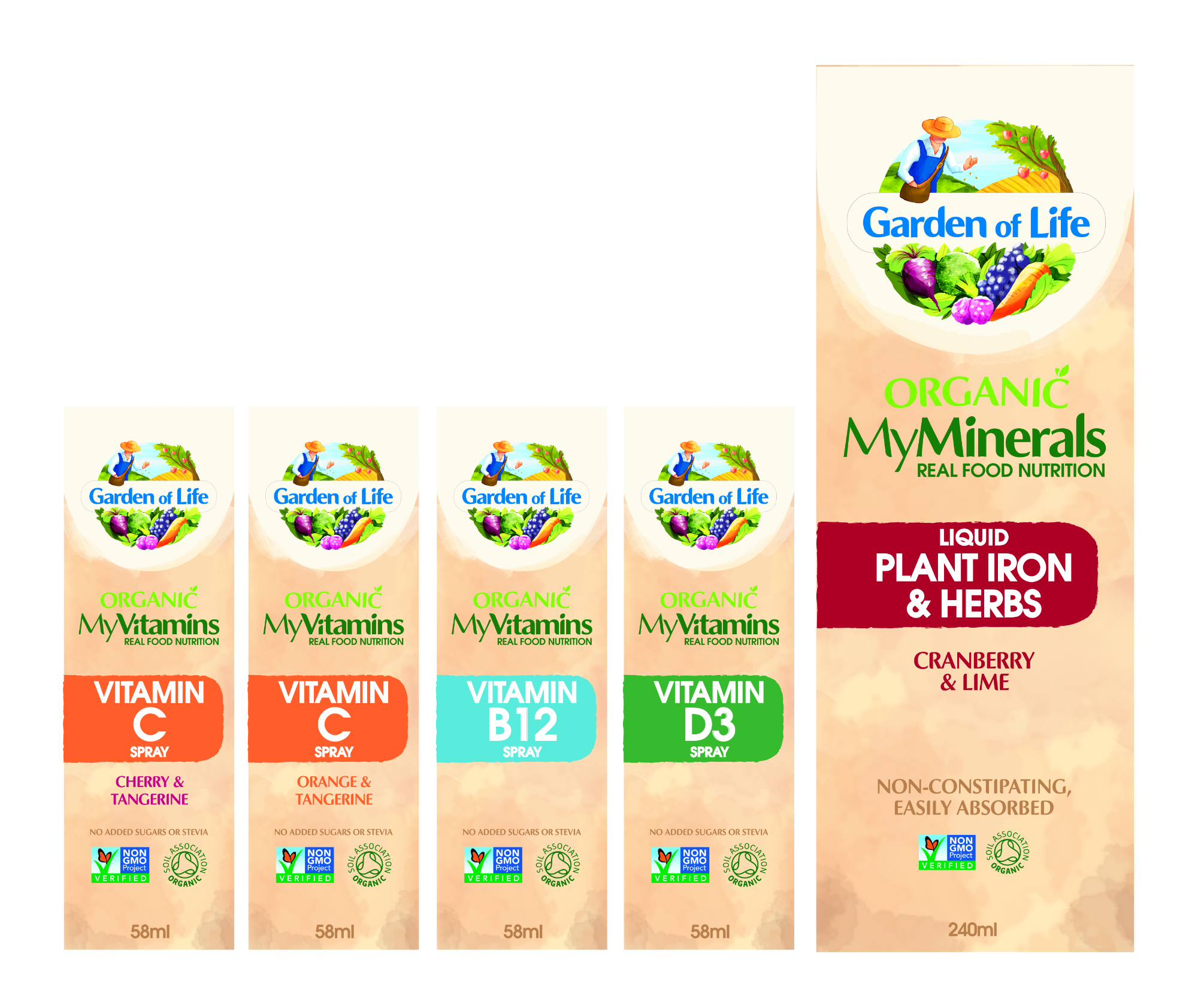
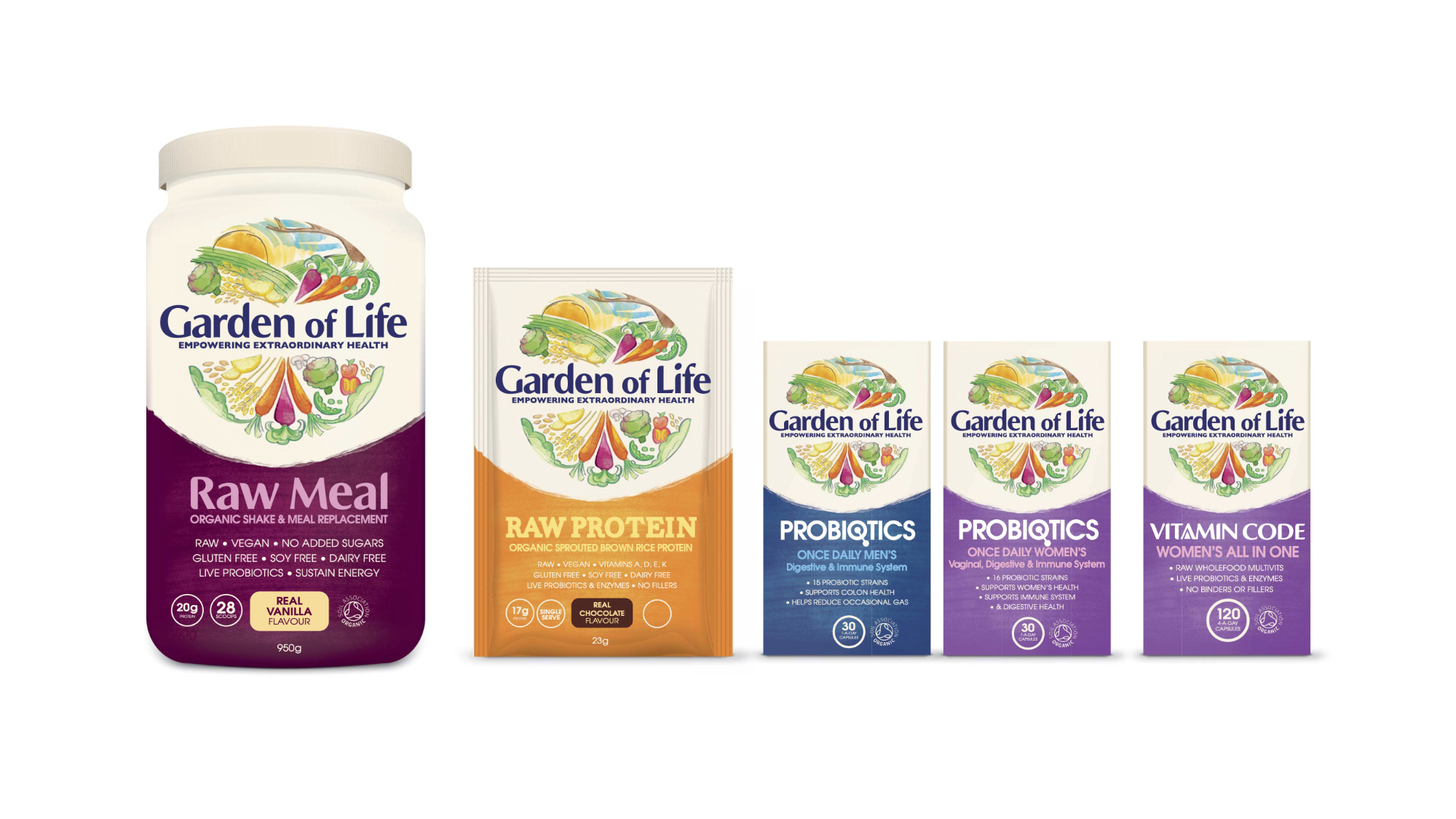
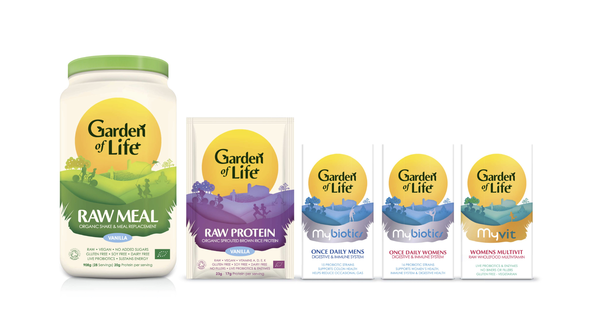
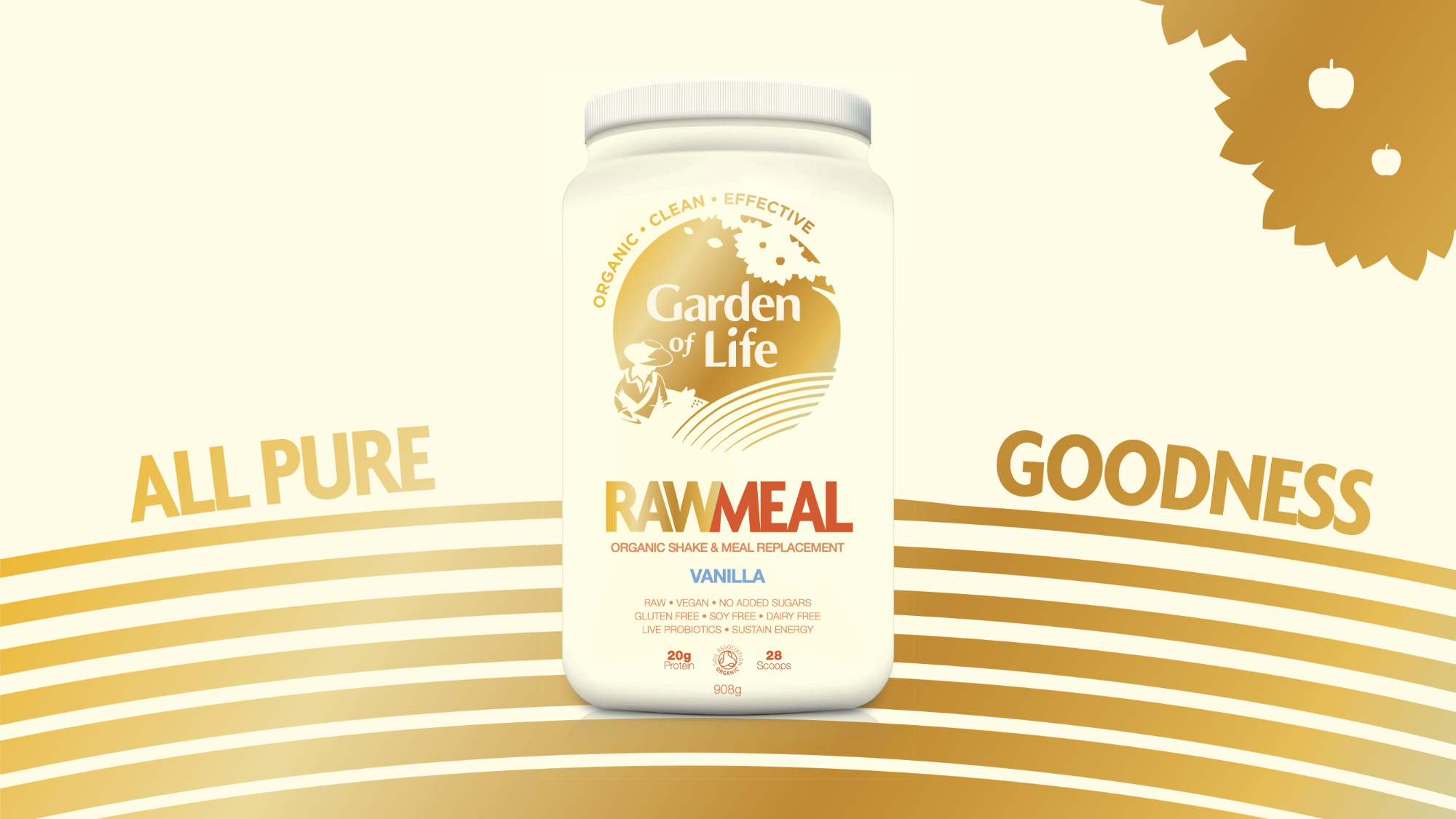
The then‐existing portfolio of products and ranges had evolved organically and independently
over time creating a mismatch of creative styles and a sensory overload of graphics and information.
We had to address the overall brand architecture, product differentiation and communication
hierarchy, to make it easier for consumers to understand and shop.
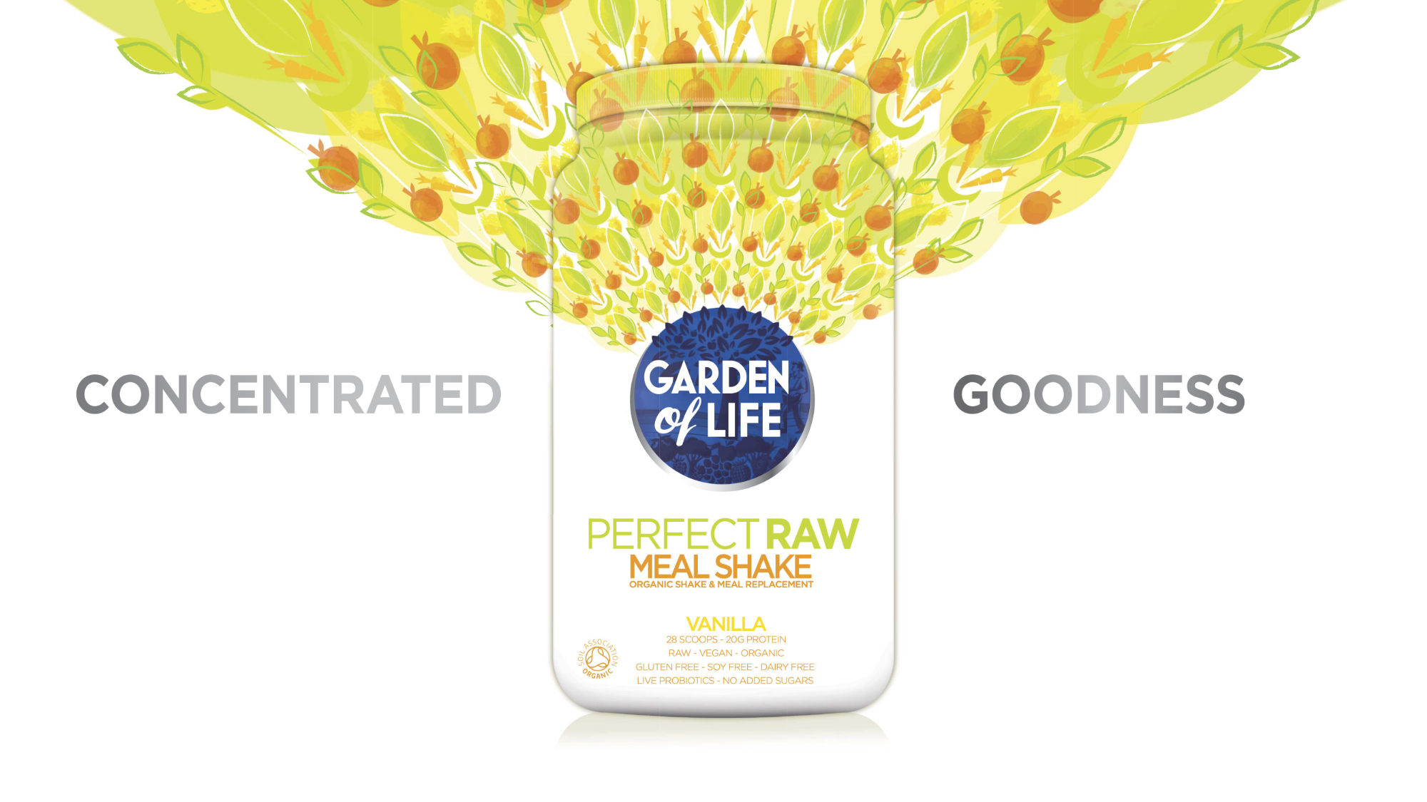
We began by distilling the brand promise into a simple message, "extraordinary ways of
supplementing your extraordinary life through the power of our organic garden", and proposition
‐ "Live your extraordinary!"
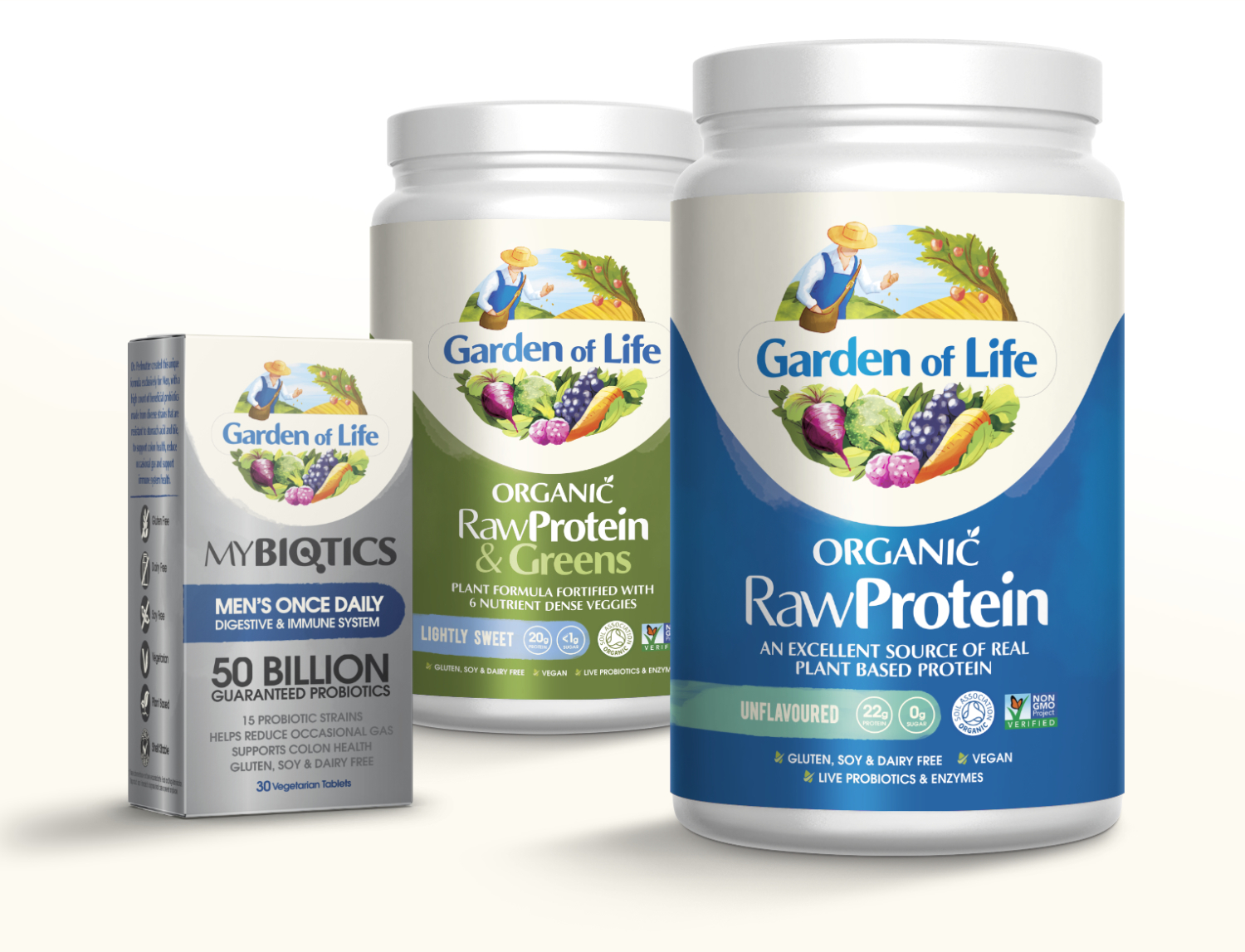
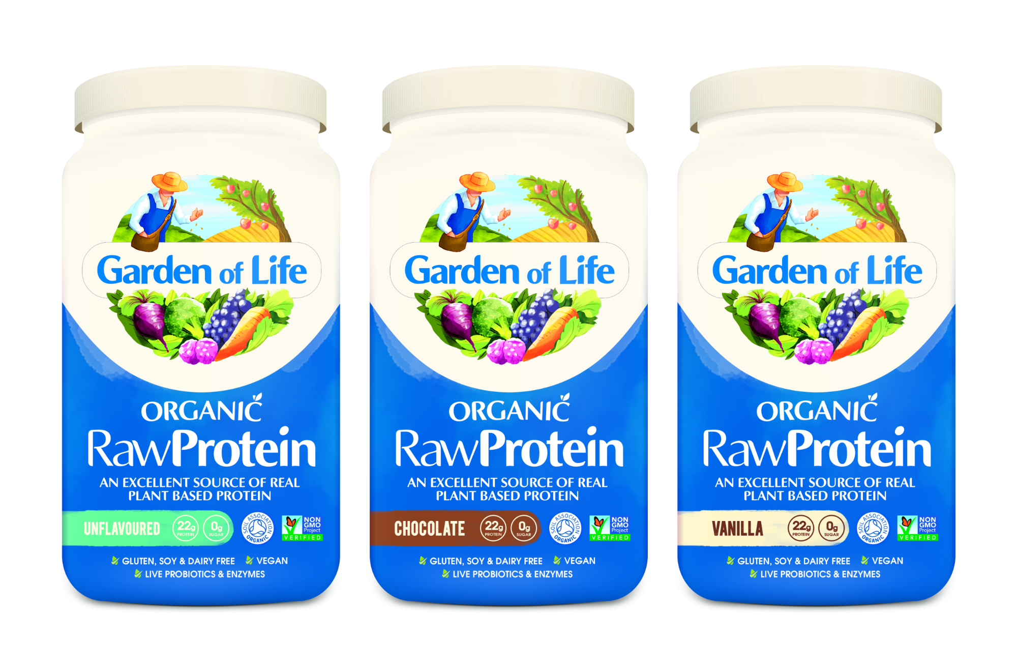
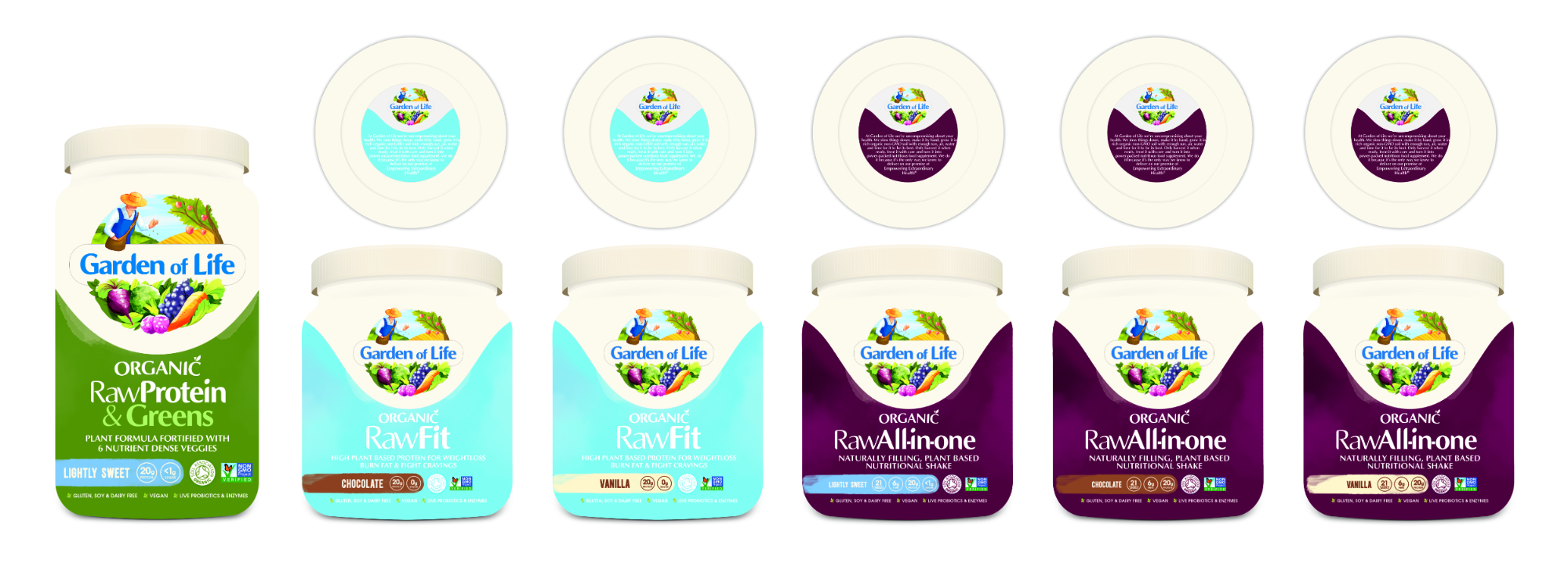
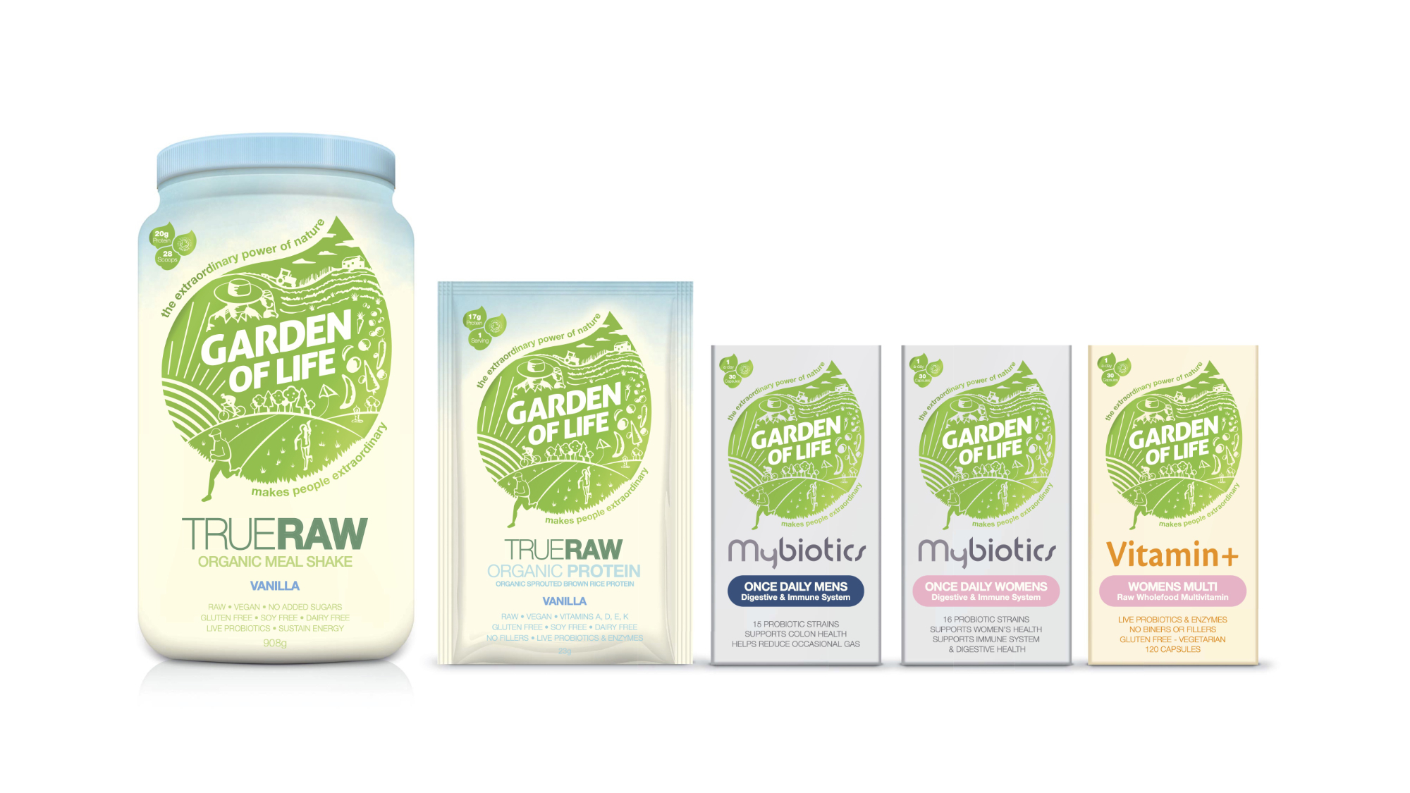
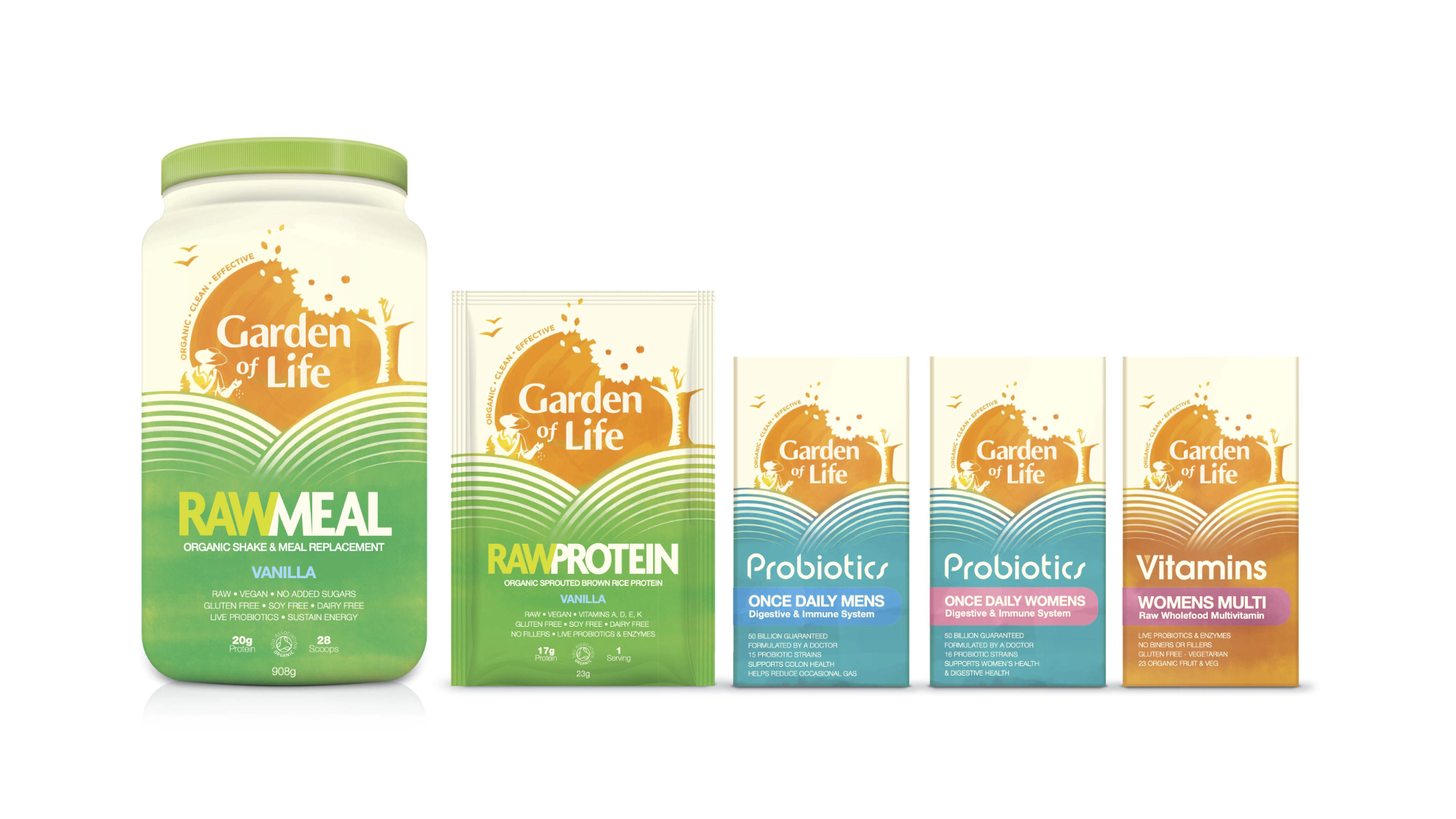
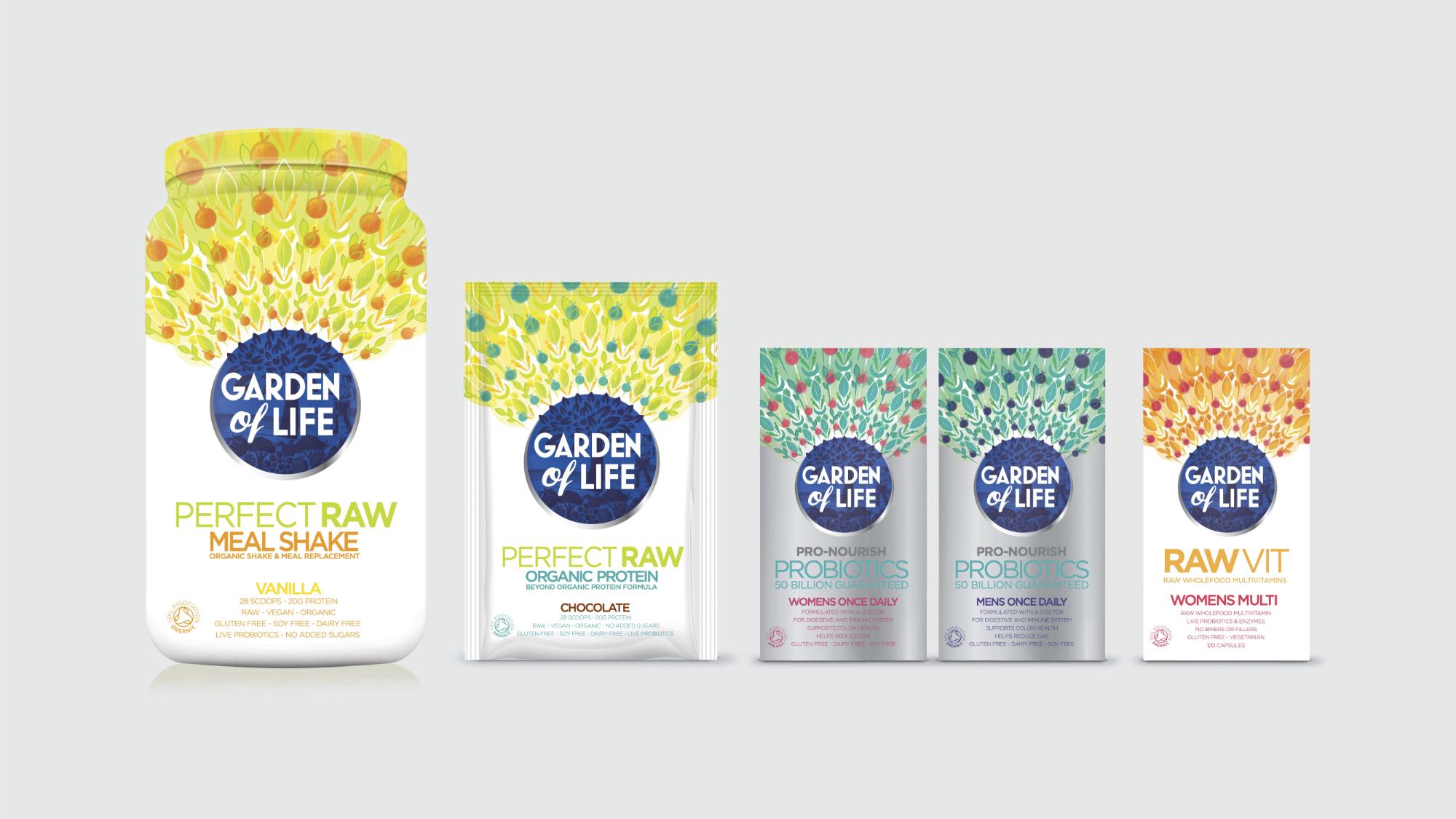
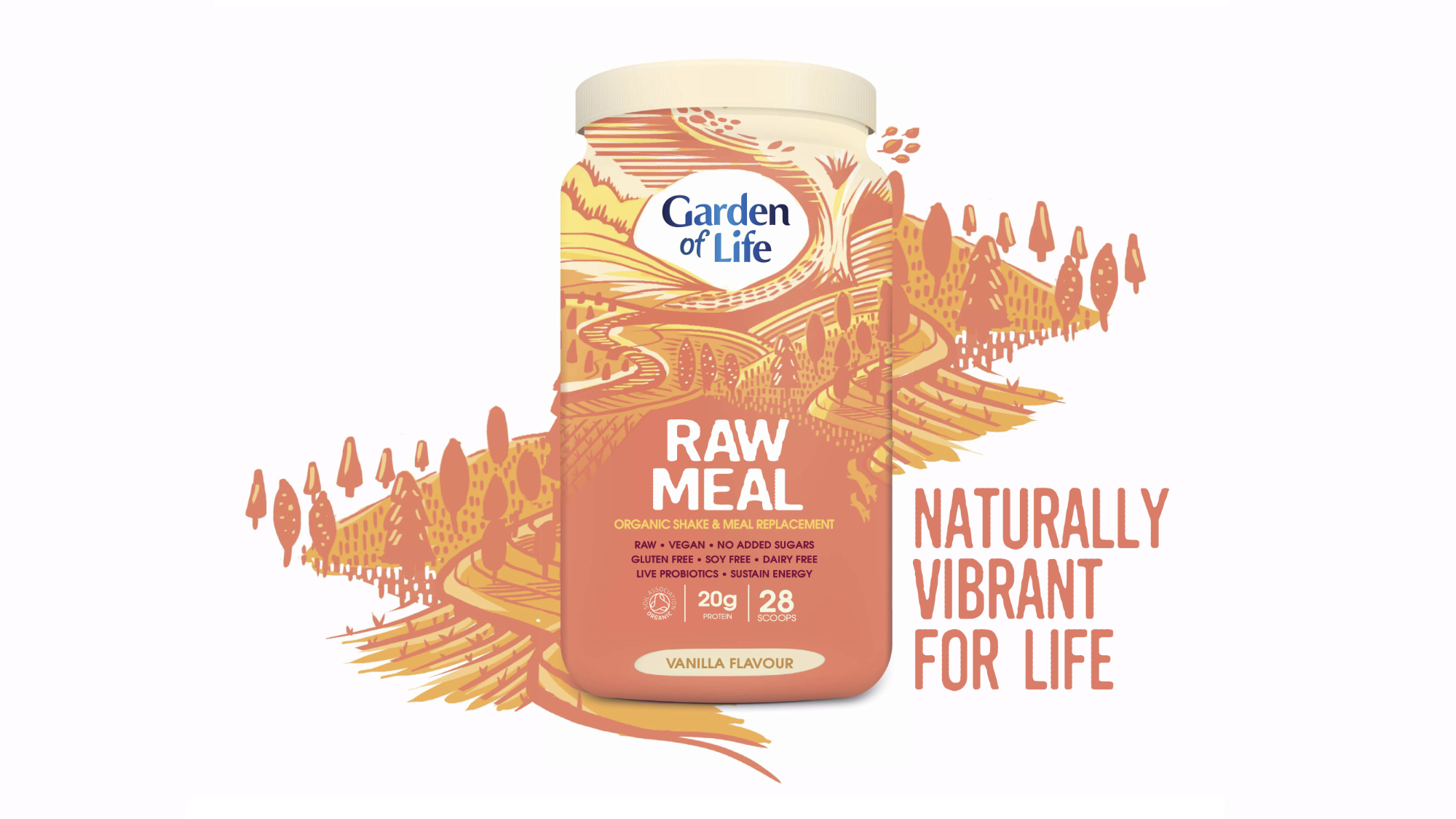
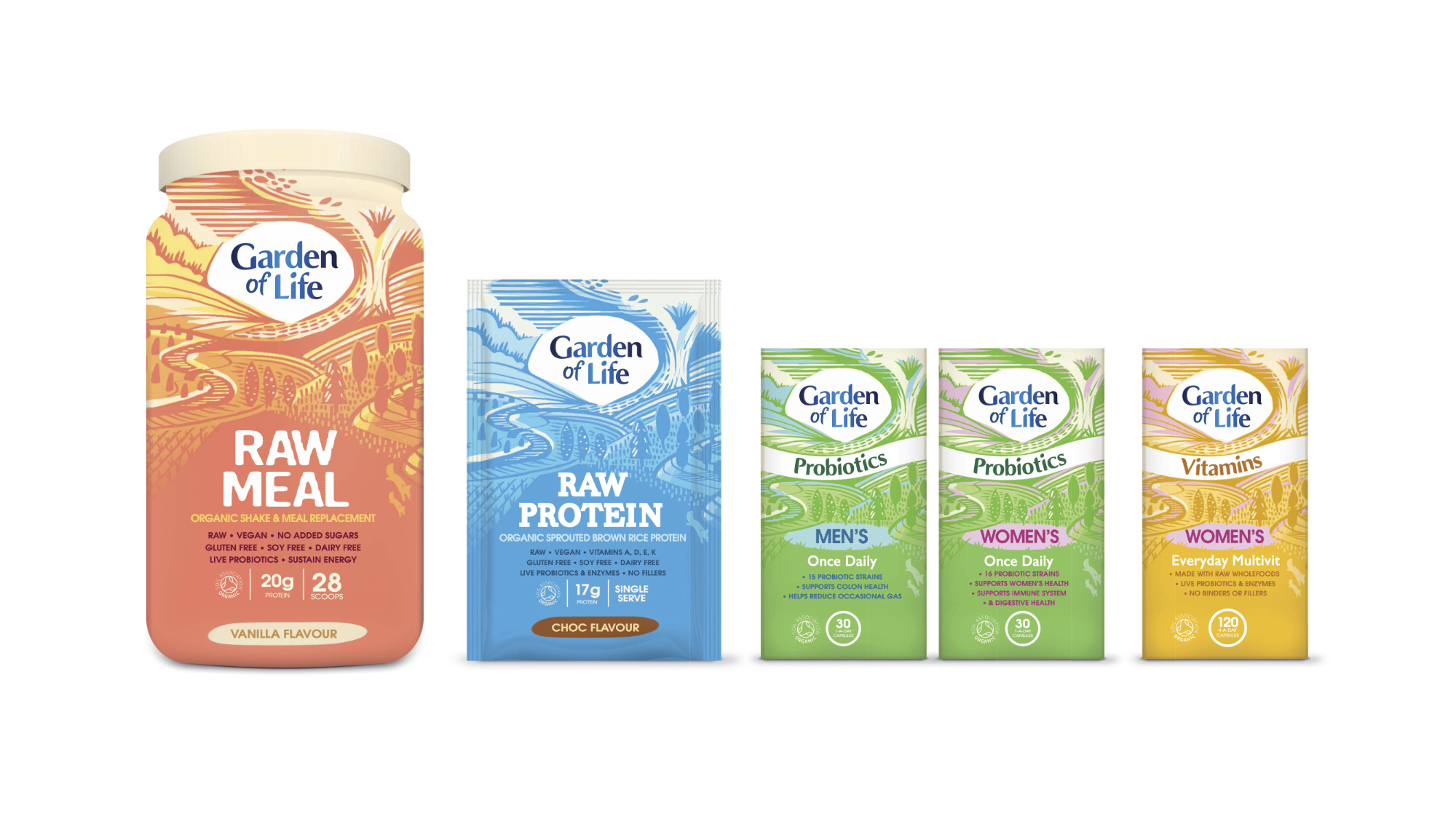
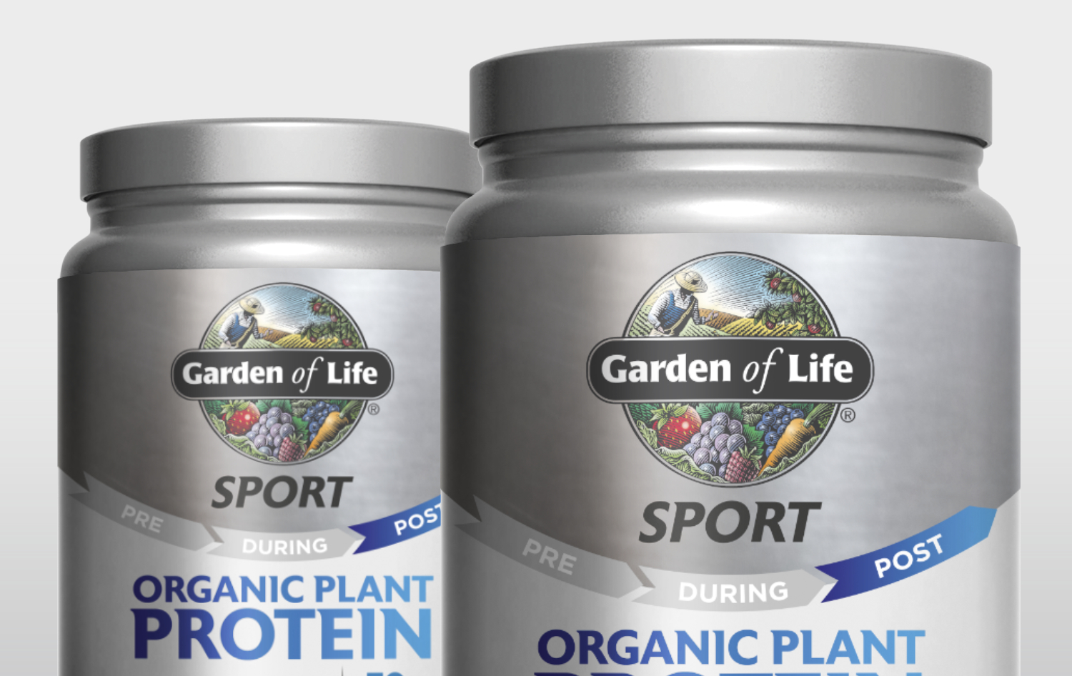
PROVIDING STRUCTURE
Garden of Life's in‐house creative team would be rolling out the new brand identity
across hundreds of SKUs, so we needed to set tight but flexible rules for the asset architecture and
overall packaging structure.
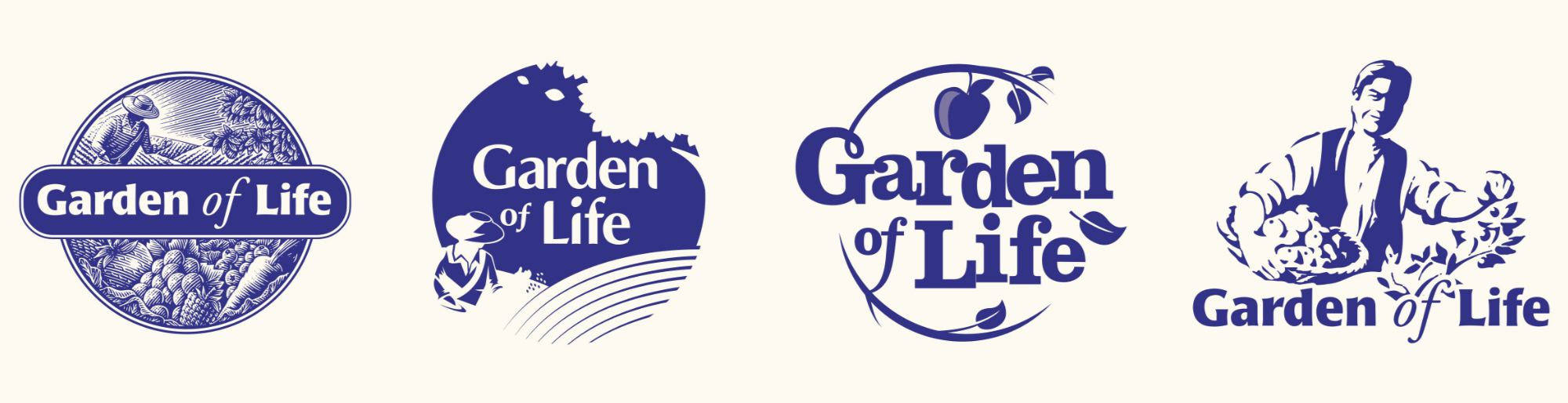
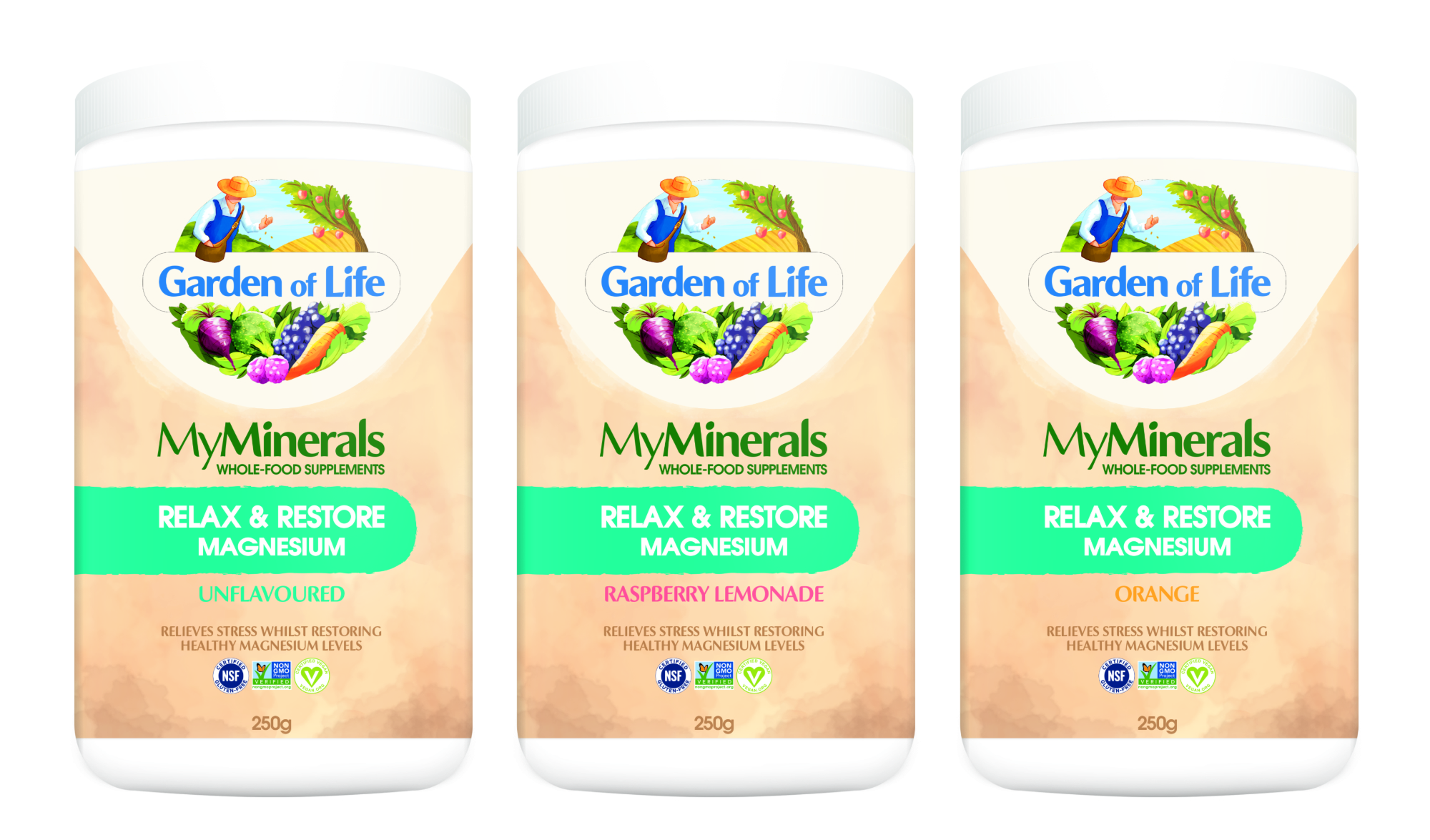
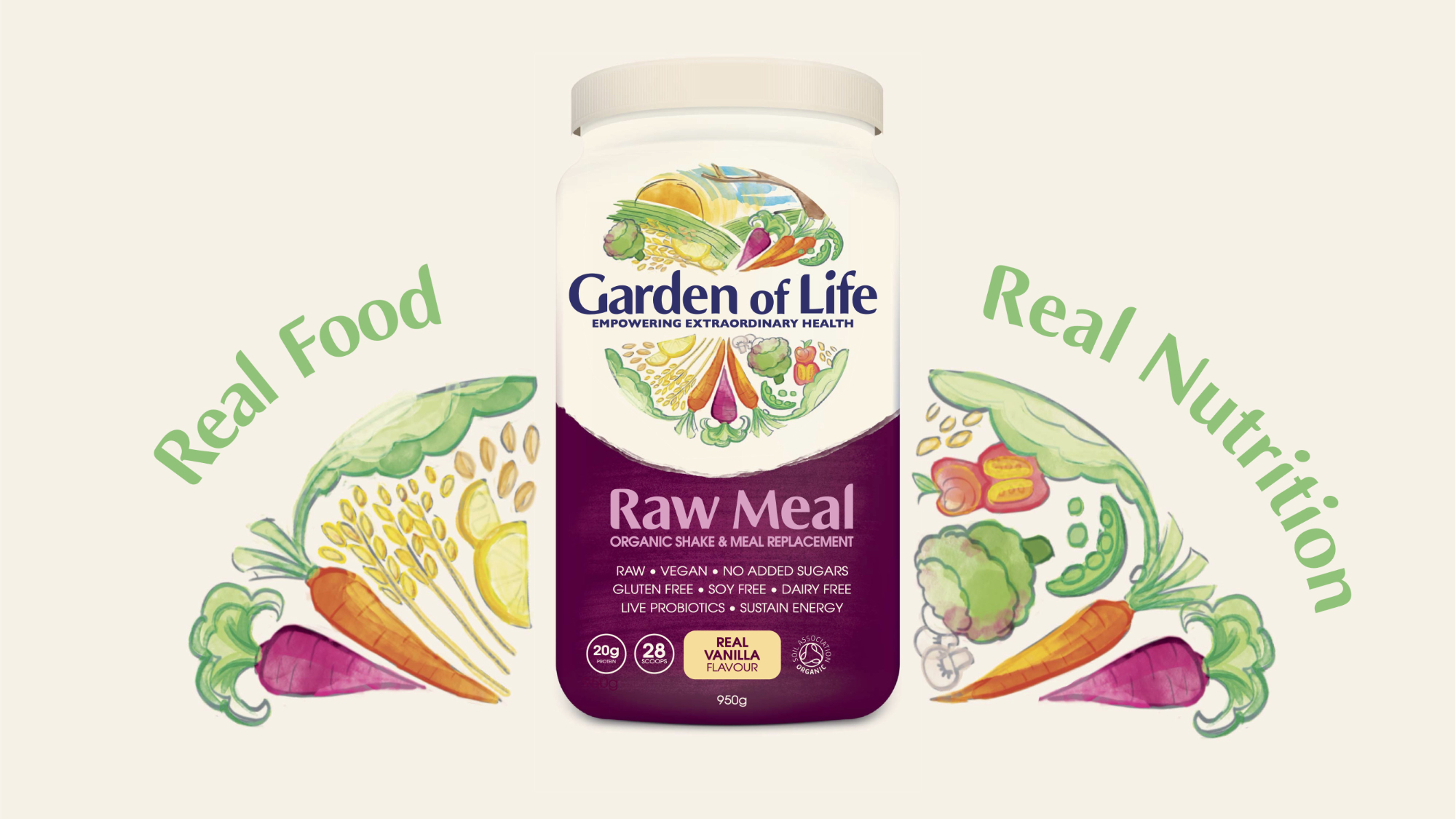
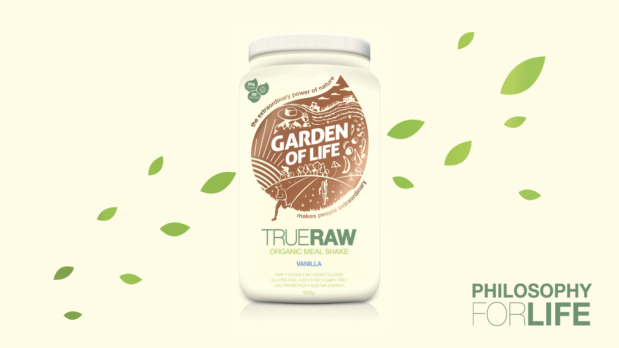
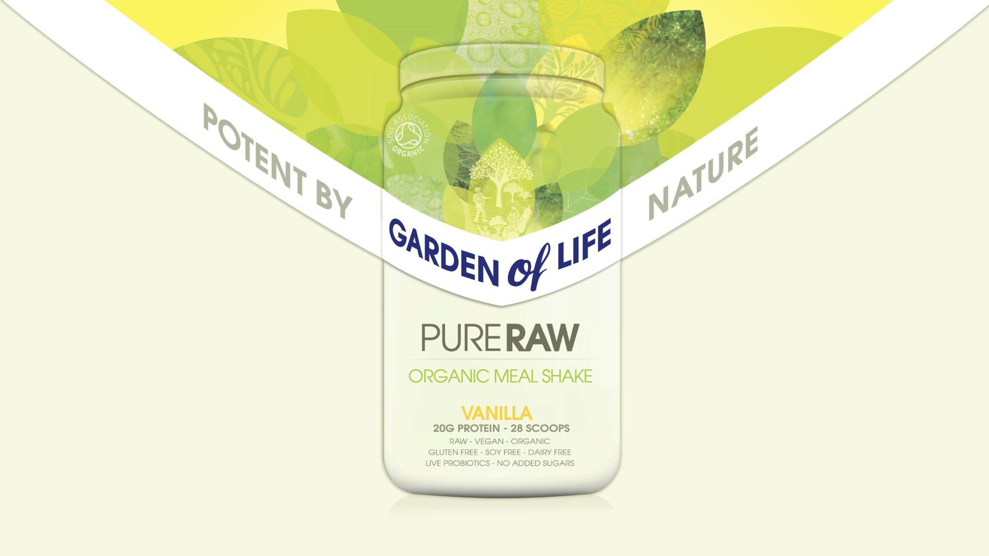
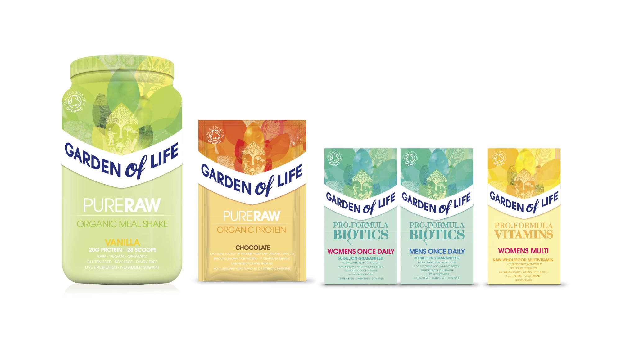
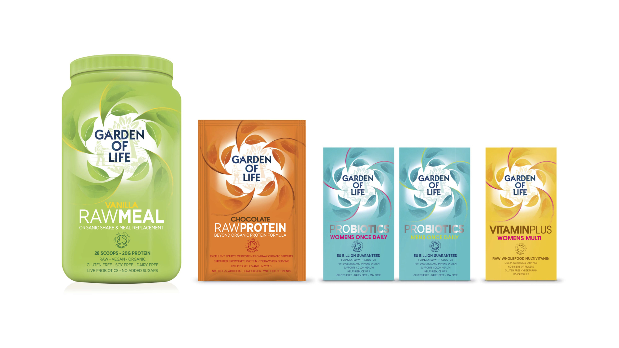
The One's That Got Away...
A selection of the original brand concepts for Garden of Life that never made it past
the intial stages.
Photoshop
Illustrator
Brand Strategy
Art Direction
Branding
Packaging
Typography
Digital Illustration
Retouching
Graphic Design
Iconography
My Role: Designer, Design Director & Account Manager. Team Credits: Springetts Brand Design Consultants: Sophhie Broderick ‐ Senior
Designer, Max Ostler - Designer & Chris Redford - Designer.