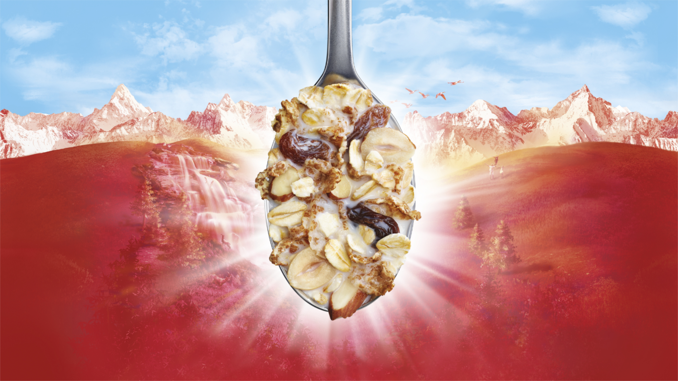
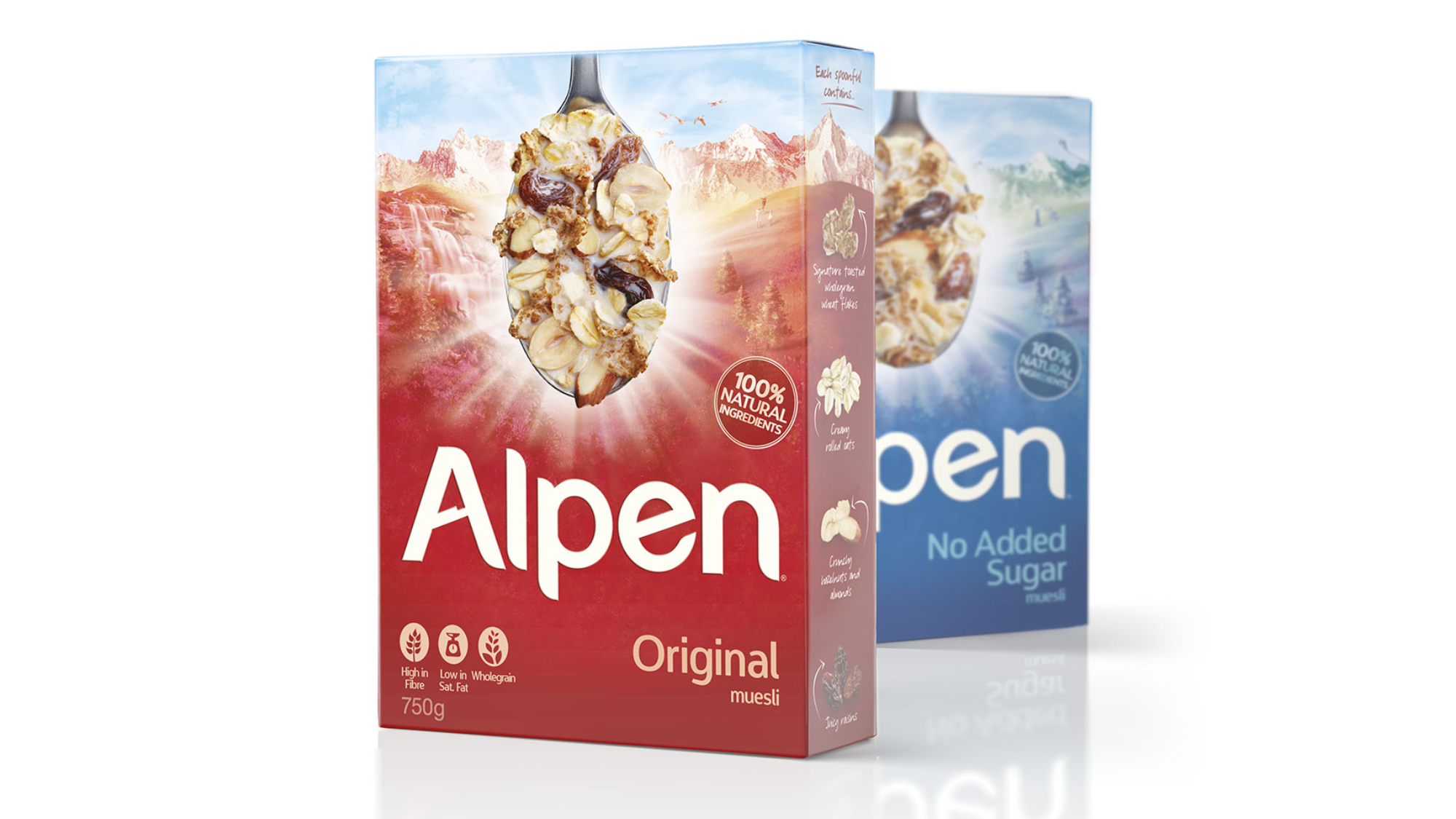
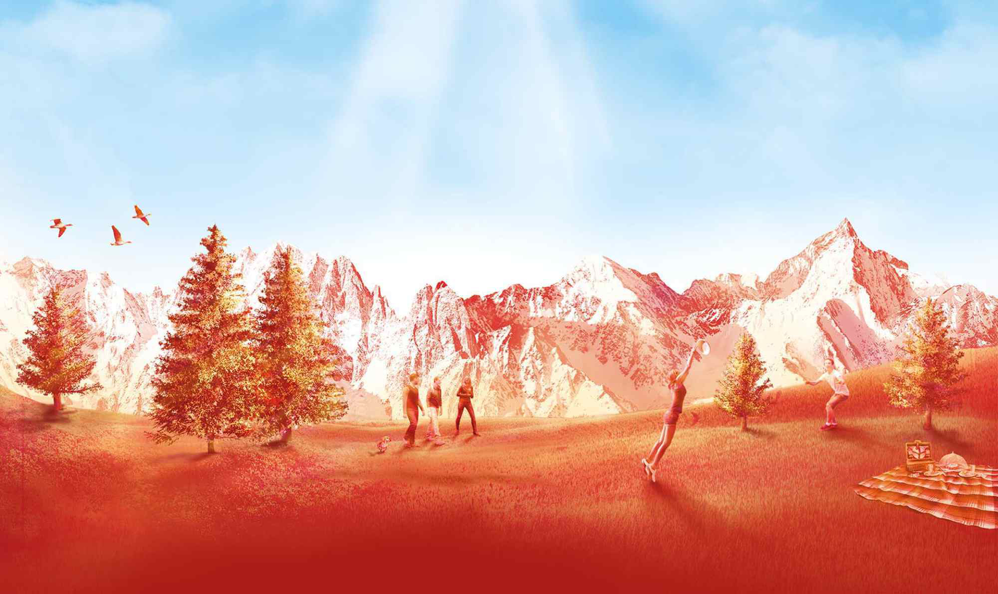
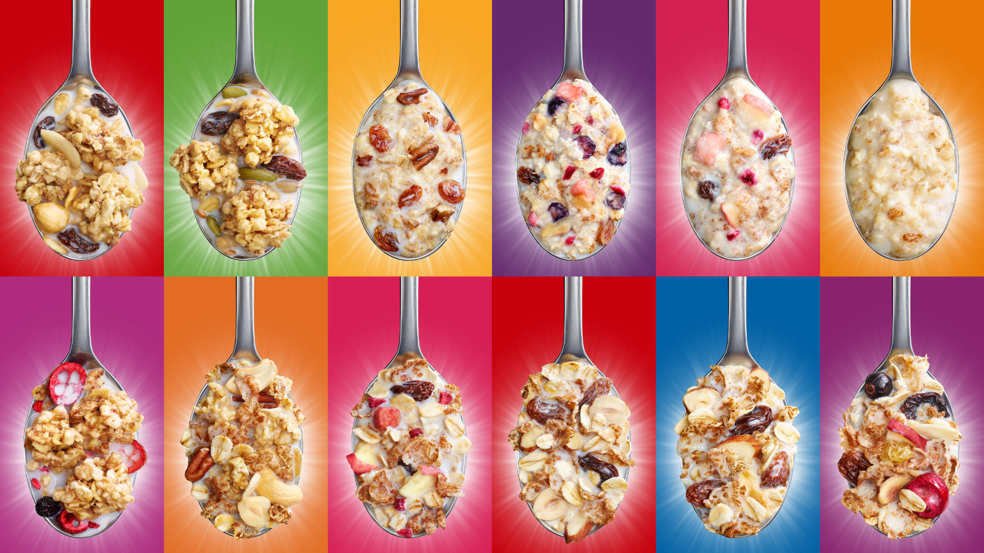
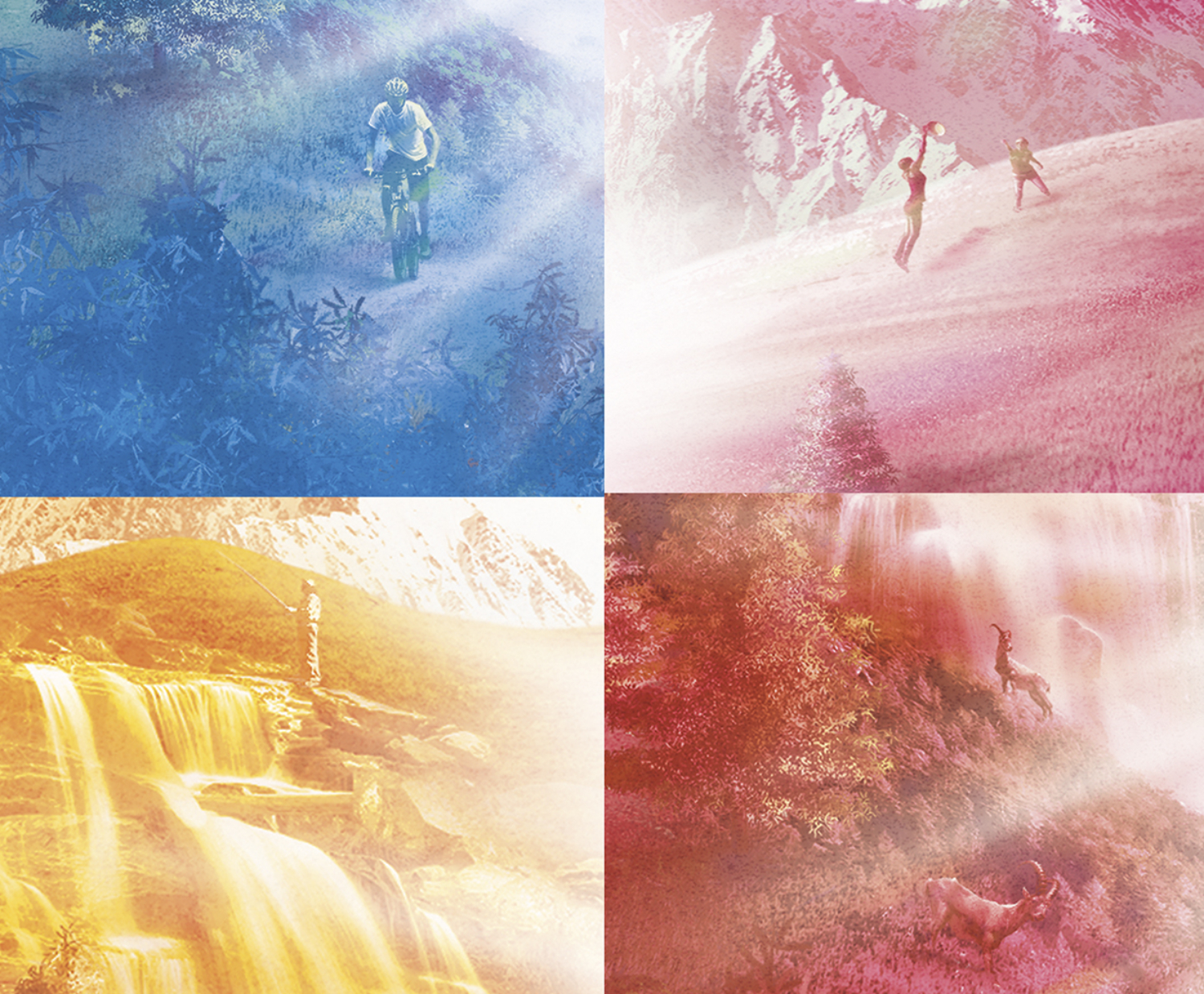
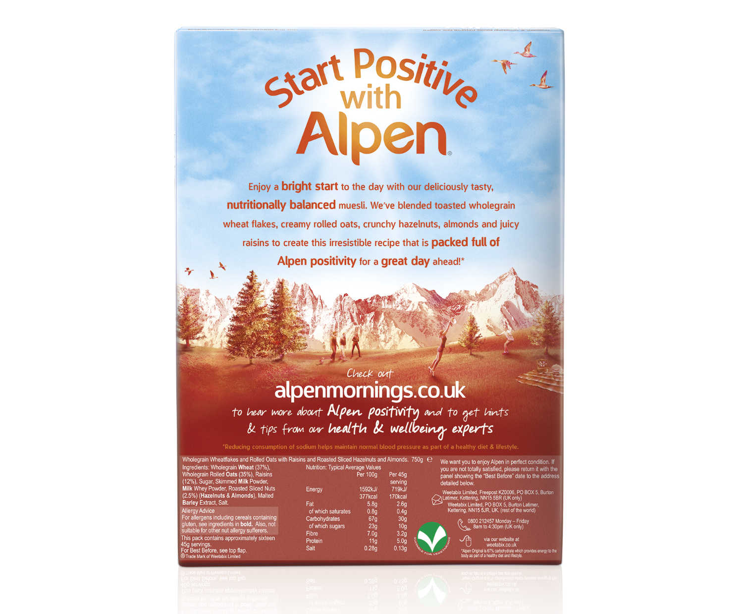
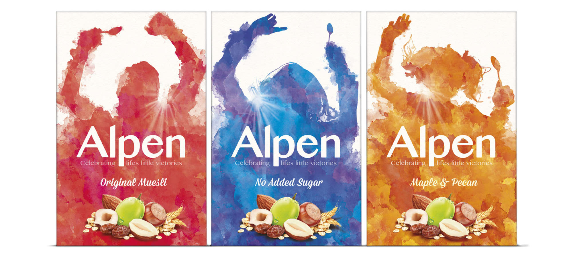
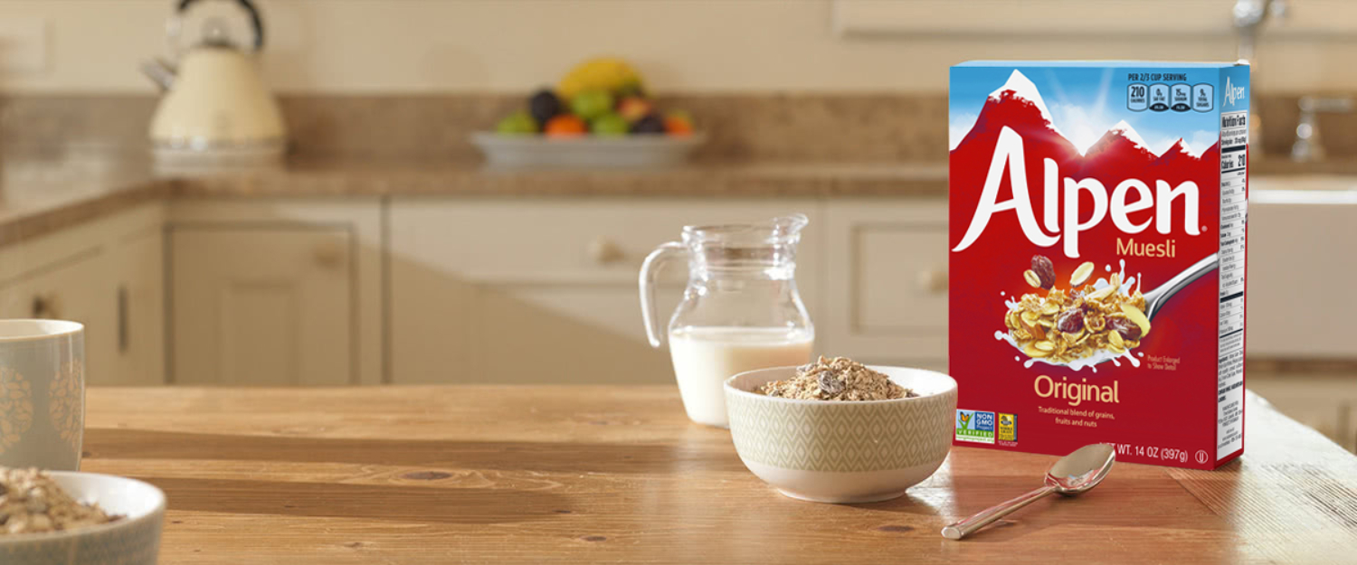
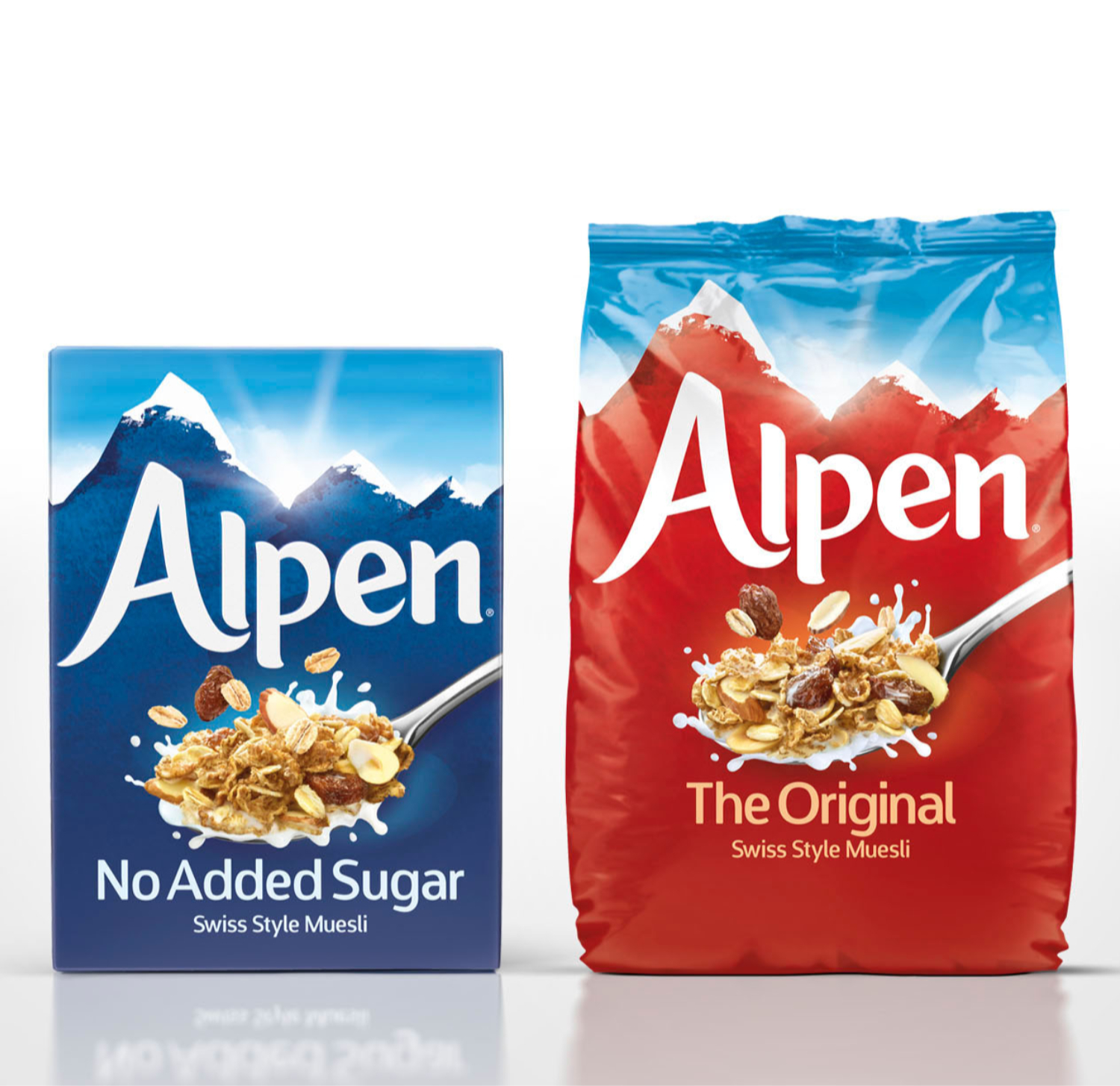
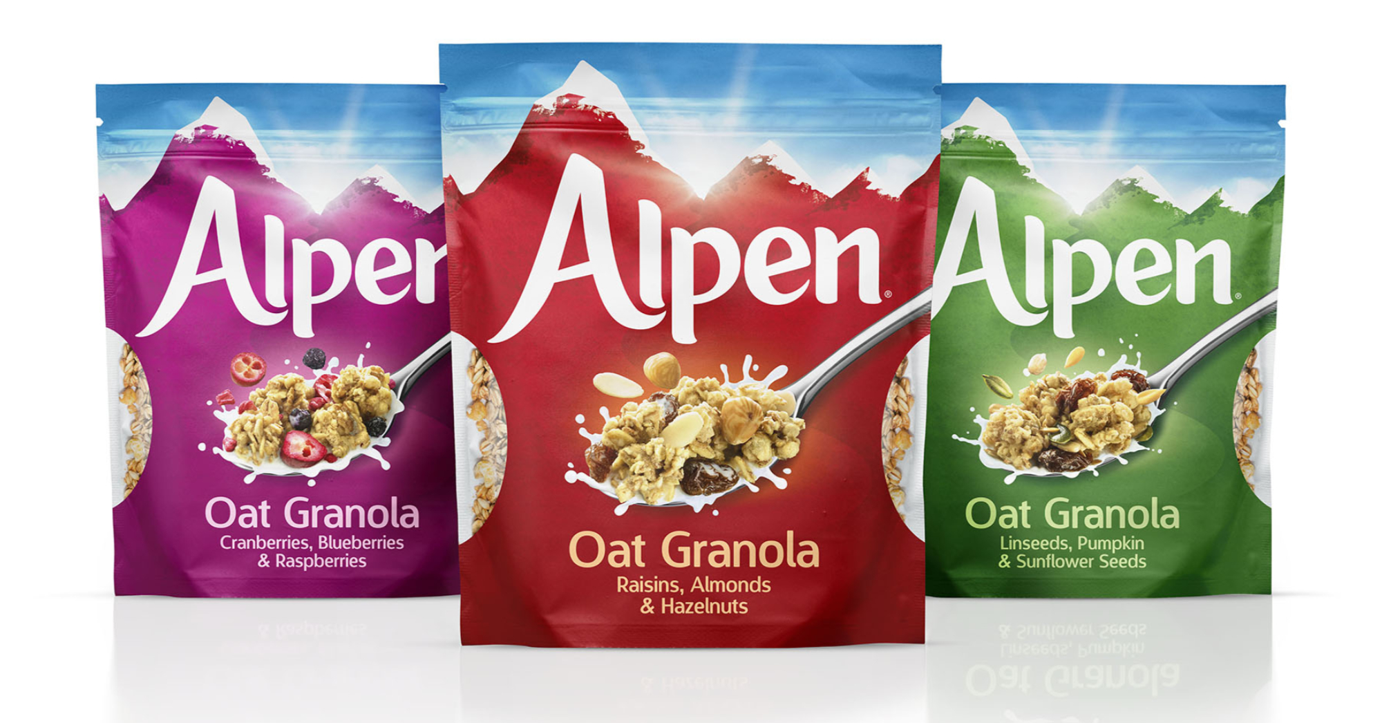
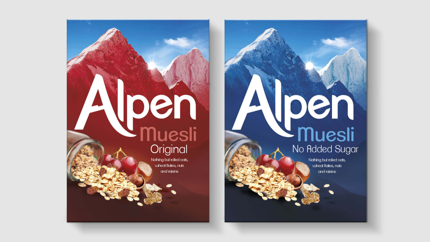
New competition with a fresh approach to the muesli category had left Alpen looking like the dry healthy option. Each pack captures a scene focusing on the goodness of life outdoors in what was previously a static rugged mountain range. The spoon icon heroes the balance of taste and the natural positivity of starting the morning right. A new, clean and modern Alpen brandmark completed the brands rejuvenated place in the category.
The 2015 sketchpad
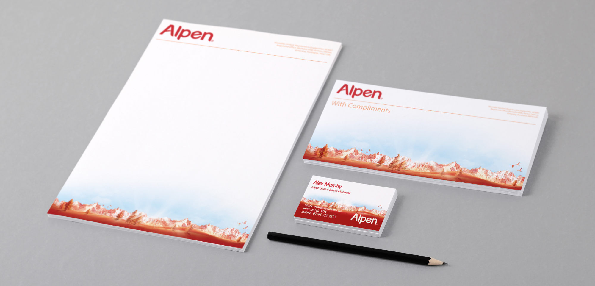
The Alpen Way
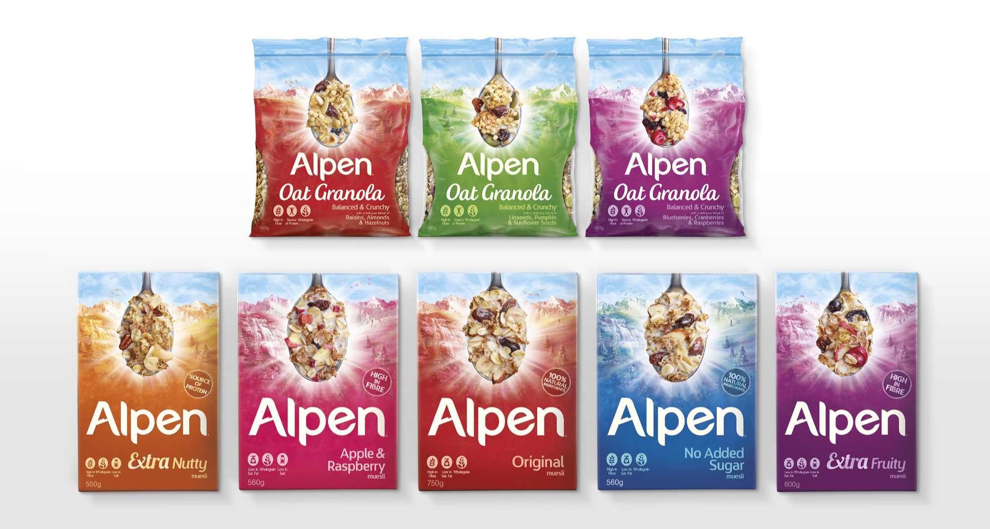
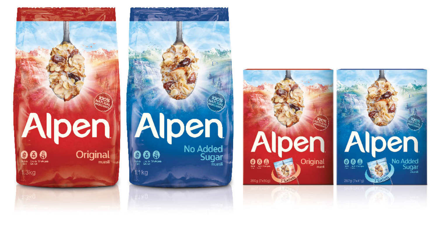
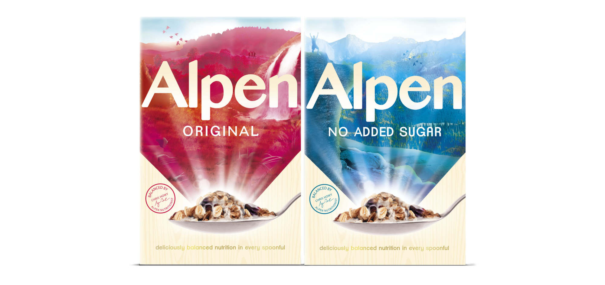
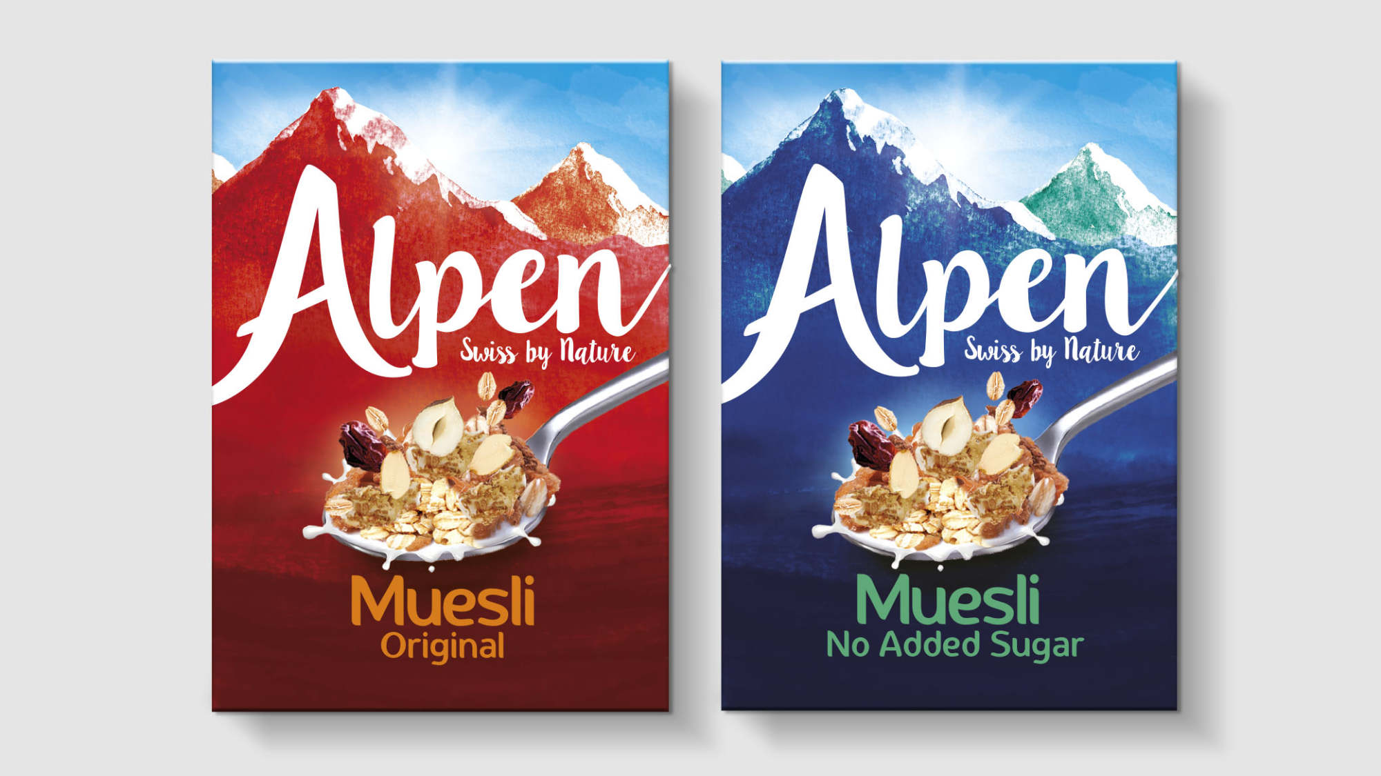
In 2017 ,distinctive Brand Asset research suggested Alpen needed more impact on shelf, to be more instantly recognisable as Alpen by building on their uniquely ownable assets in the cereal isle. A simplified and more iconic snow‐capped mountain range was introduced along with fresh blue skies, suggestive of the rejuvenating Alpine air and Swiss provenance. A new brand mark was created with a 'hero A' to harmoniously combine the brands iconic mountain range and name.
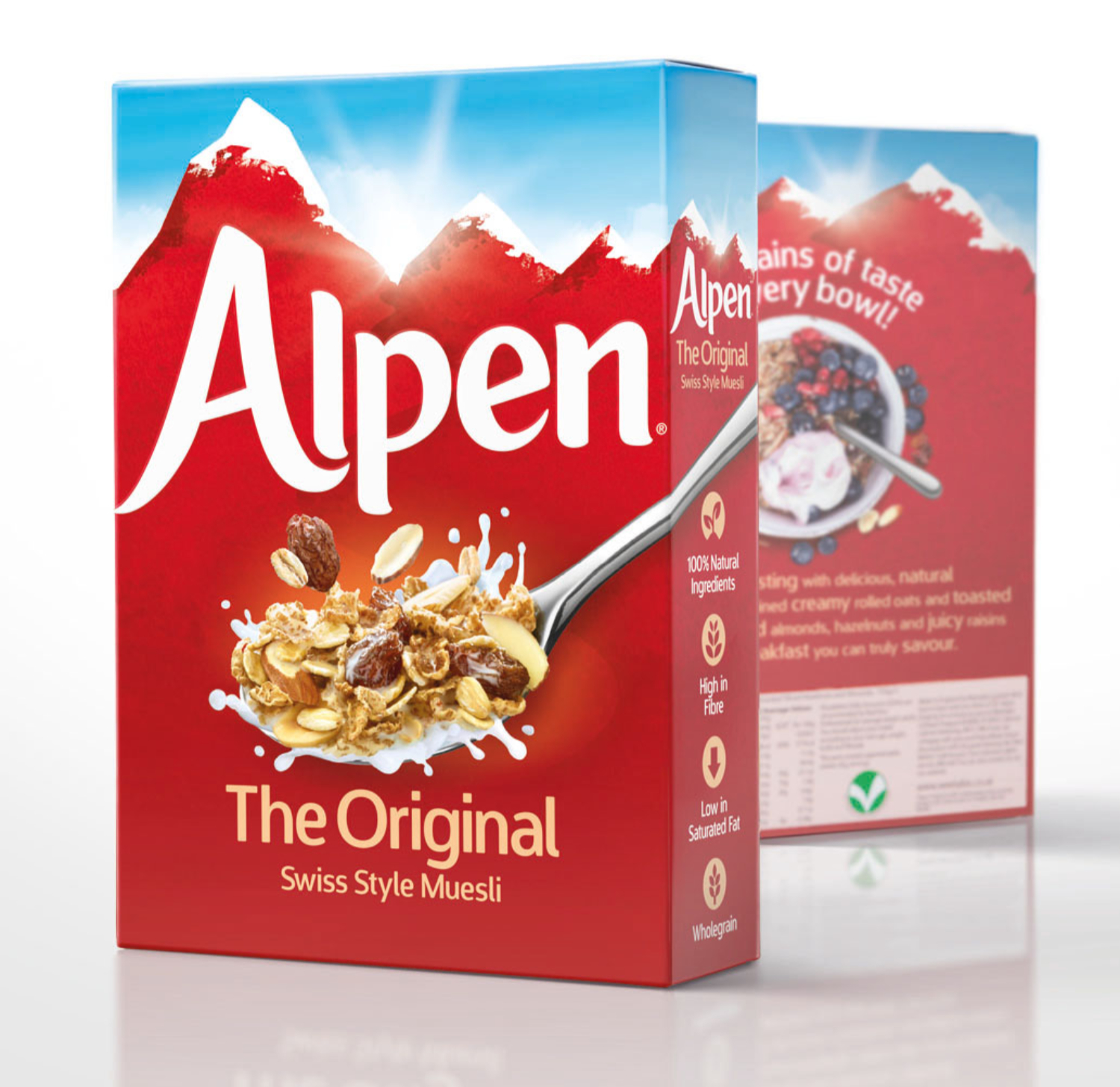
The 2017 sketchpad
- Photoshop
- Illustrator
- InDesign
- Art Direction
- Branding
- Packaging
- Typography
- Digital Illustration
- Retouching
- Graphic Design
- Iconography
My Role: Designer, Design Director & Account Manager.
Team Credits: Springetts Brand Design Consultants: Sophhie Burt ‐
Designer.
Partners: Photographer: Howard Shooter.