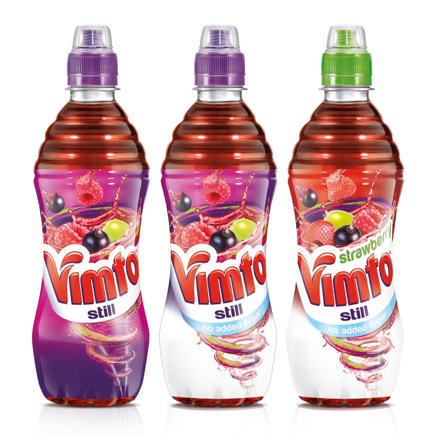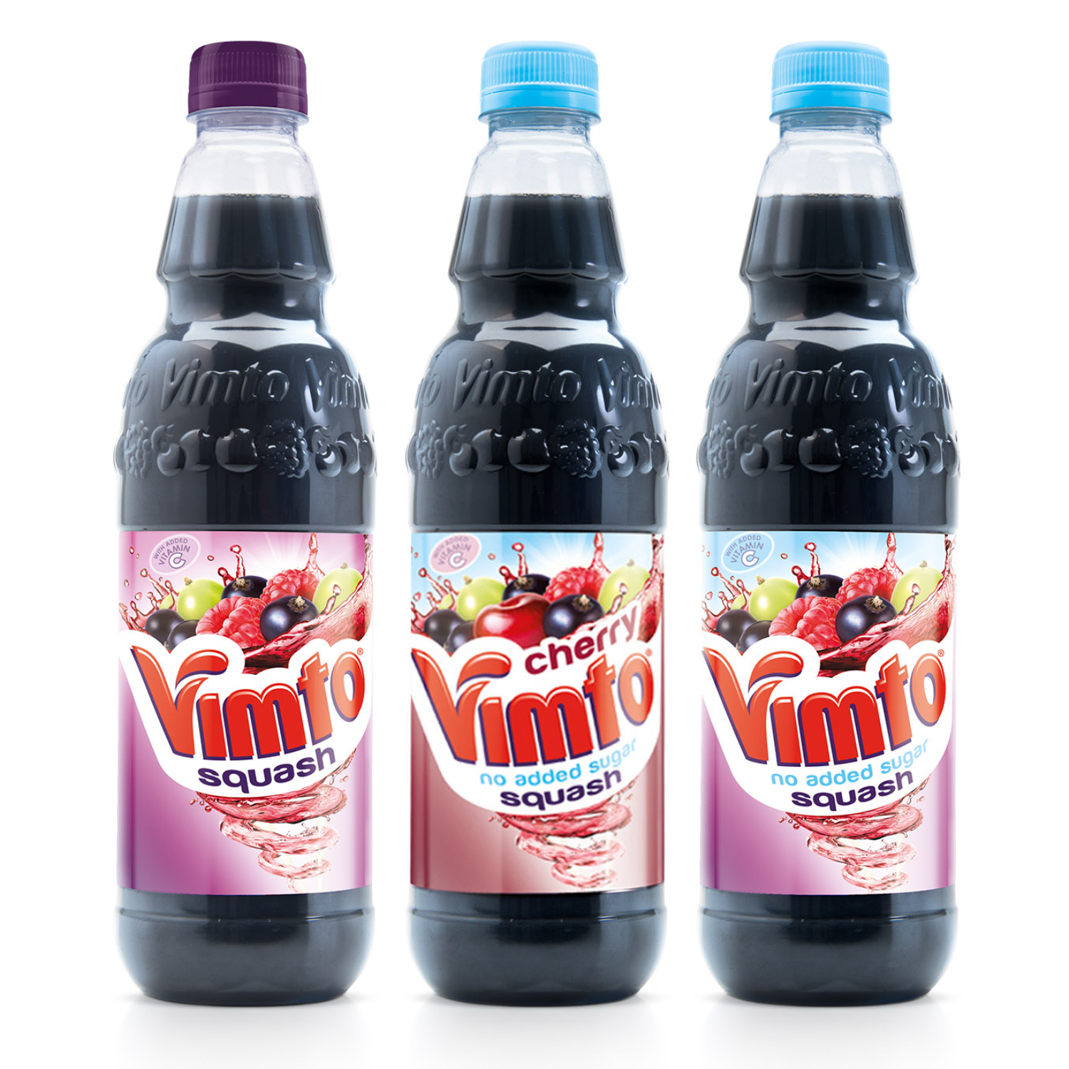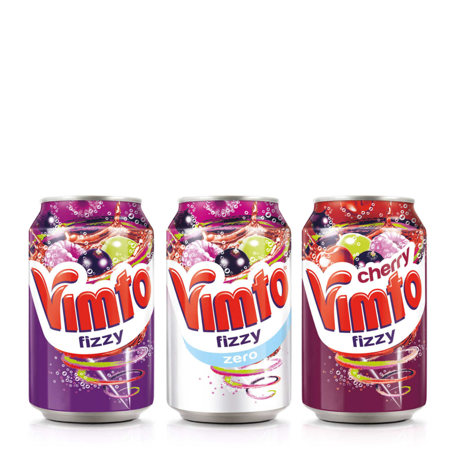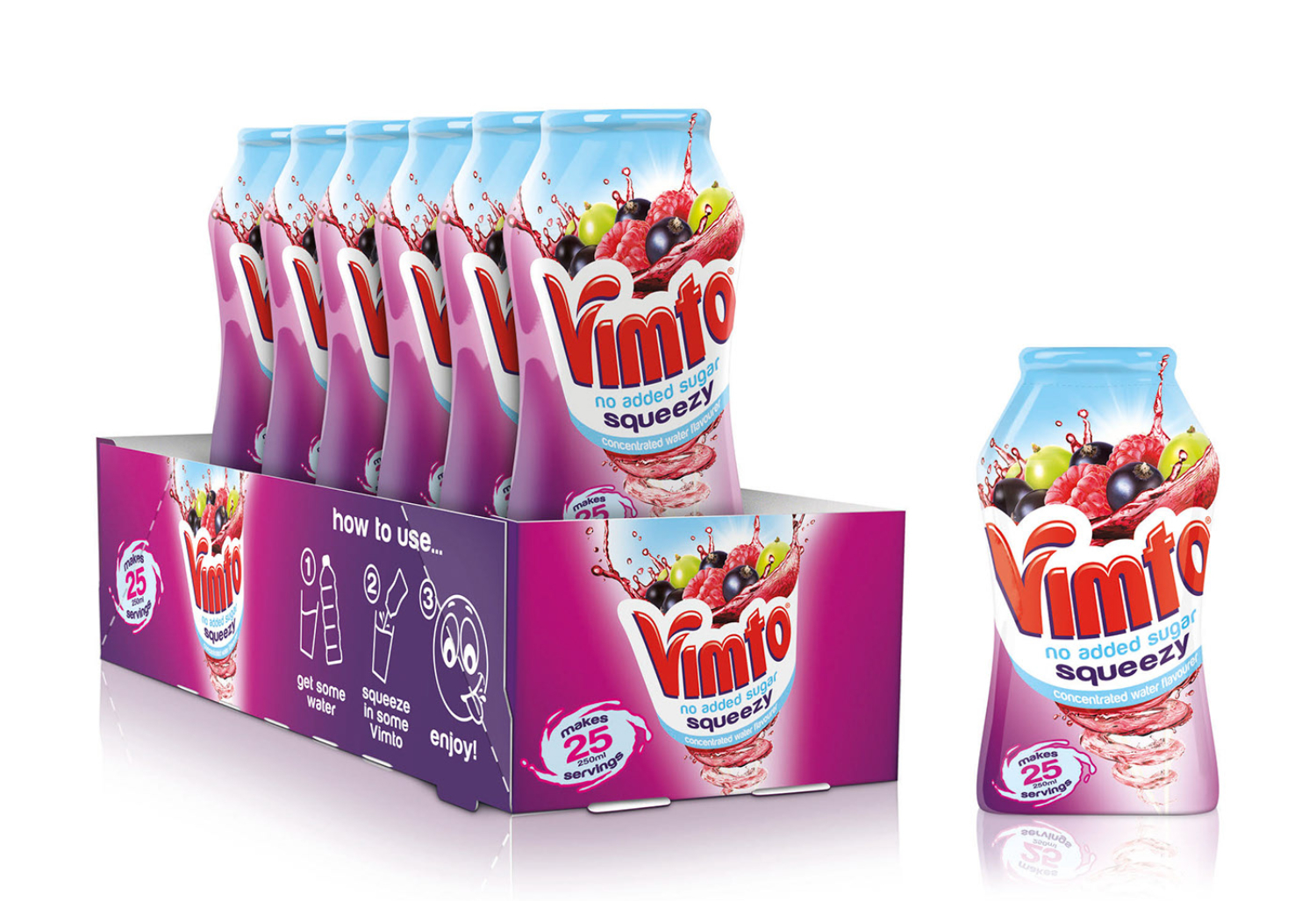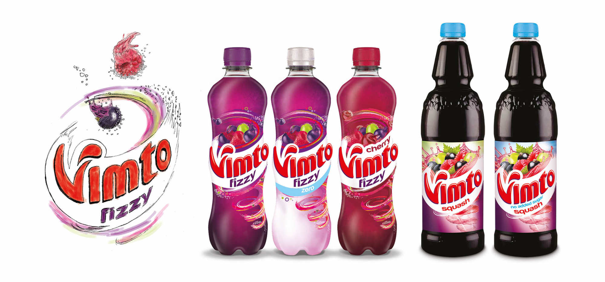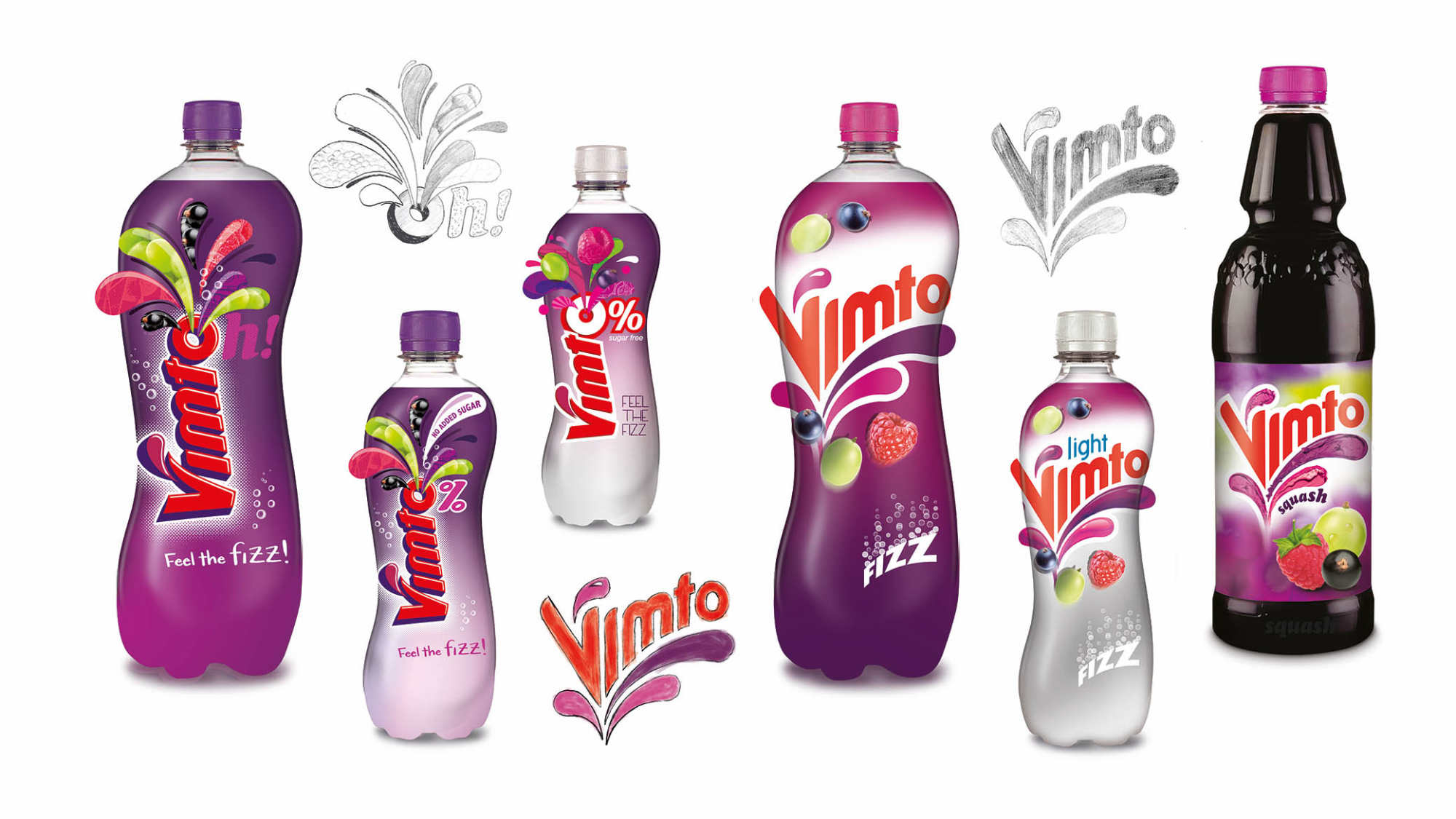
VIMTO
Seriously Mixed Up Fruit
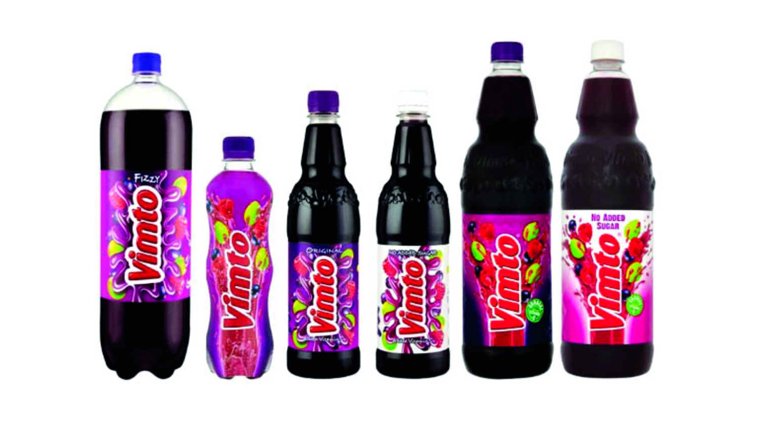
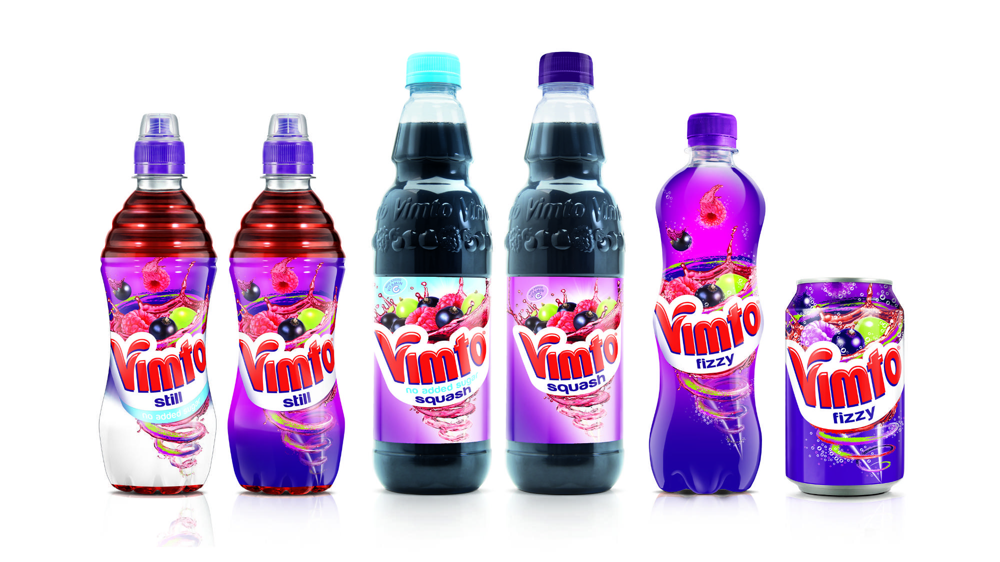
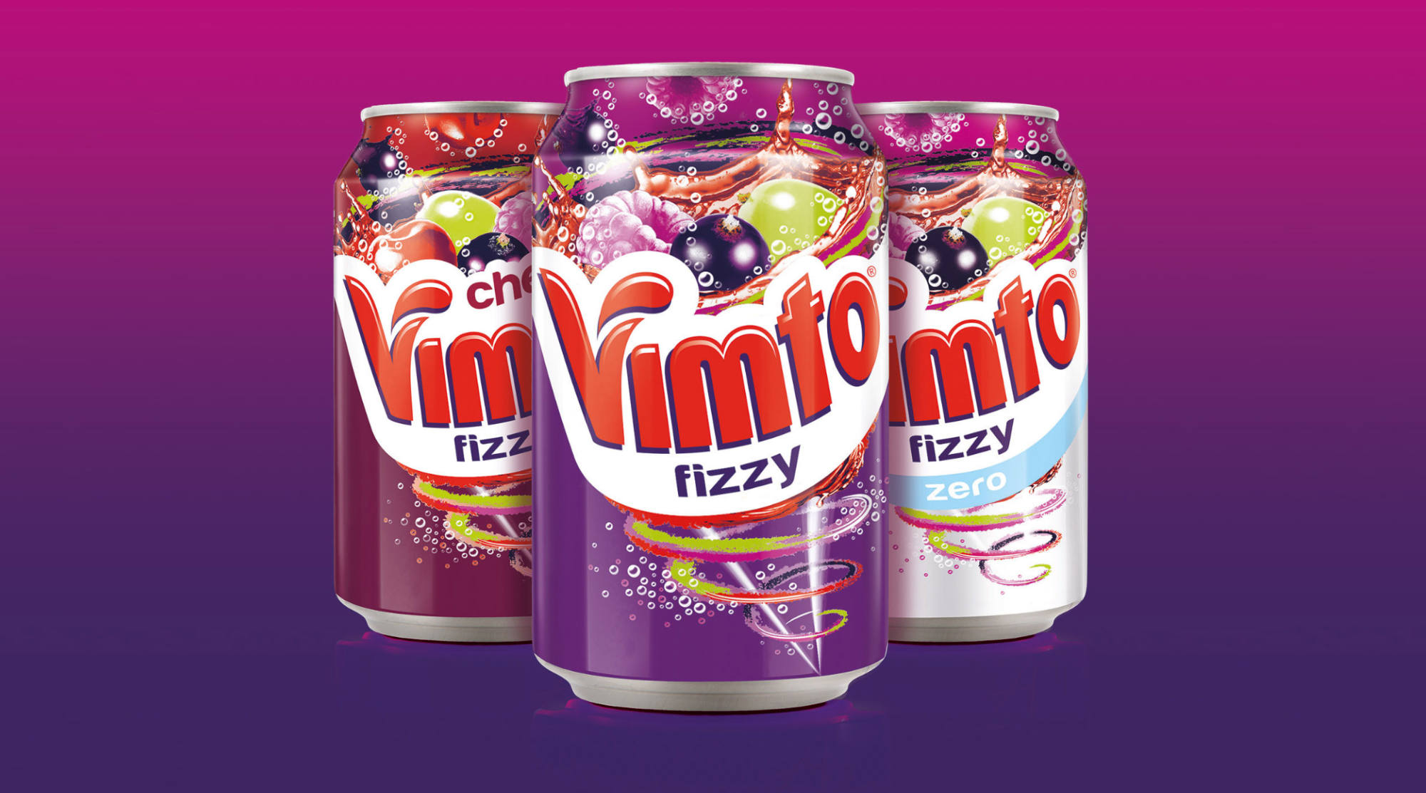
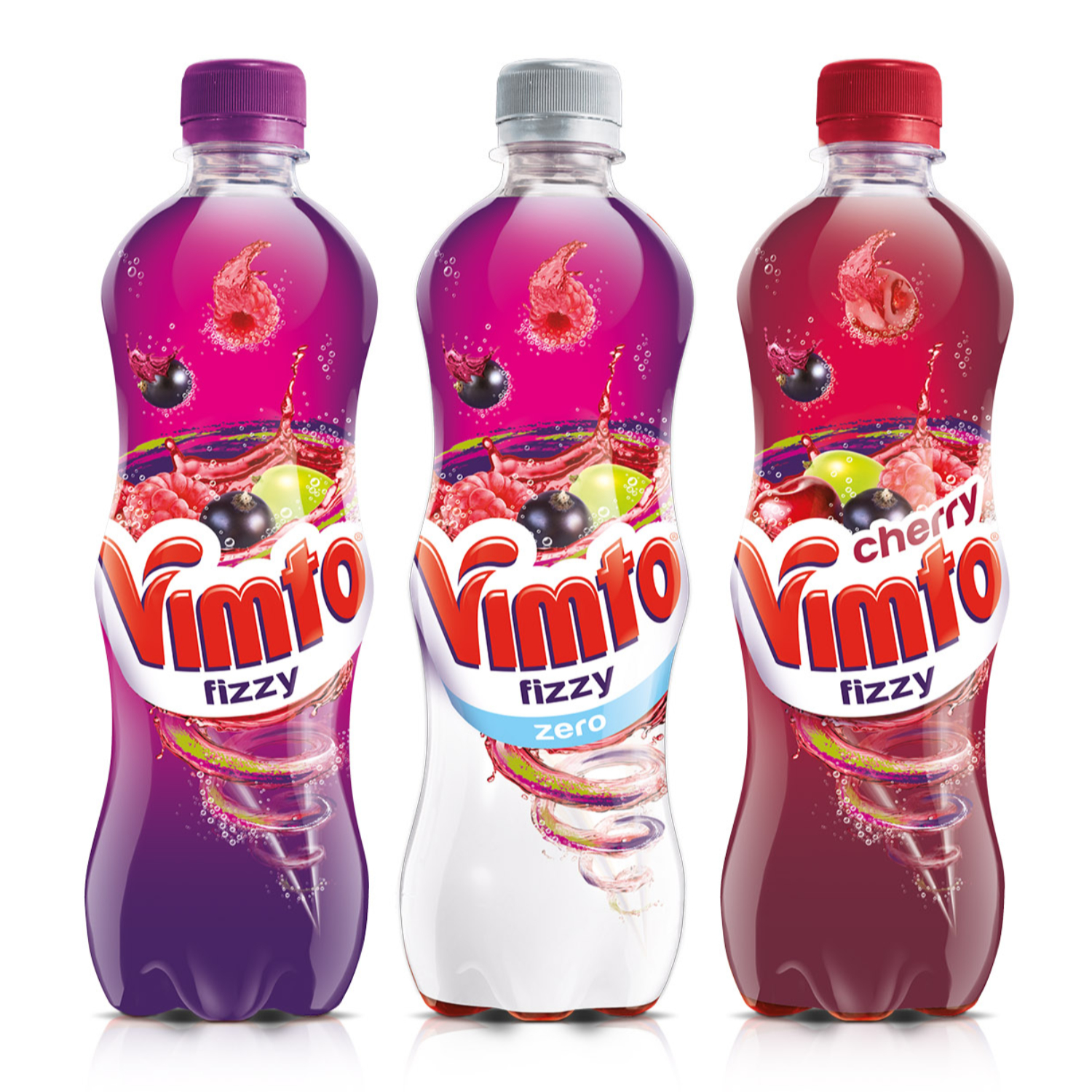
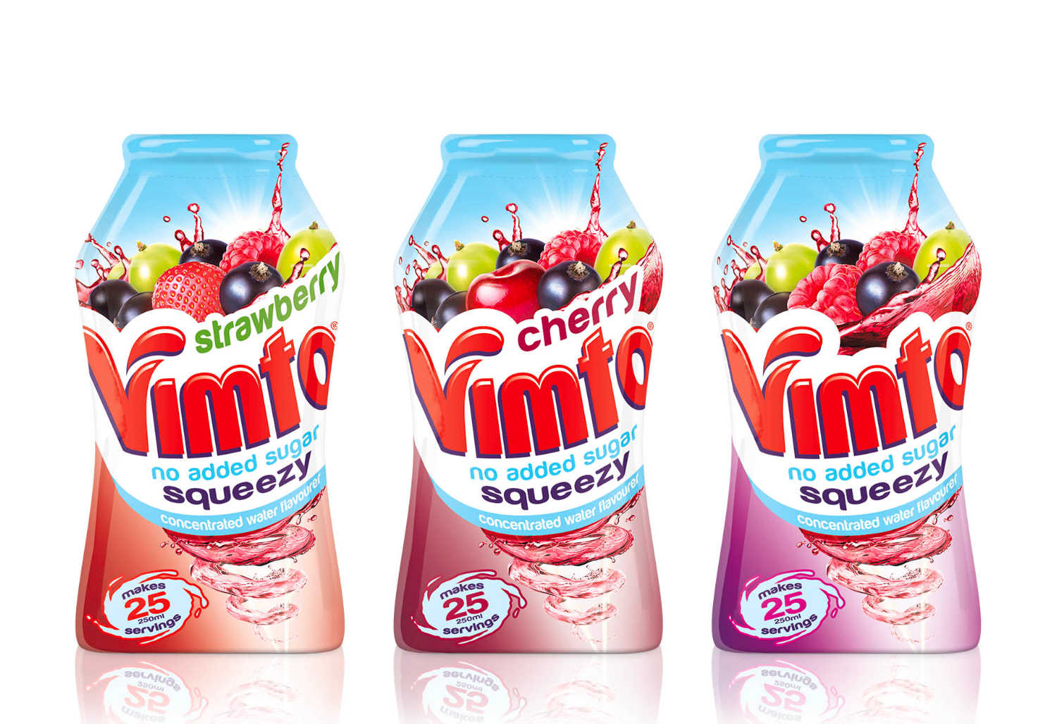
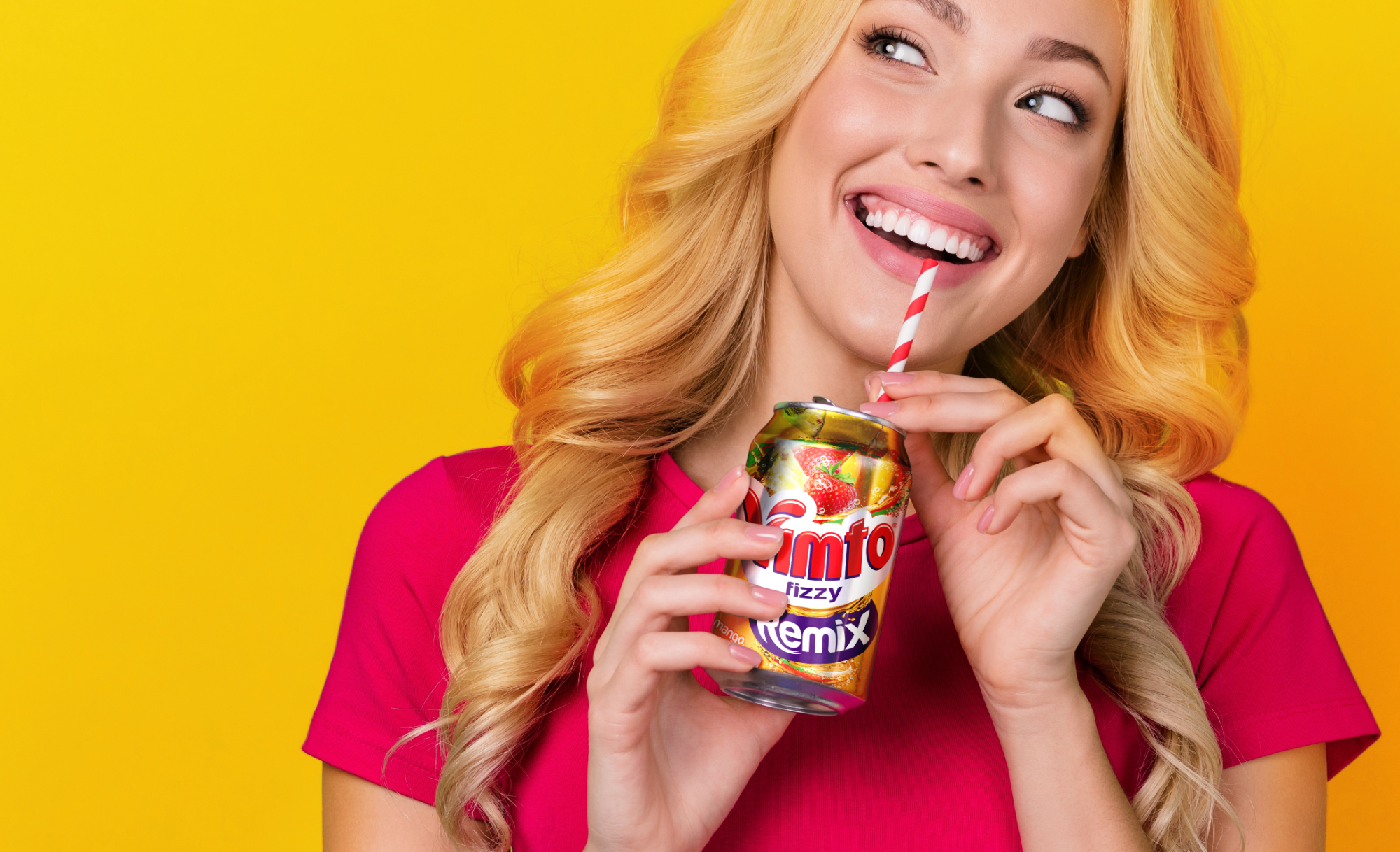
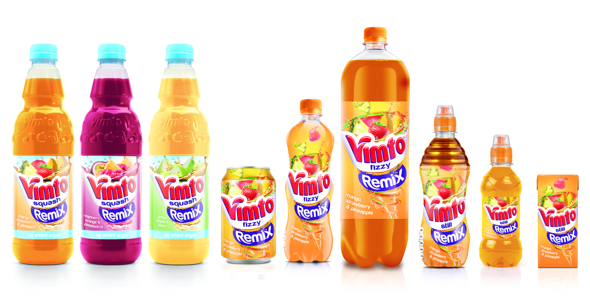
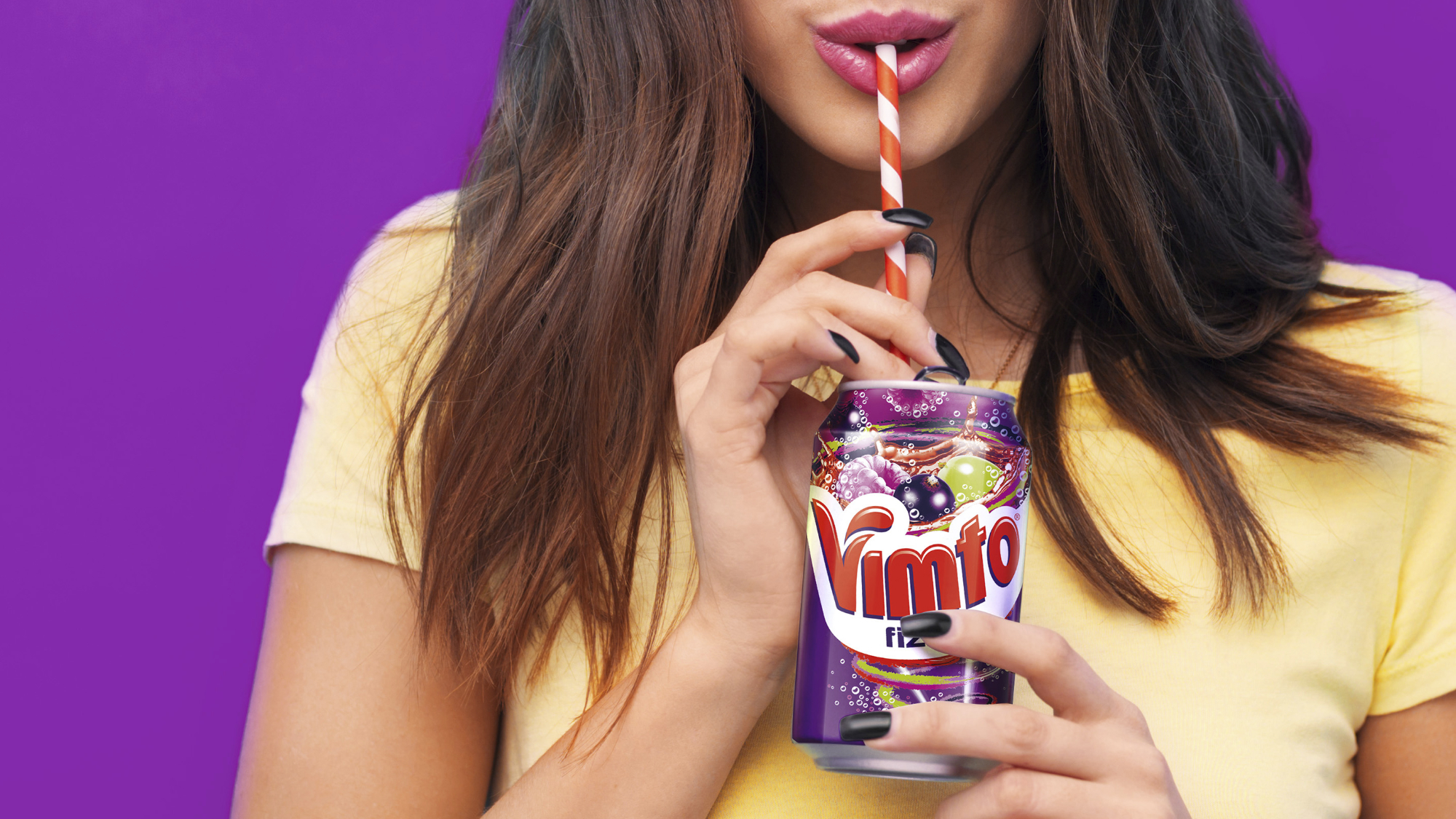
Rebranding Vimto's entire soft drinks portfolio to convey a more emotional and fun approach to the packaging, rooted in Vimto's deliciously unique flavour. The cans and bottles feature a new Vimto logo ‐ a smiling vortex ‐ a visual metaphor for the brand's positioning of 'seriously mixed up fun'.
It emanates from below the logo before bursting from the logo towards the opening, giving the consumer the impression that they will taste full Vimto flavour from the very first sip to the very last.