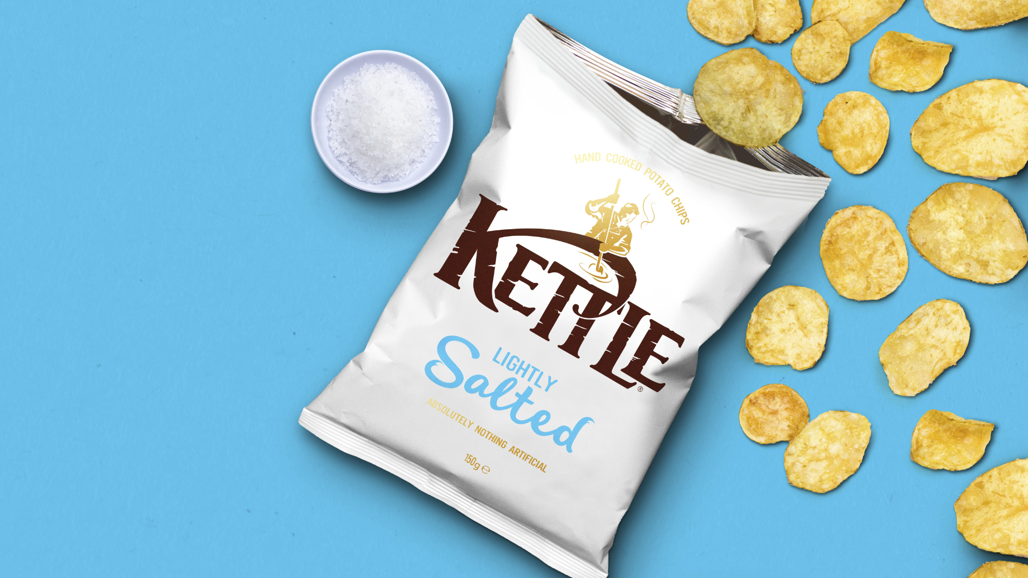
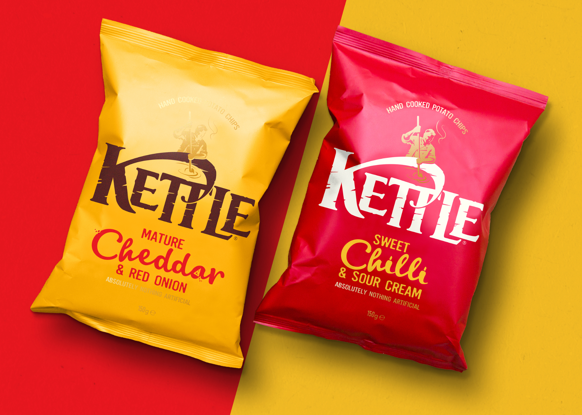
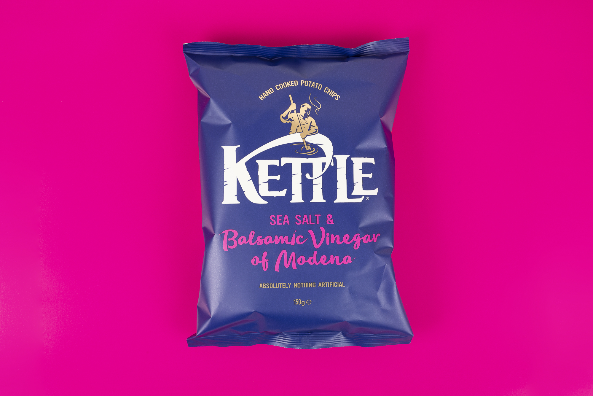
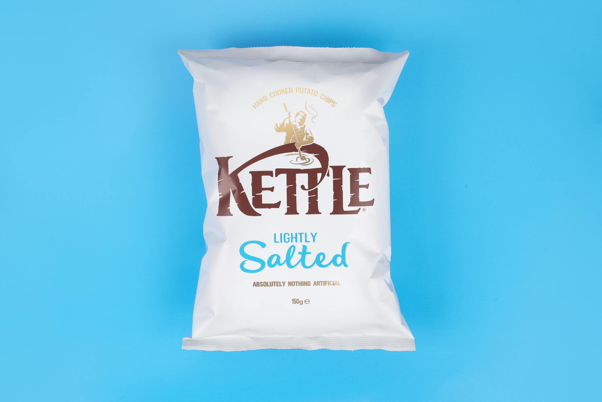
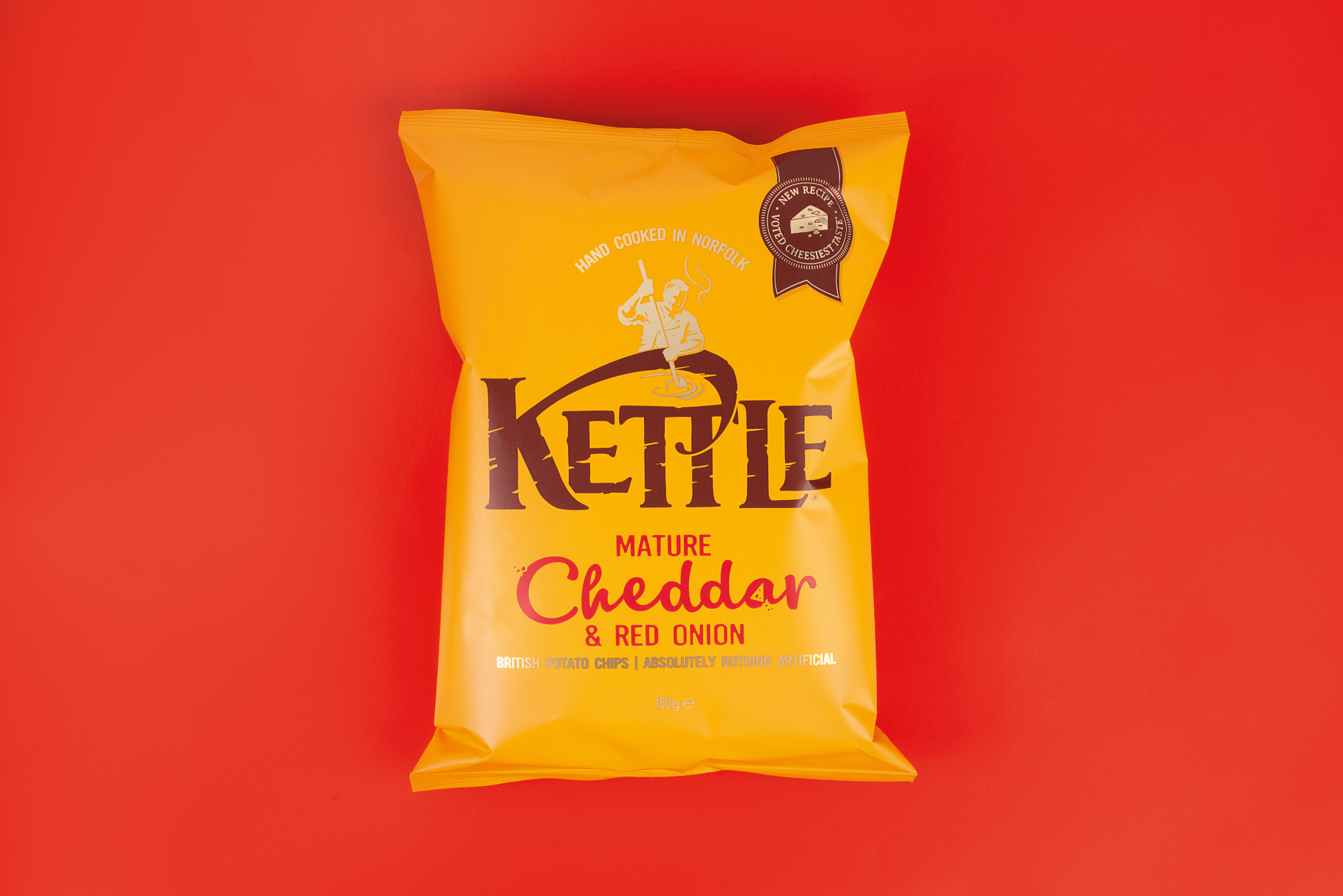
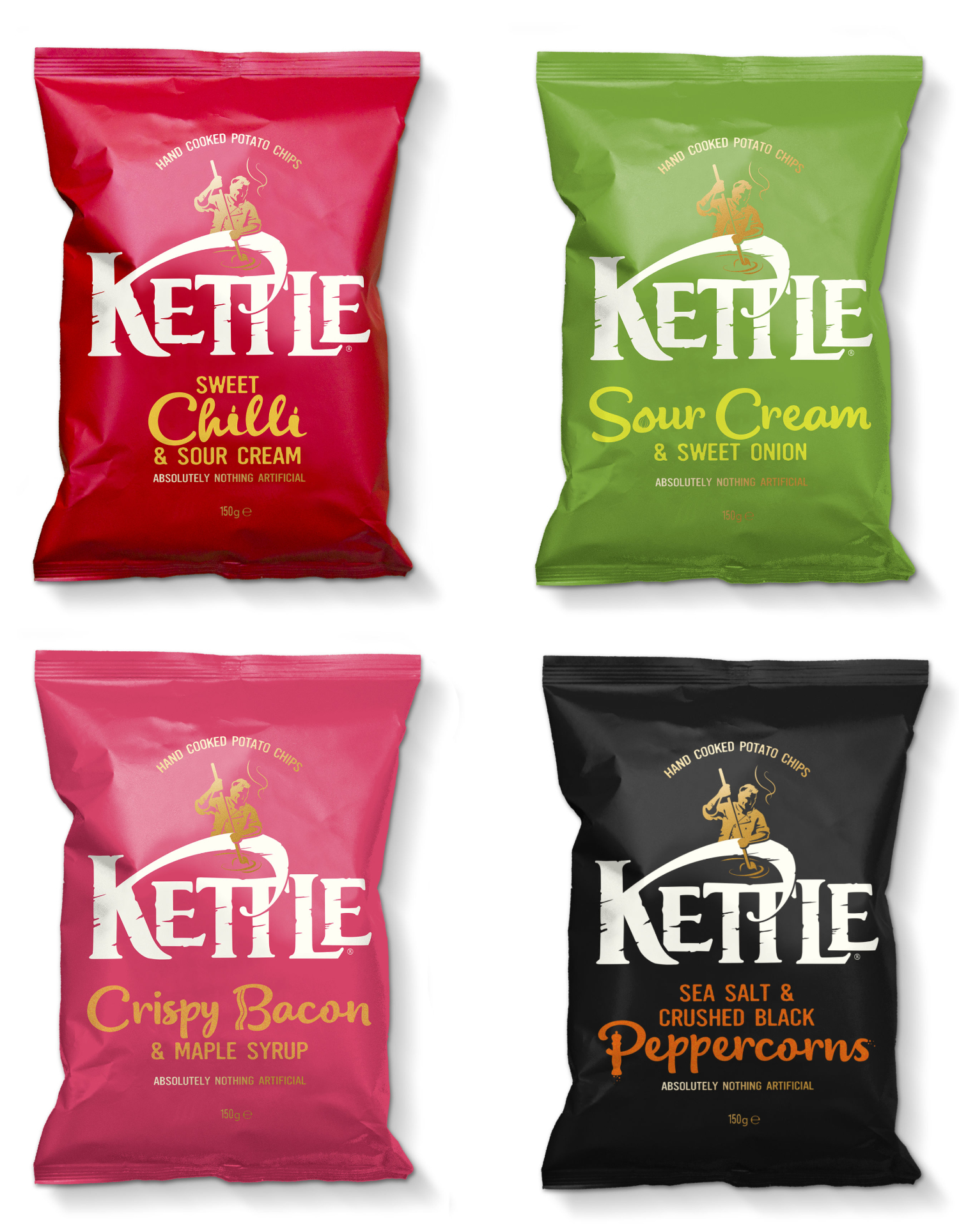
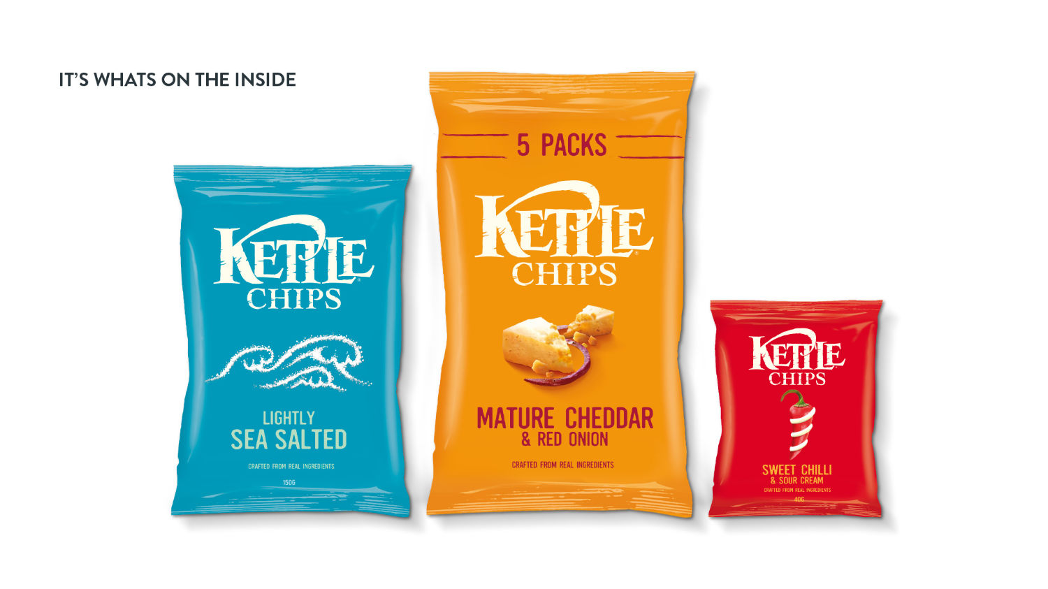
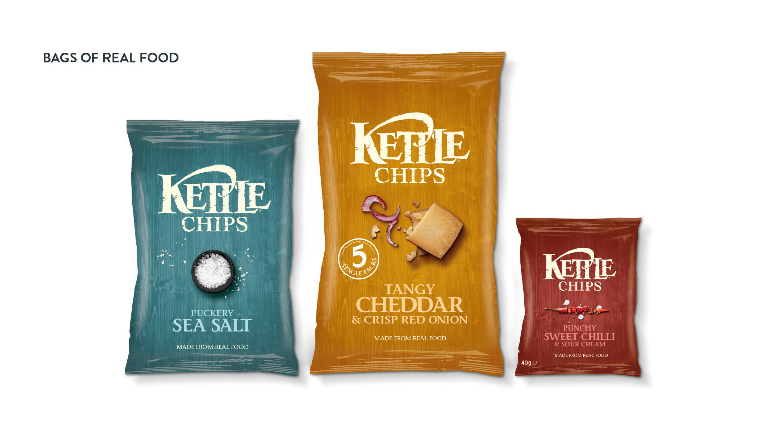
Kettle Chips was seen by the 'young and aspiring' as a formal, social
snack for their parents, who love the finer things in life. This redesign helped Kettle to loosen
their tie a little and inject more personality into their world of tradition and authenticity.
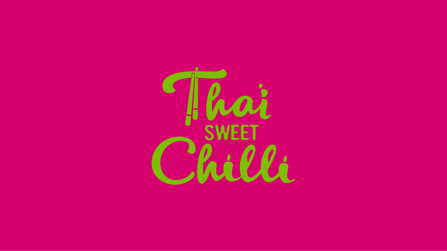
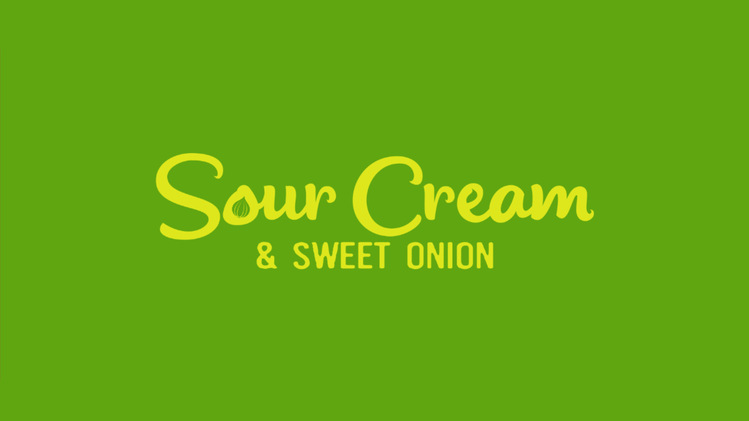
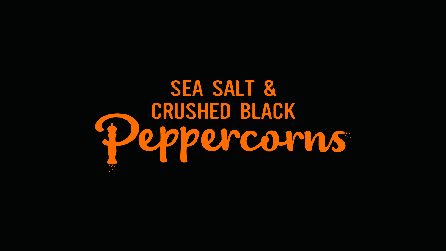
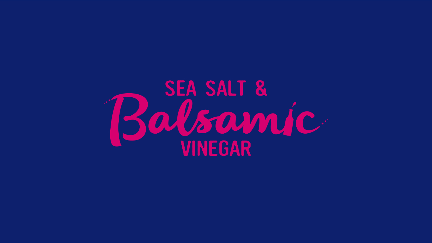
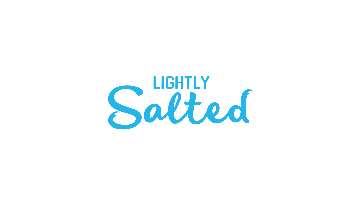
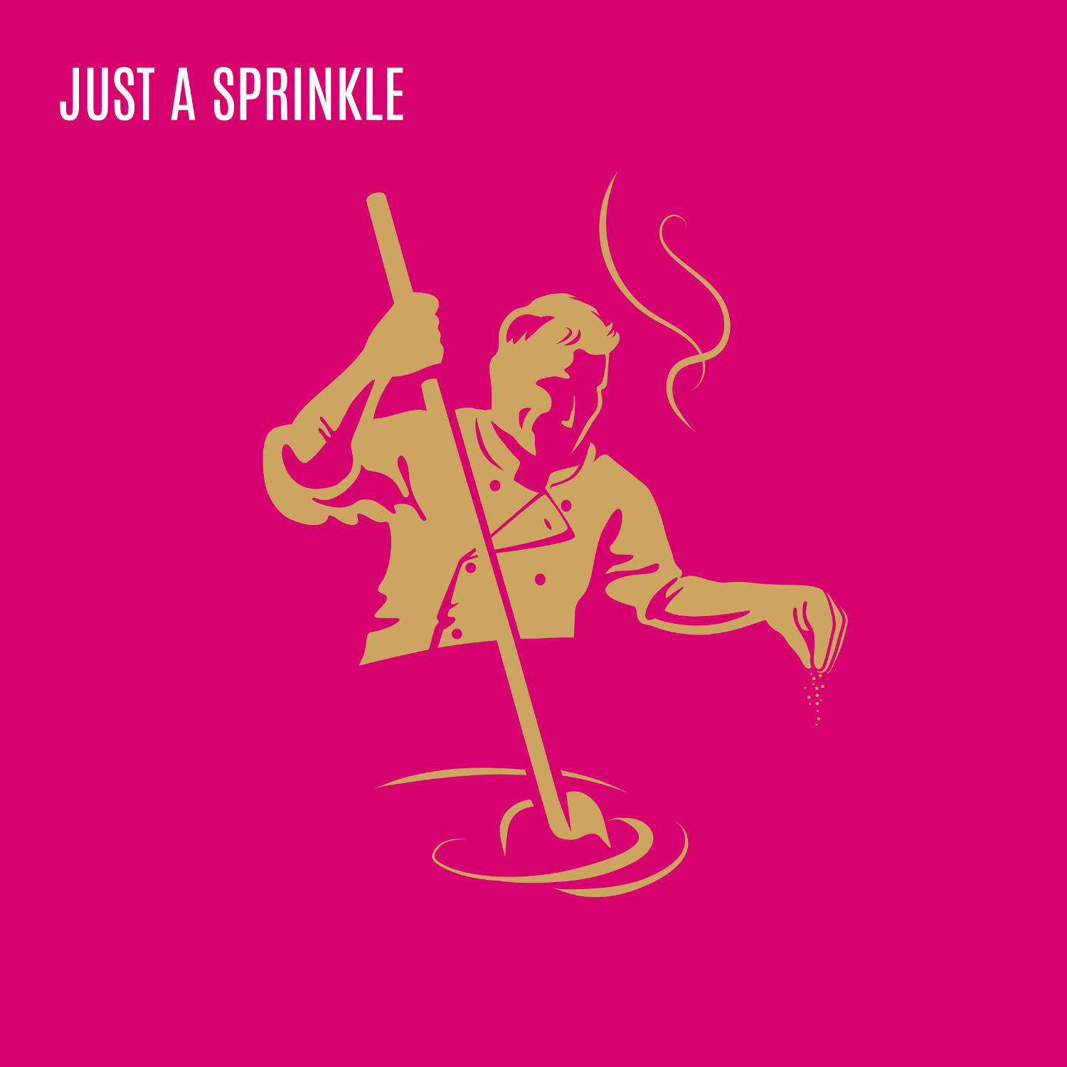
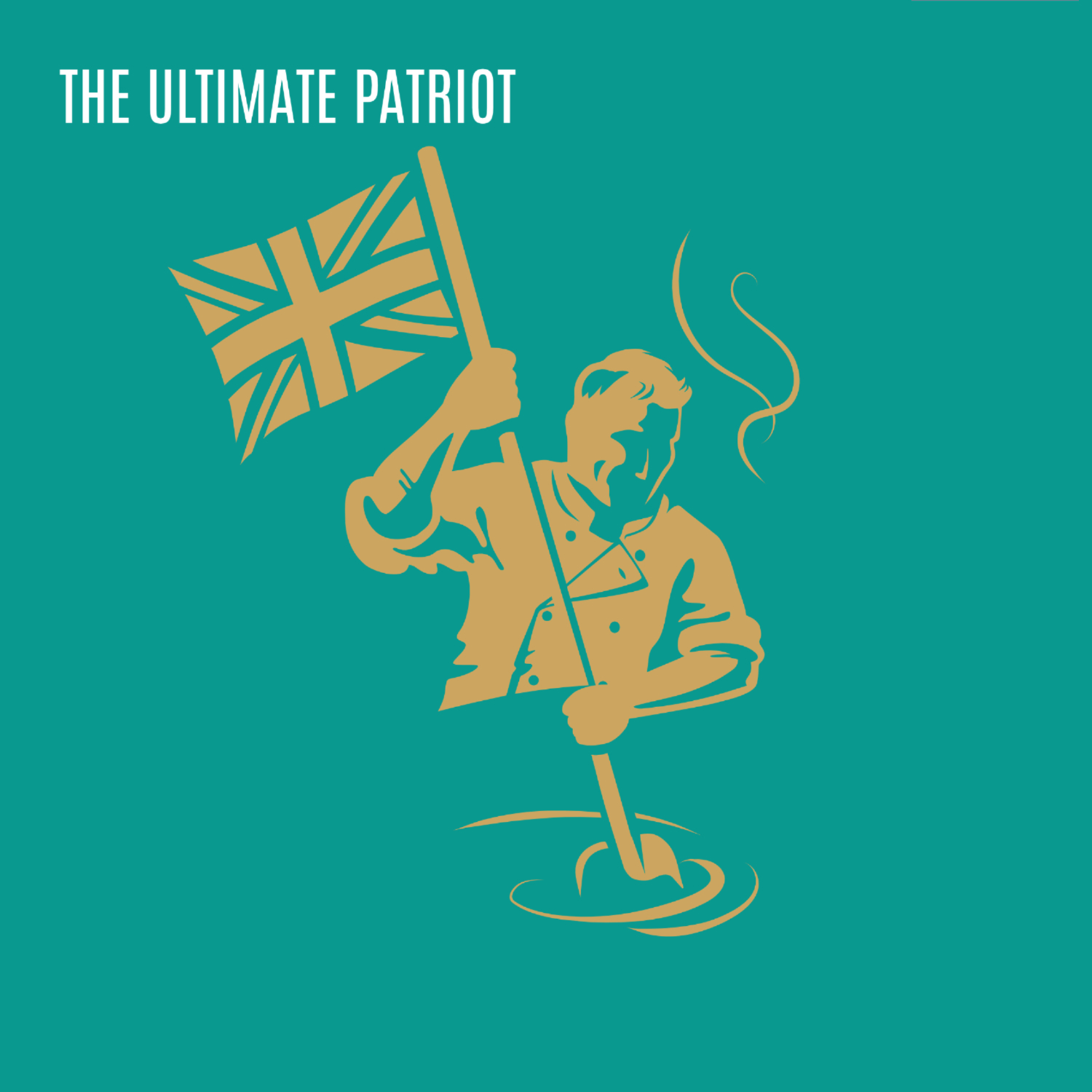
This was done by introducing softer, handcrafted typography and hidden foodie
illustrations to bring out the personality of each seasoning. The informality carries through on to
the back of the pack with a more conversational approach to Kettle's story.
The Sharp Challenge
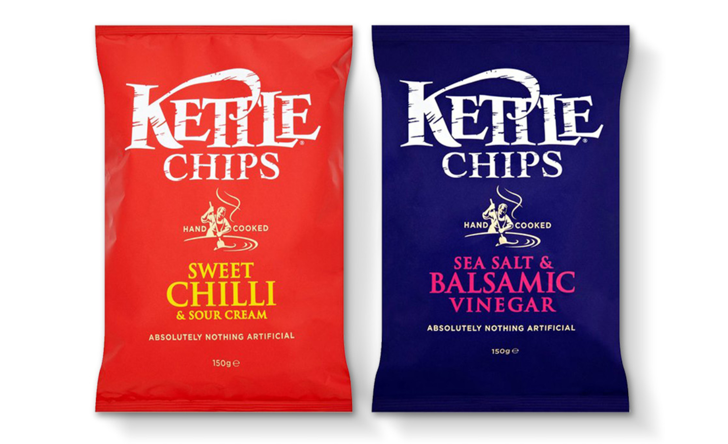
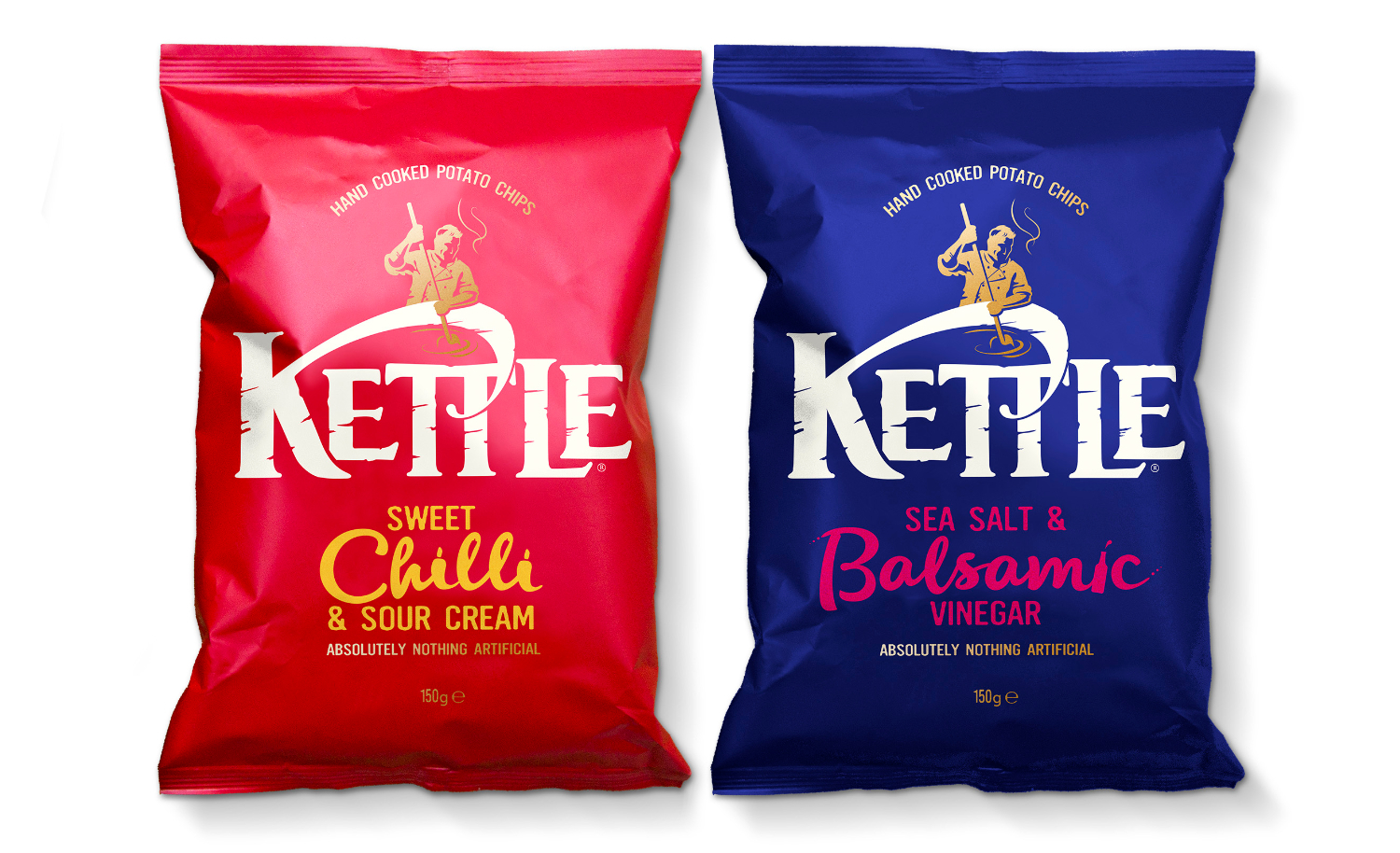
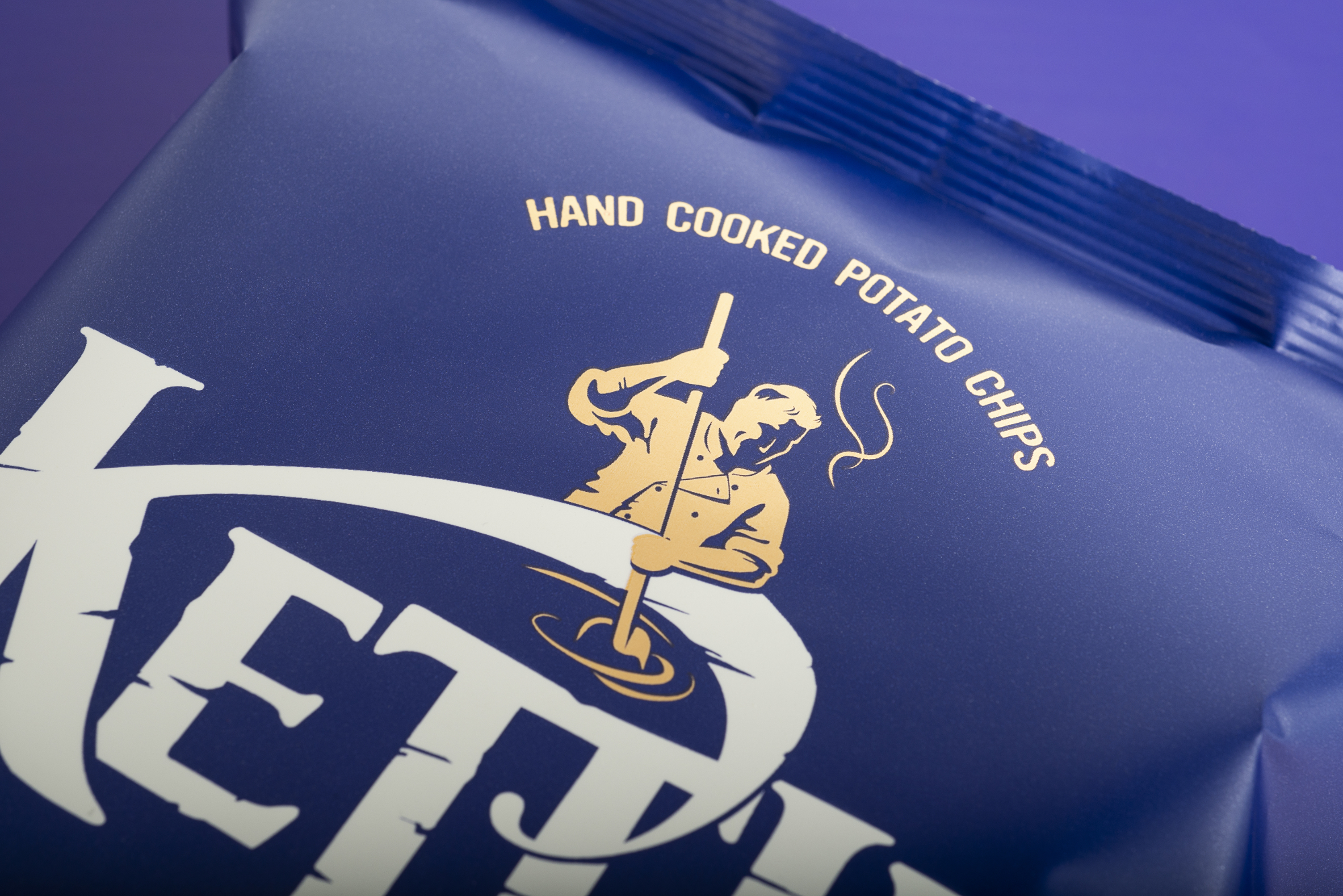
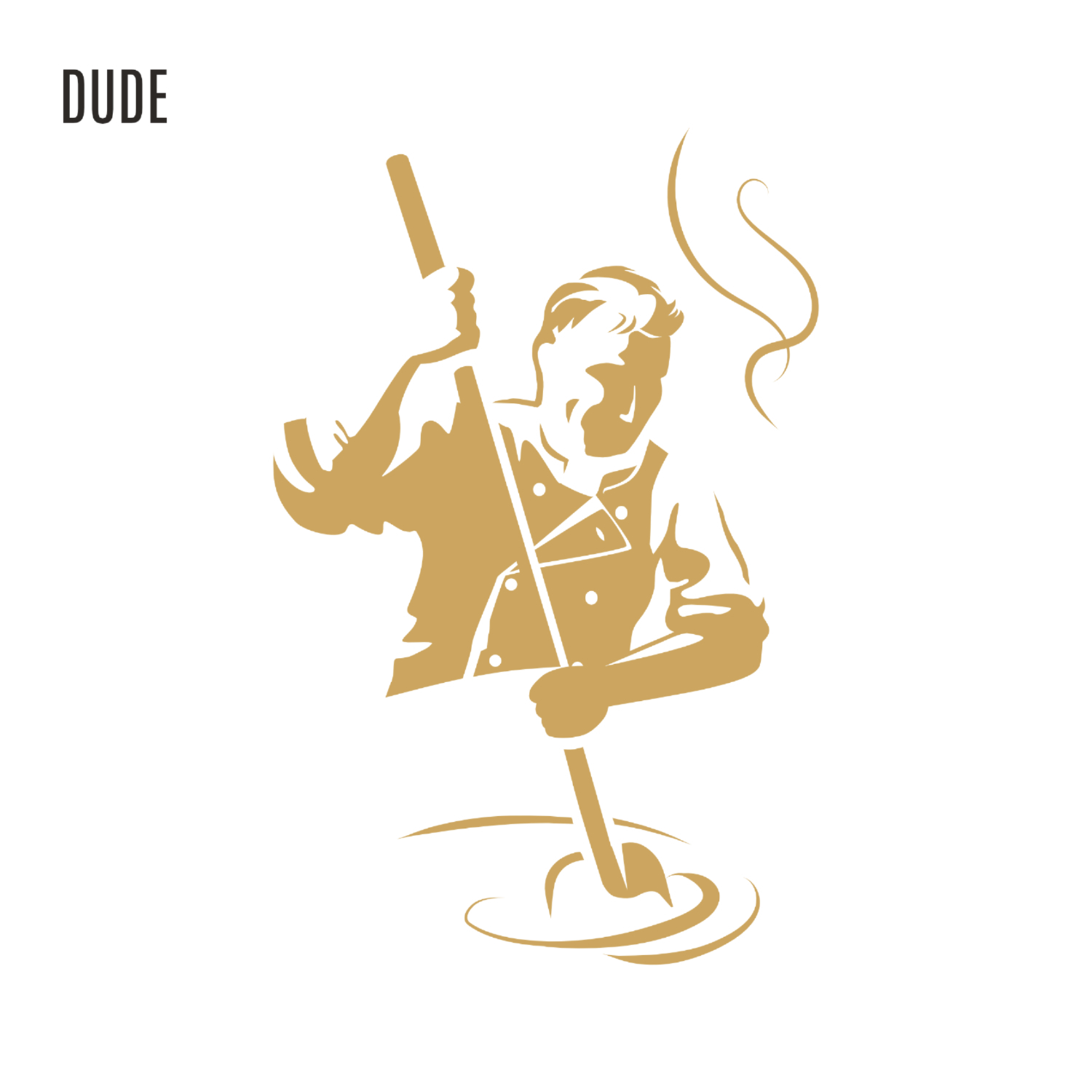
We addressed the challenge from some consumers that Kettle Chips are too hard and sharp by softening
the brand mark, reducing the sharp edges and scratchy appearance of the iconic 'woodcut'
logo.
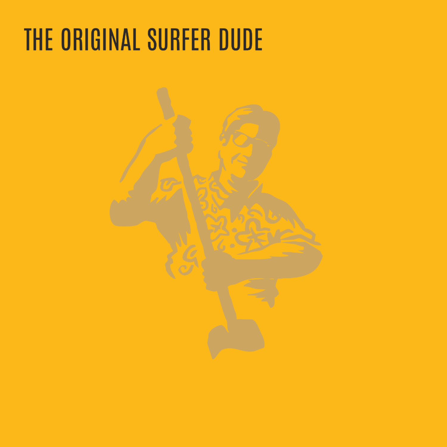
By taking the bold step to remove 'chips' as part of the brand name and elevating
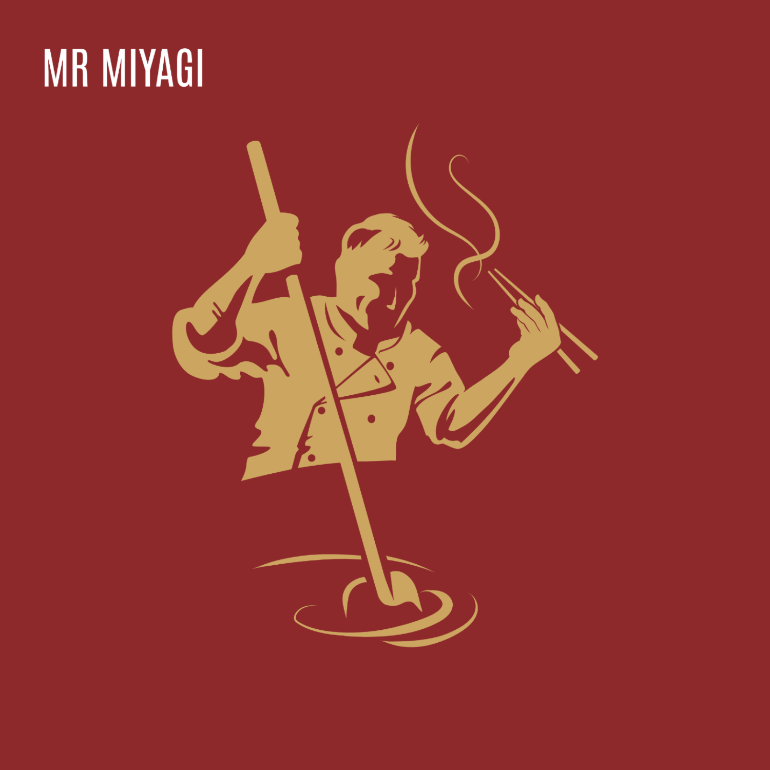
'dude' (Kettle's iconic mascot) to a more central position on top of the
logo
we were able to move the logo to the heart of the bag, improving impact on shelf.
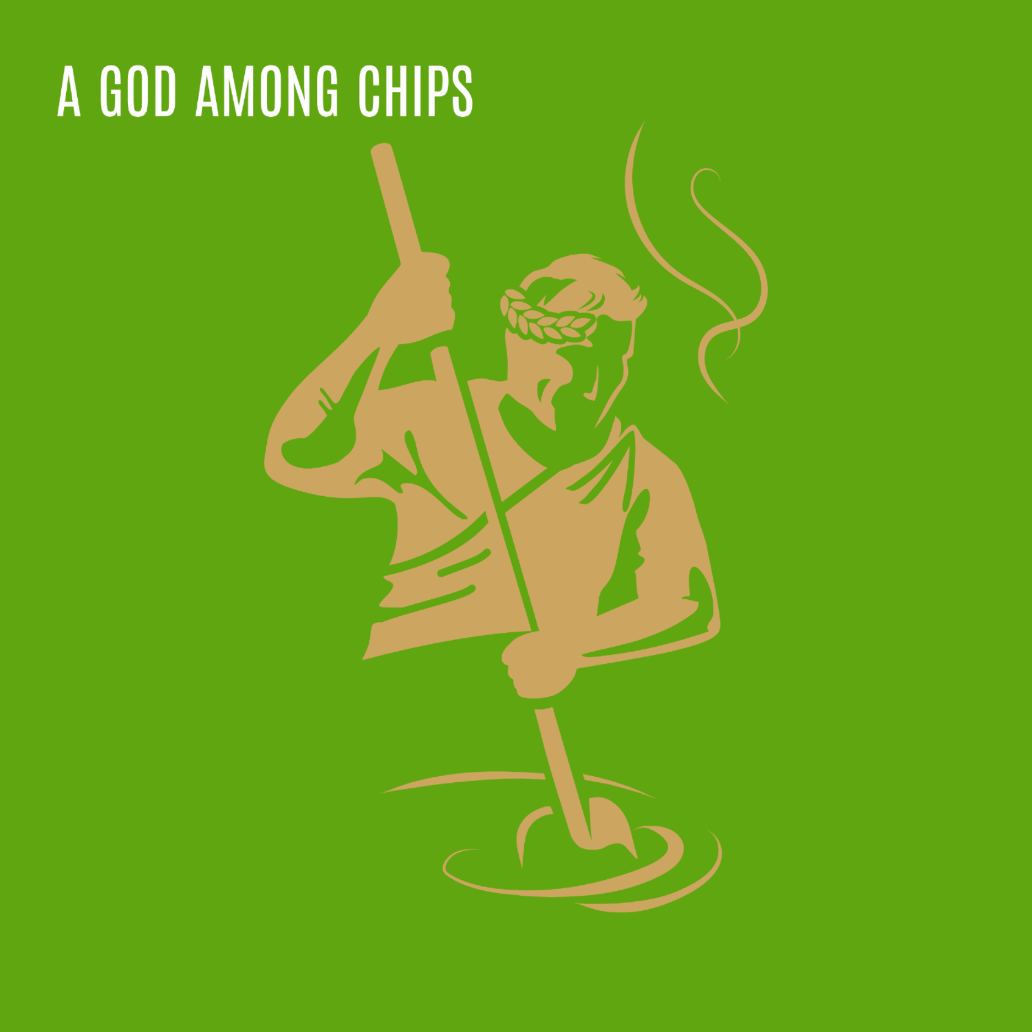
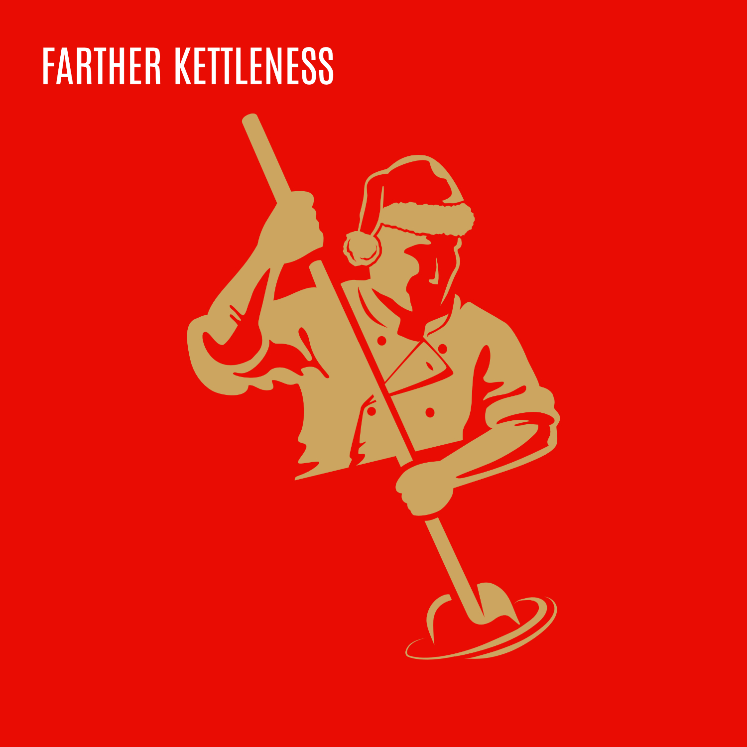
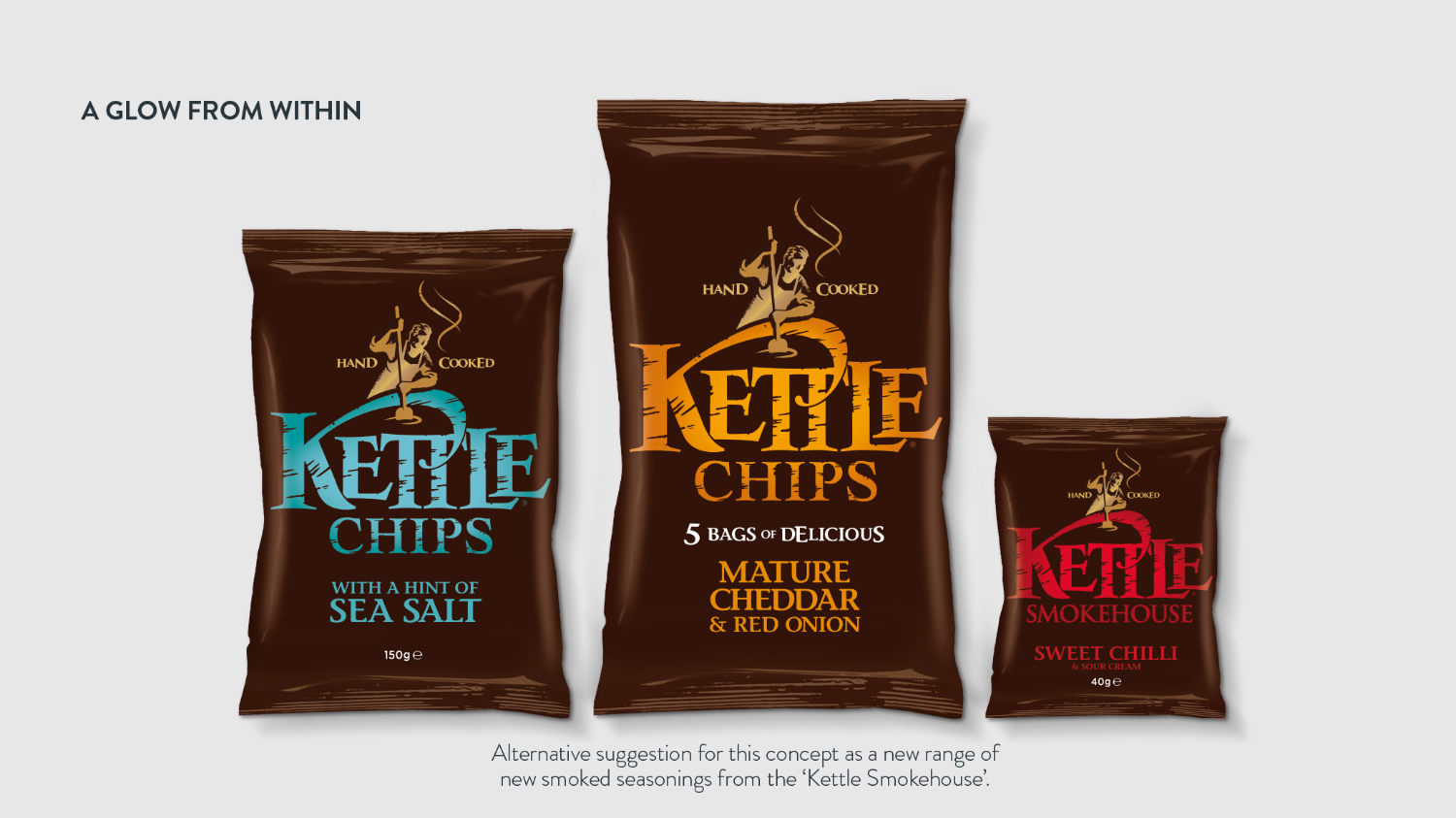
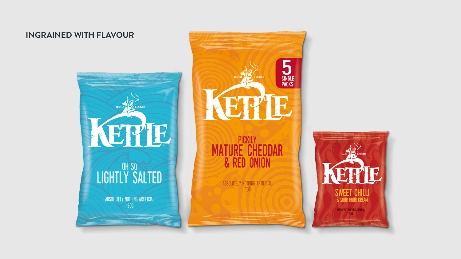
The Sketchpad
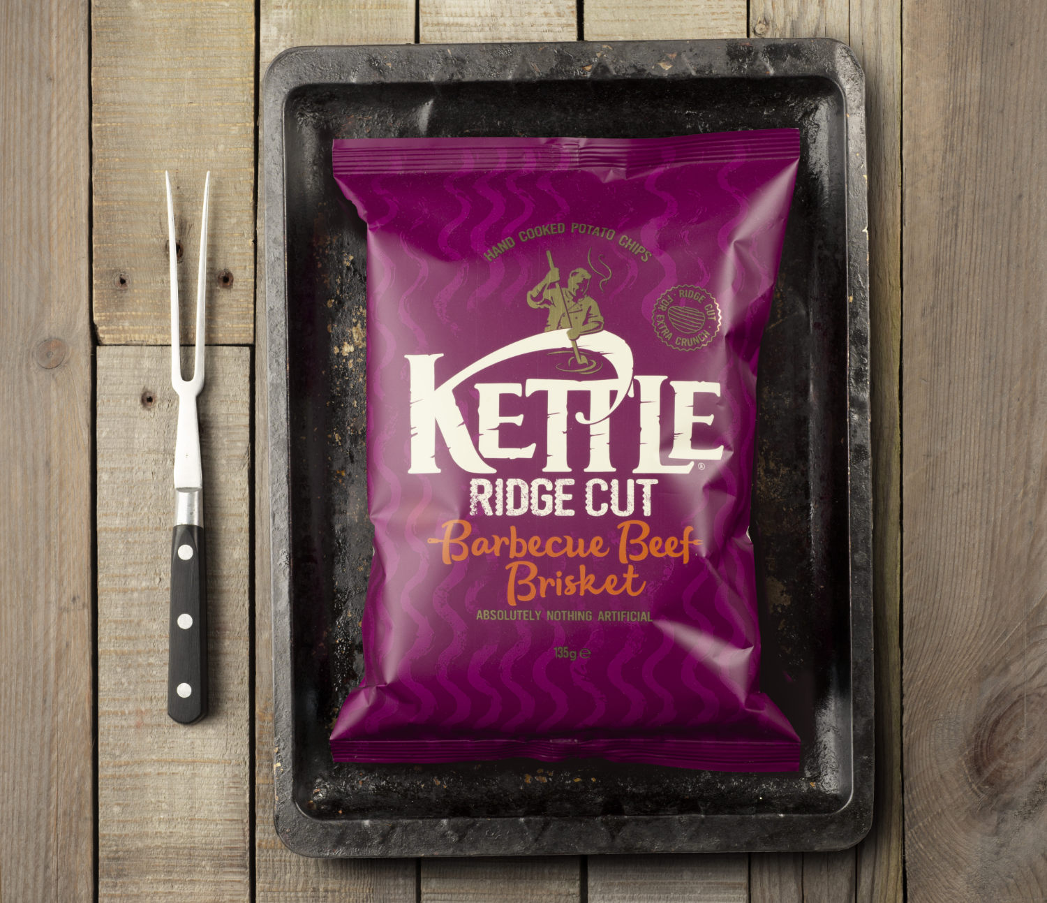
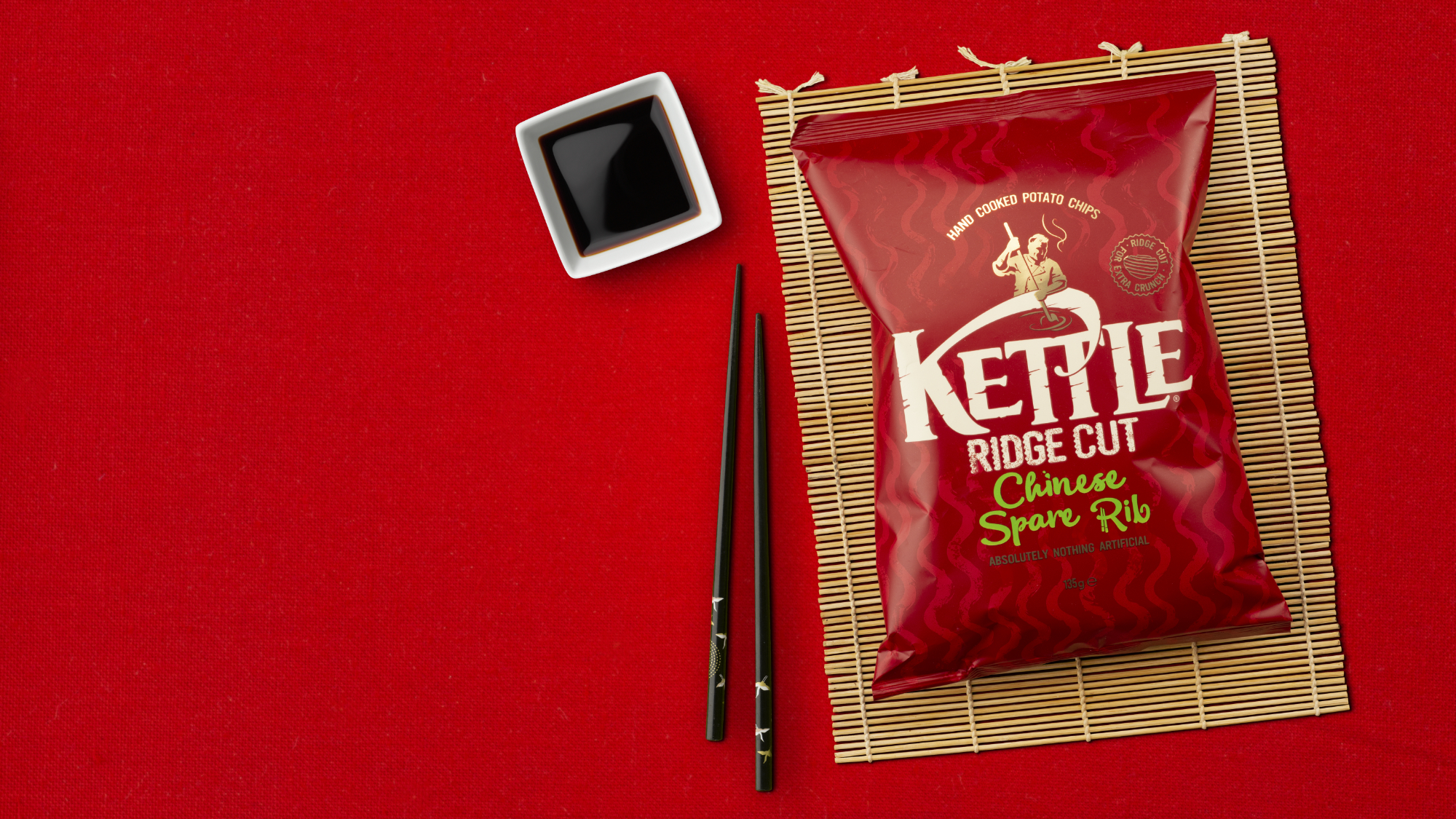
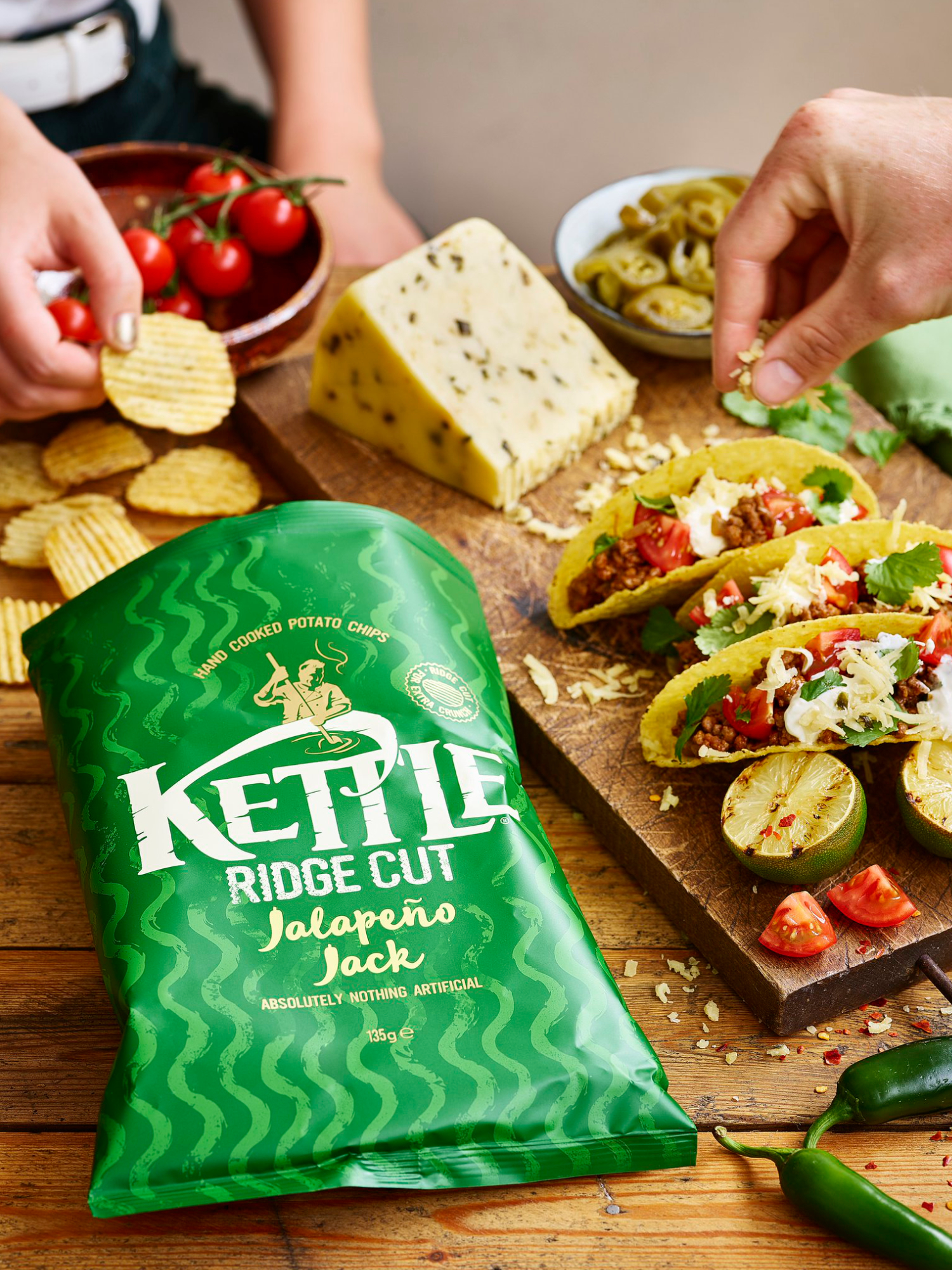
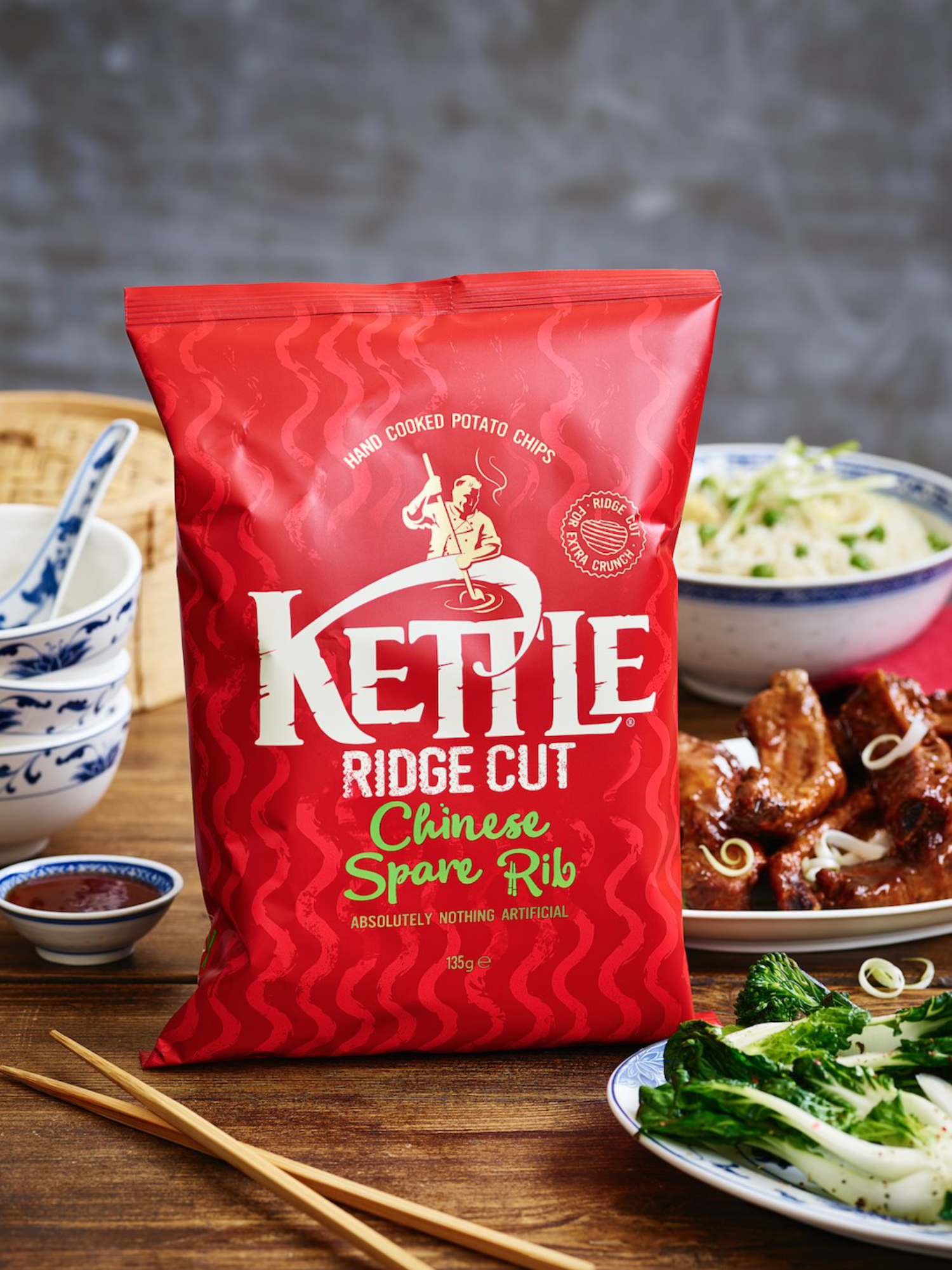
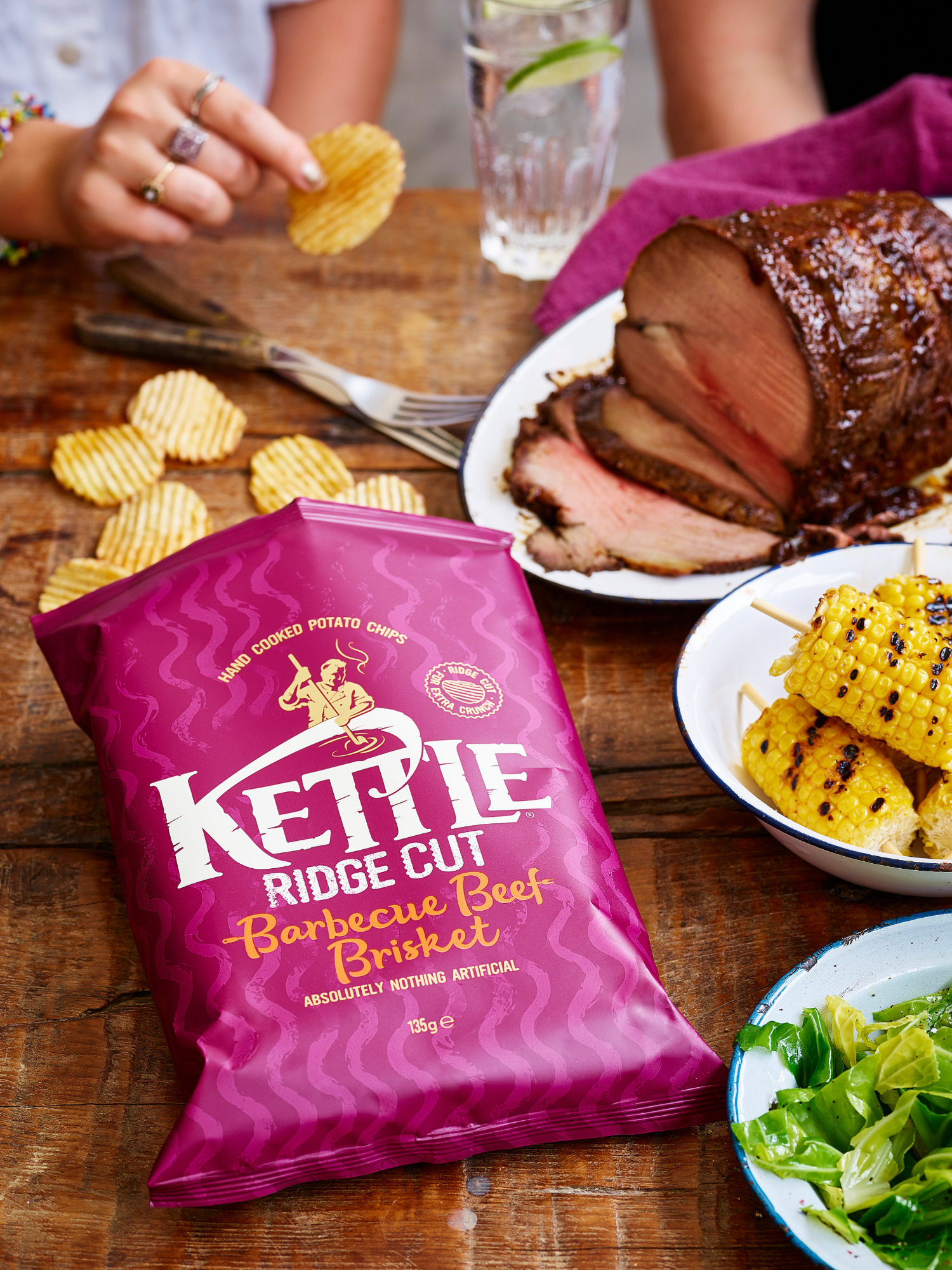
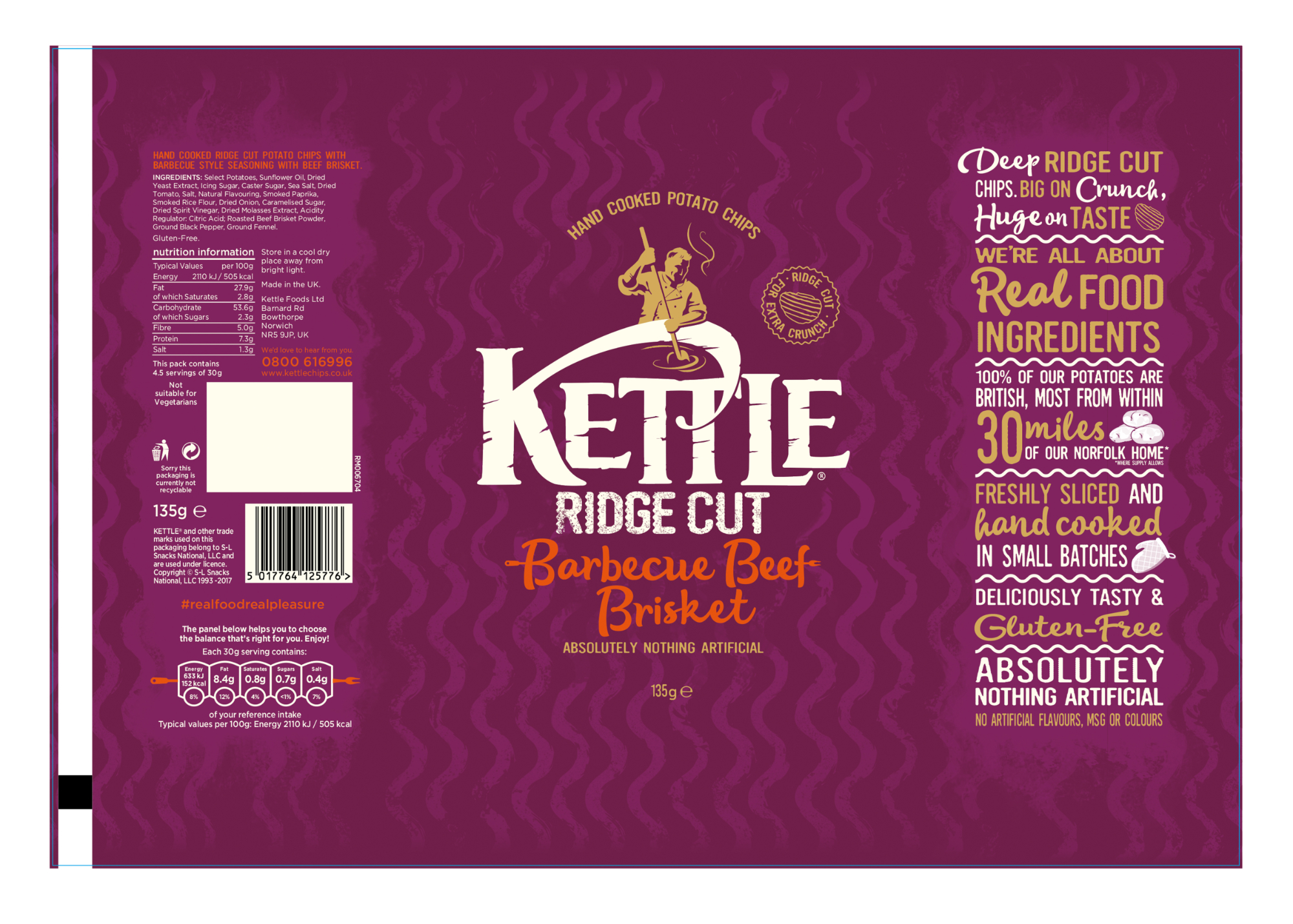
Big on Crunch Huge on Taste
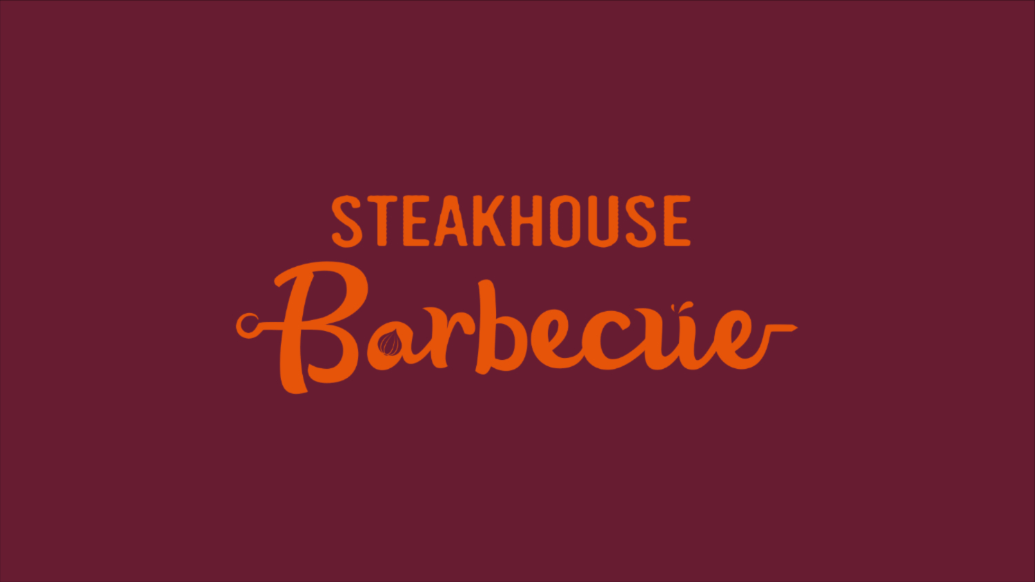
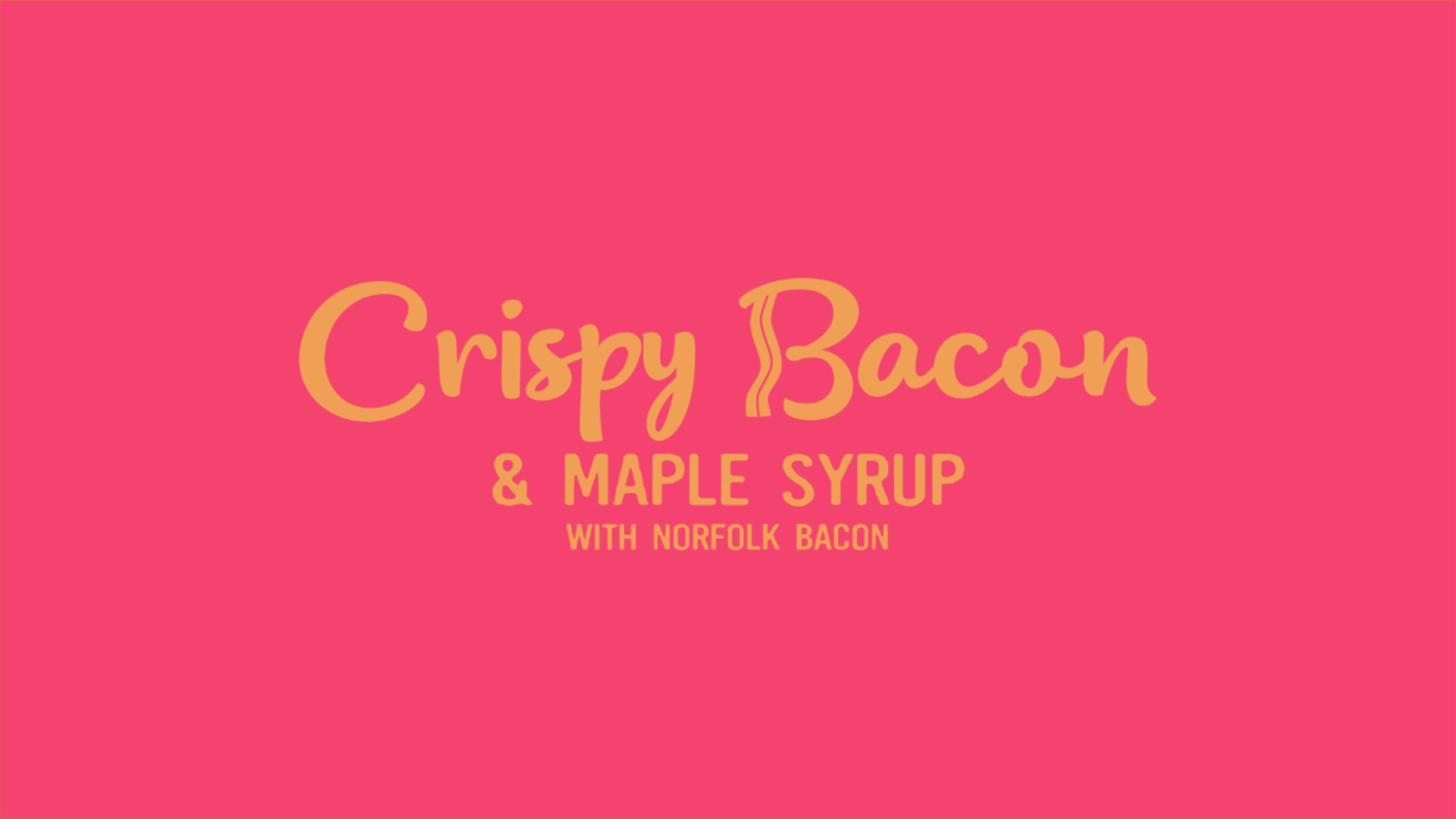
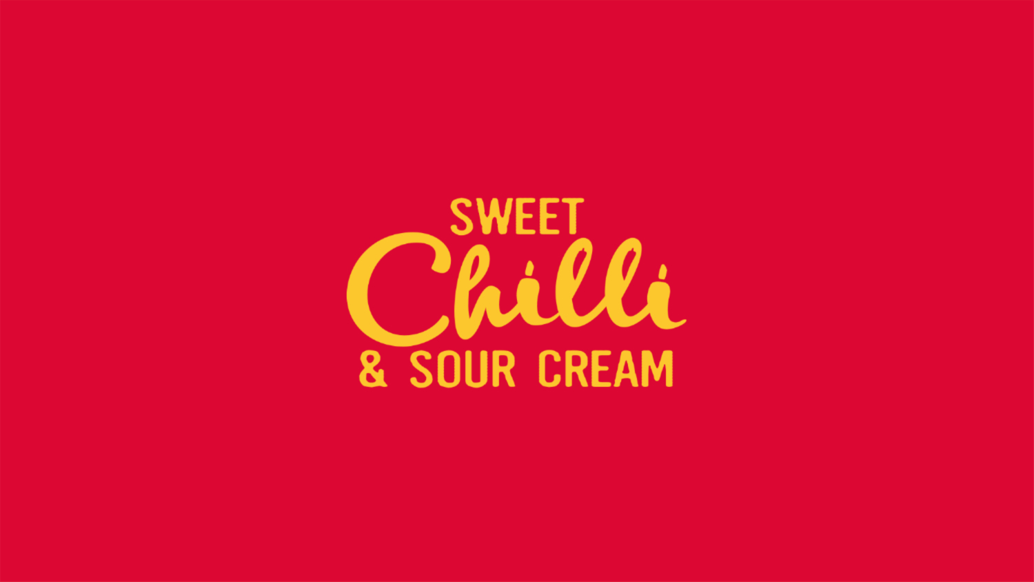
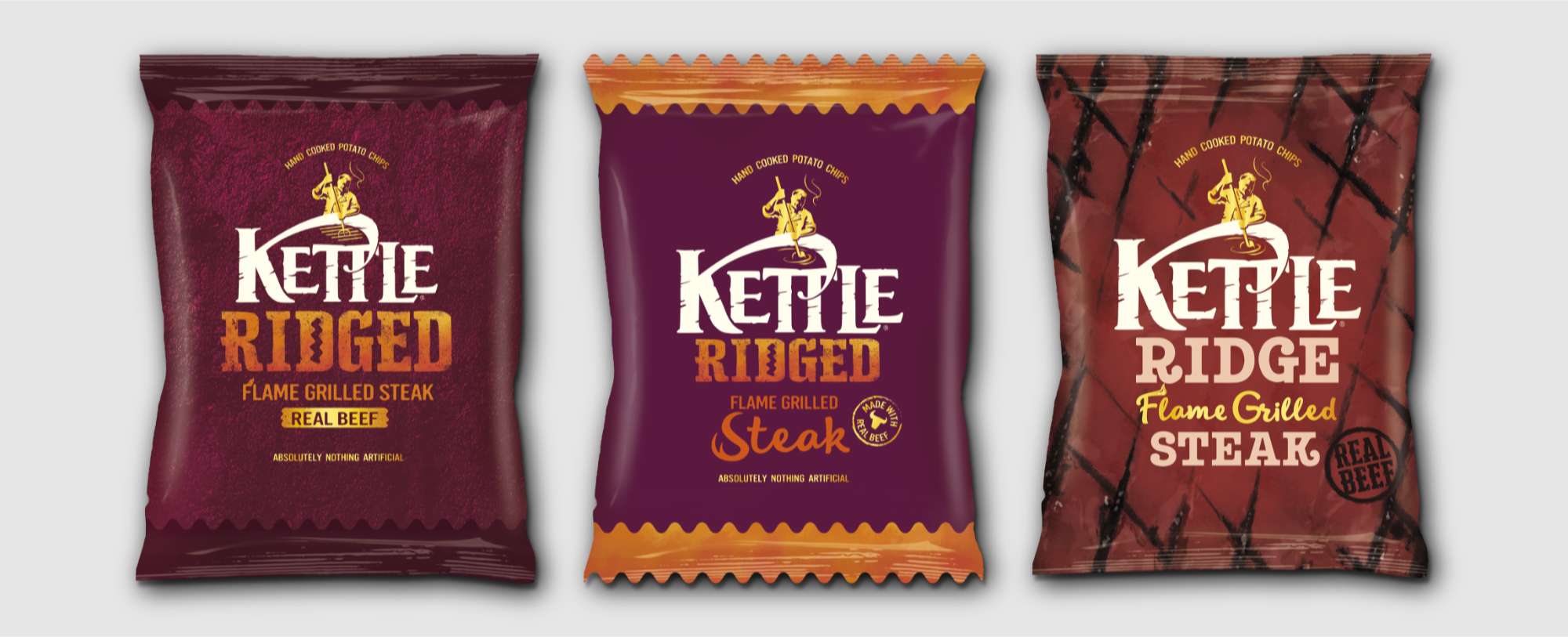
Having come and gone several times since initial launch Kettle wanted to relaunch their range of
Ridge Cut potato chips with bigger, bolder seasonings and differentiate from their core range.
Their challenge in their packaging brief was to retain all the simple 'Kettleness' of their
core range whilst clearly communicating the bold flavours and ridge cut format.
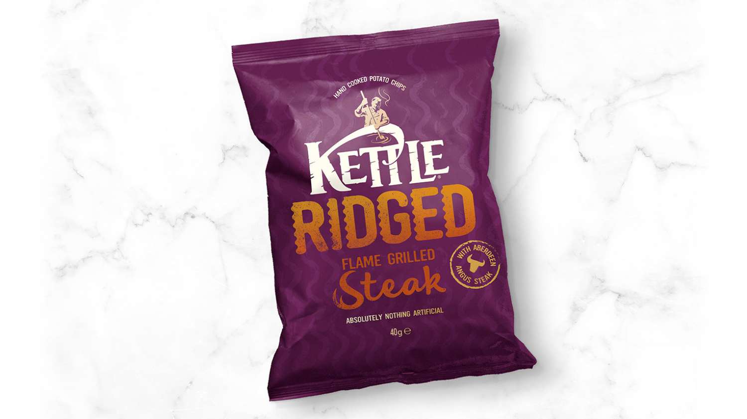
Before relaunching the new range of seasonings, an initial relaunch of a sole SKU,
Flame Grilled Steak, laid the groundwork for the new look Kettle Ridge.
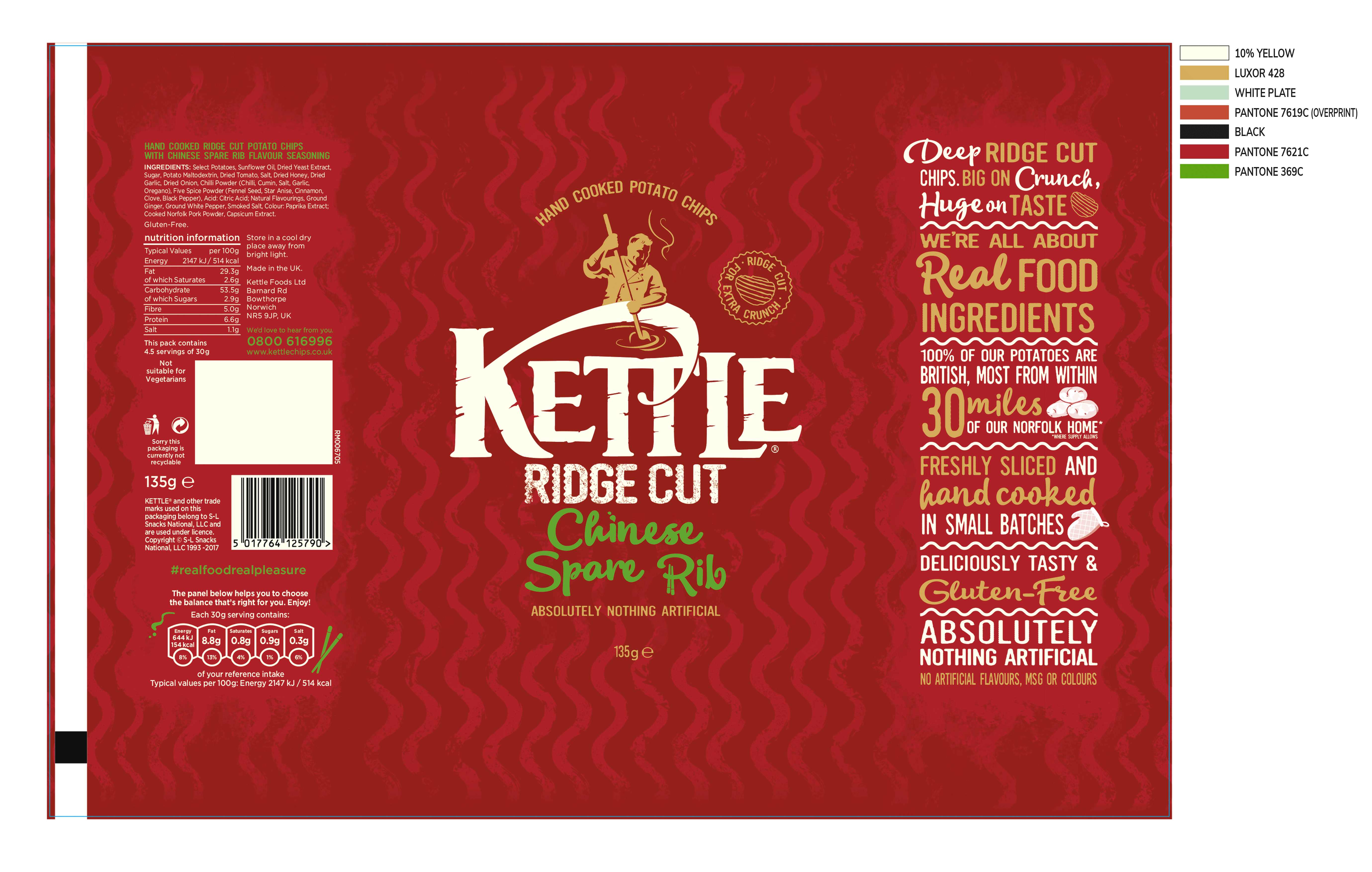
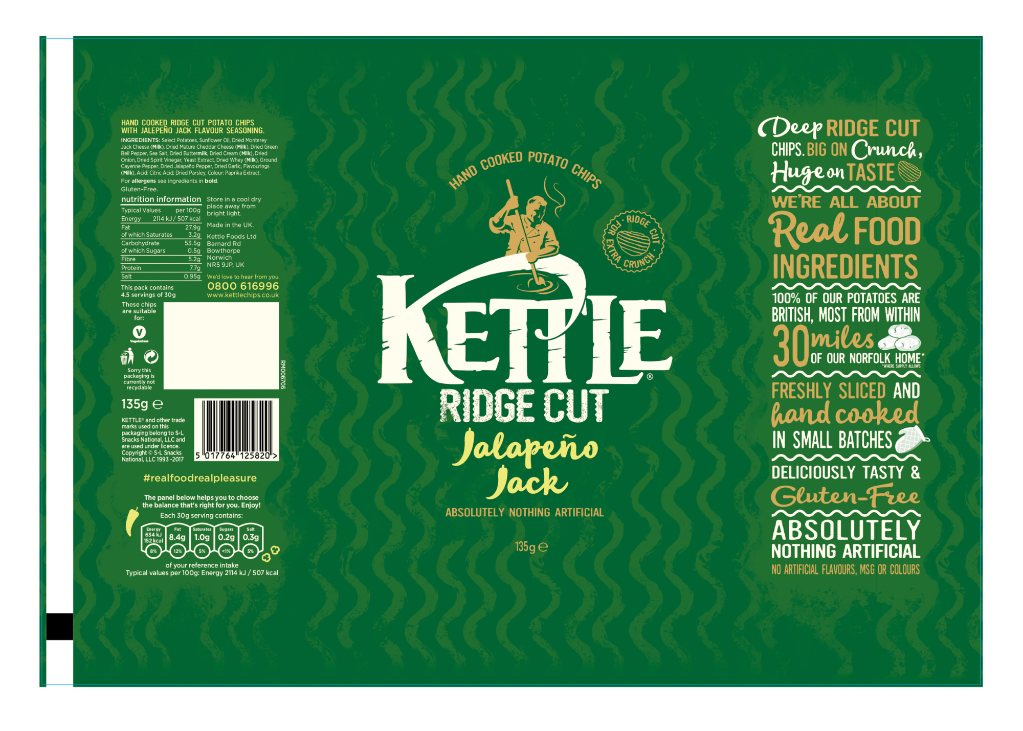
Production of final artwork, channels and separations.
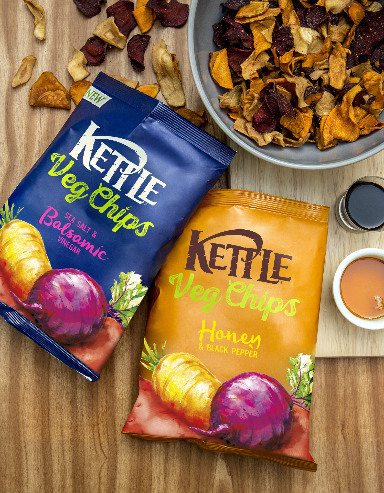
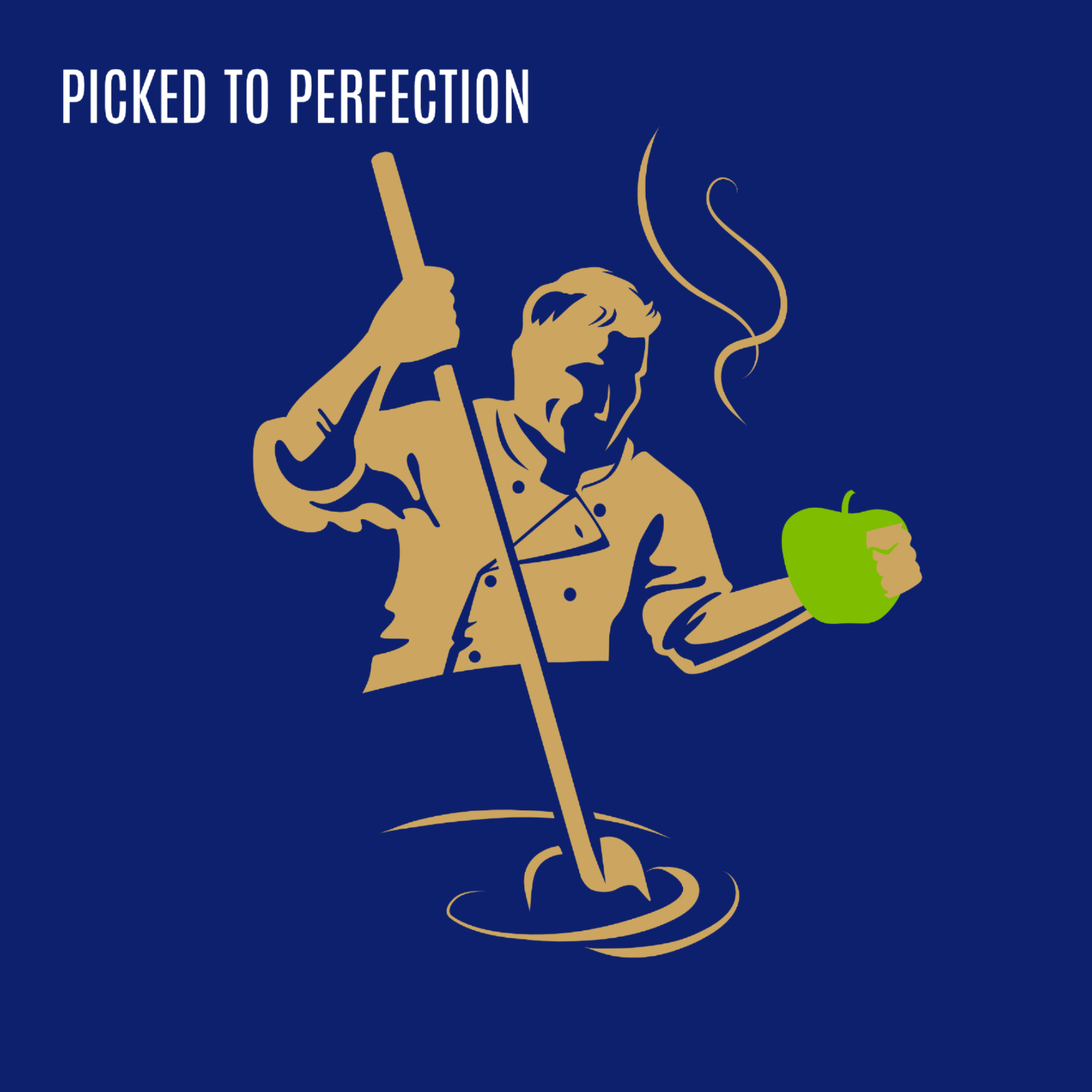
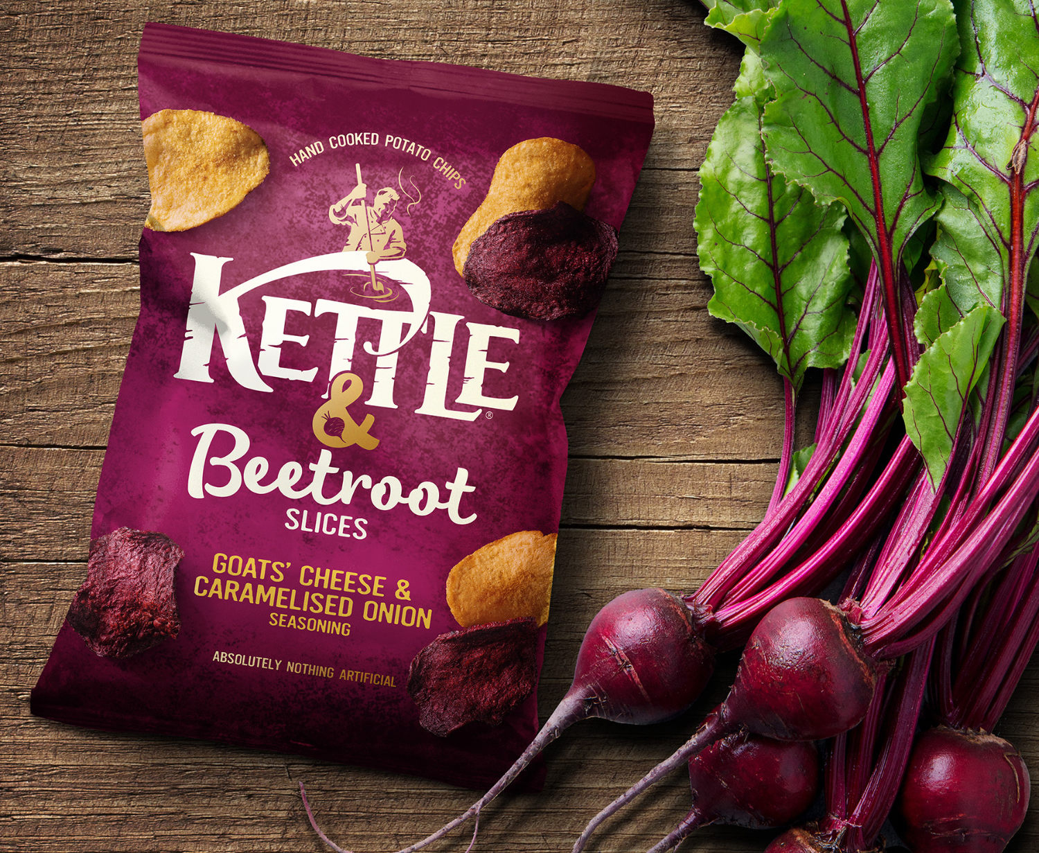
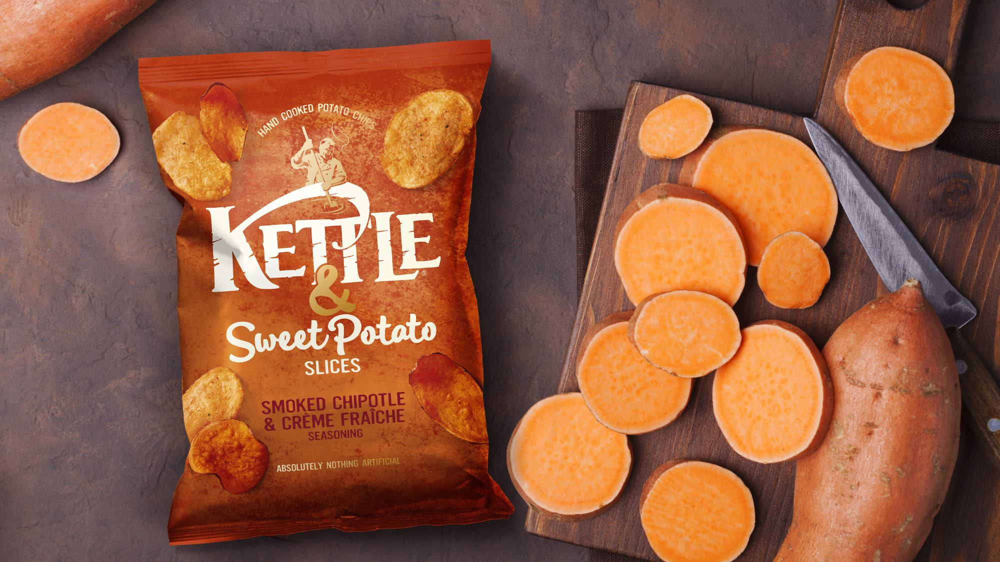
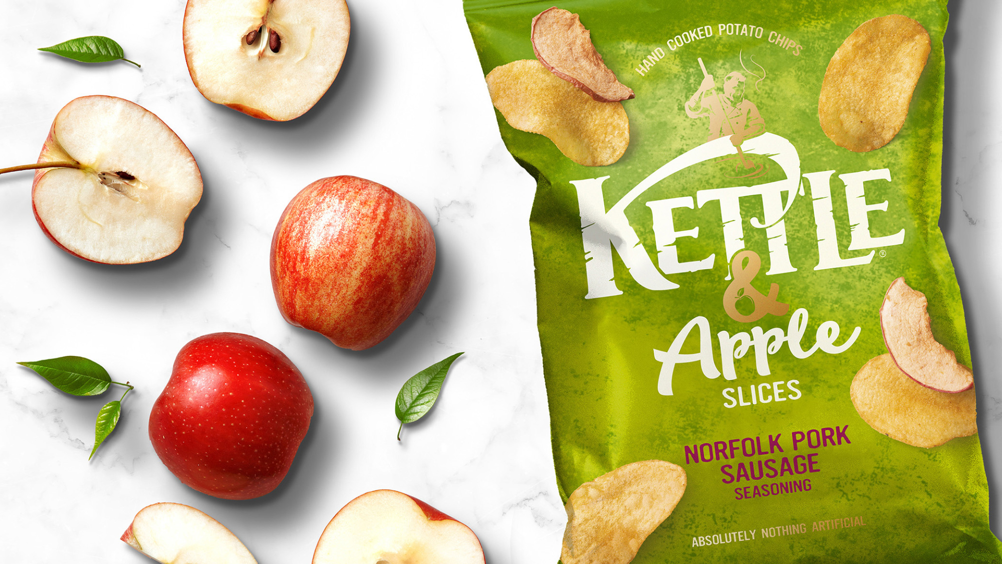
Perfectly Paired
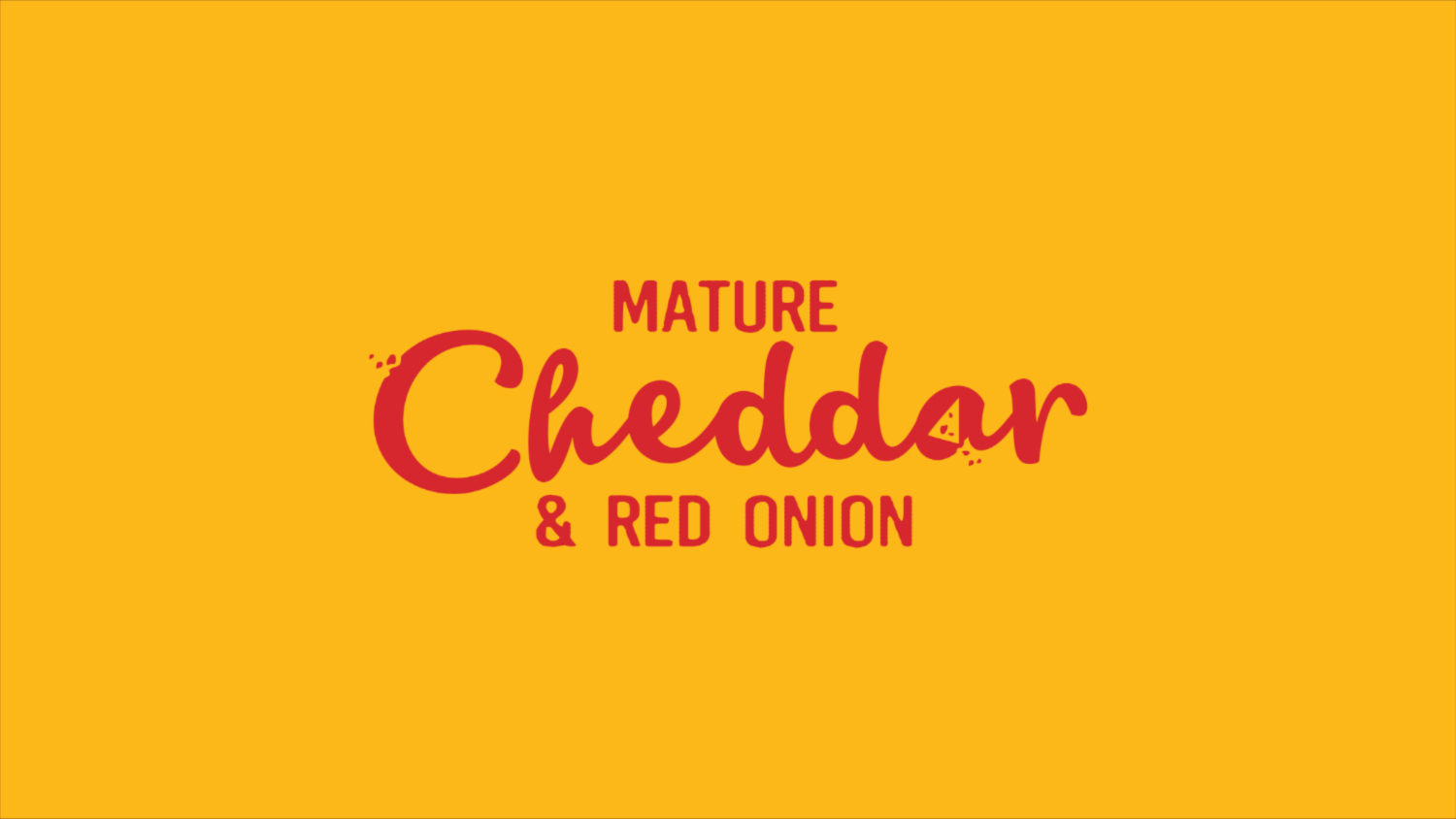
Kettle's challenge was to create a packaging identity and 'name' for a new range of
potato chips with fruit or veg 'inclusions'. As always, this would need to sit closely and
comfortably among the core range whilst clearly communicating the unique difference.
The simple approach to 'naming' came from a product truth ‐ 'your favourite
Kettle chips and more' ‐ Kettle & Beetroot, Kettle & Sweet Potato and Kettle
& Apple.
Photoshop
Illustrator
InDesign
Art Direction
Branding
Packaging
Typography
Digital Illustration
Retouching
Graphic Design
Iconography
My Role: Designer, Artworker, Design Director & Account Director. Team Credits: Springetts Brand Design Consultants: Paul Williams ‐ Creative
Director. Mark Richards ‐ Designer.
Sophhie Burt ‐ Designer. Emily Wallis ‐ Senior Designer. Max Ostler ‐ Designer Partners: Photographers: Howard Shooter and Ian O'Leary.