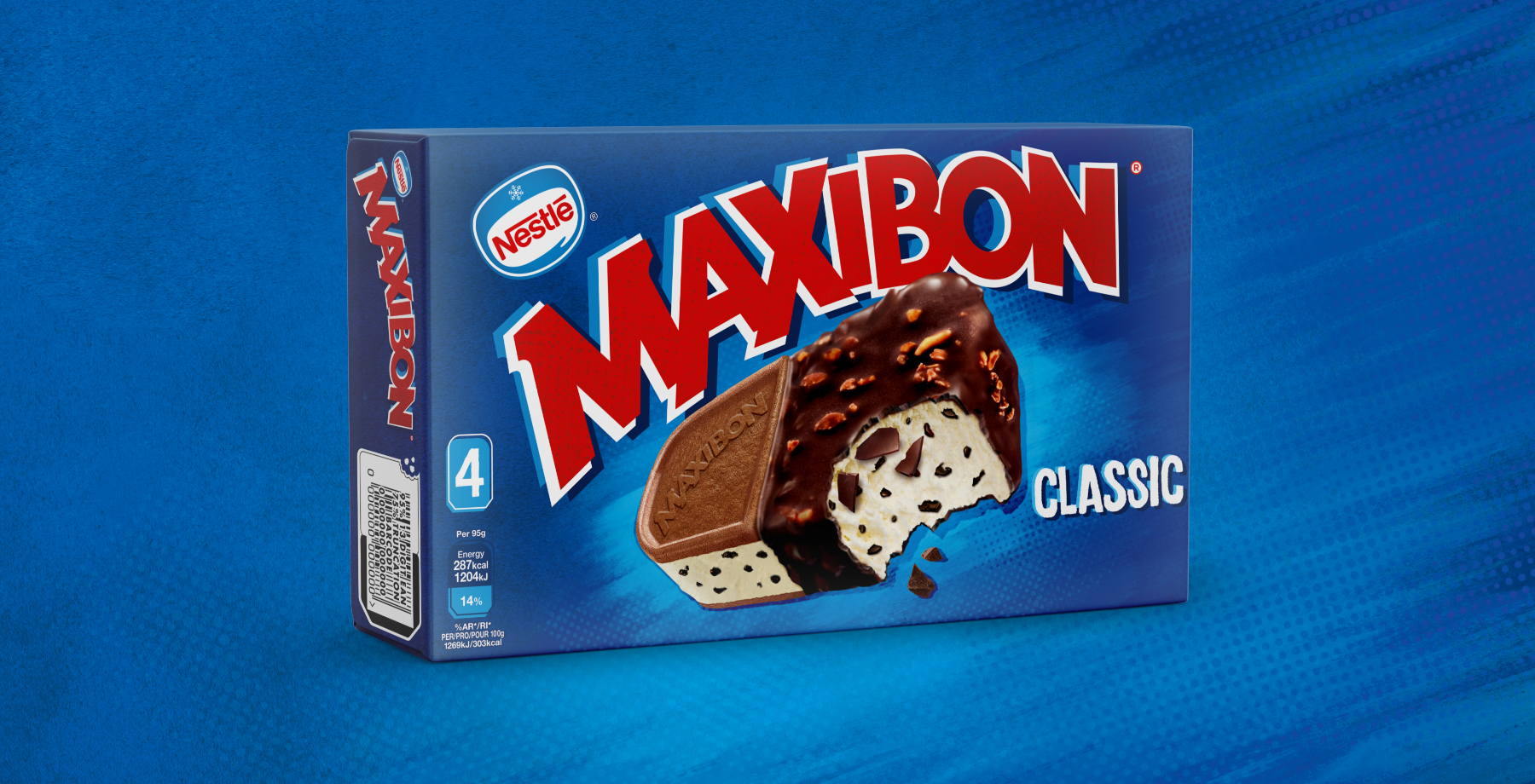
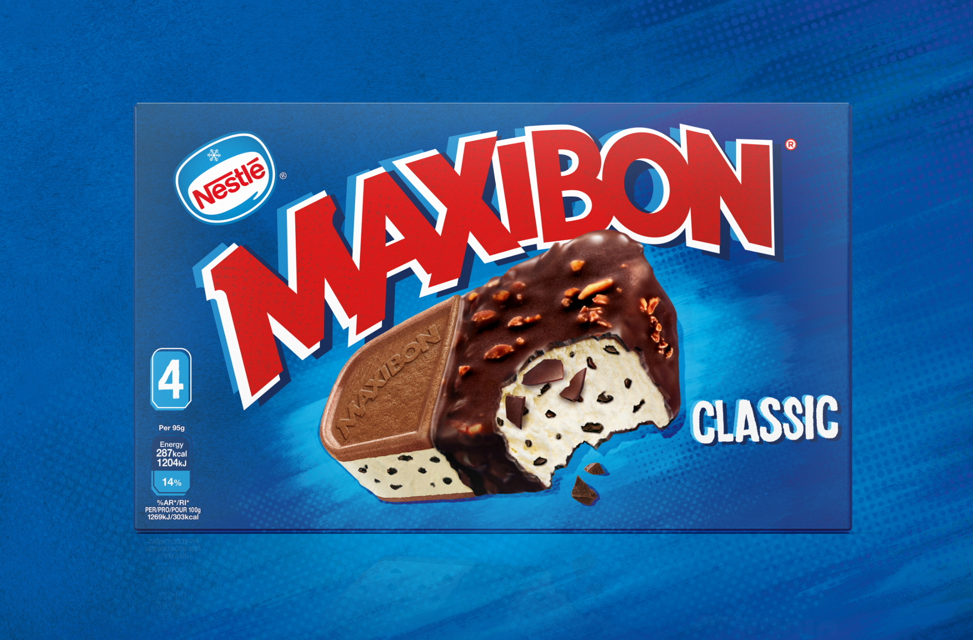
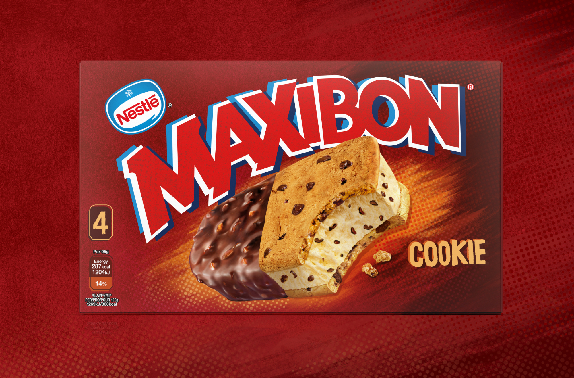
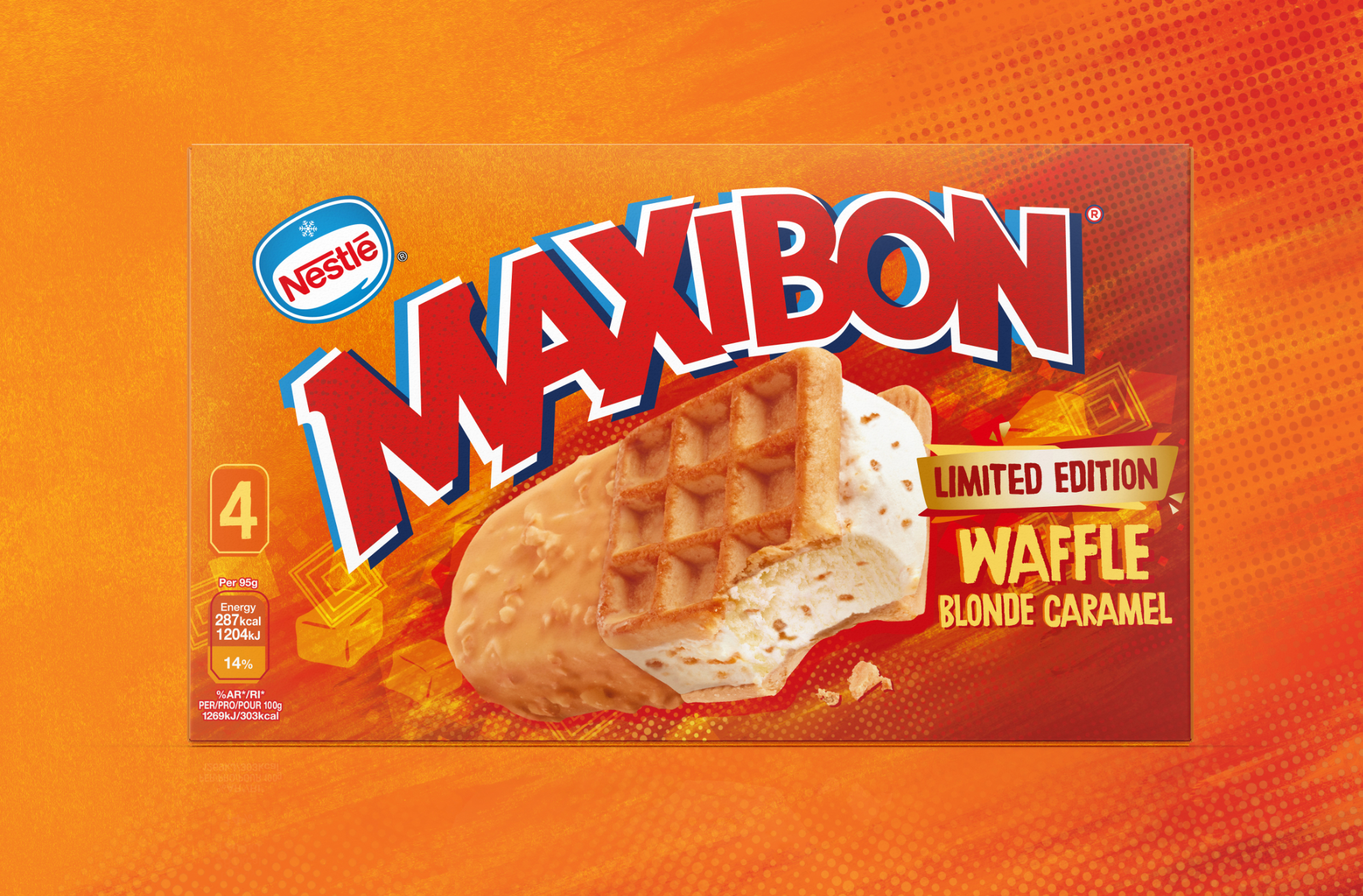
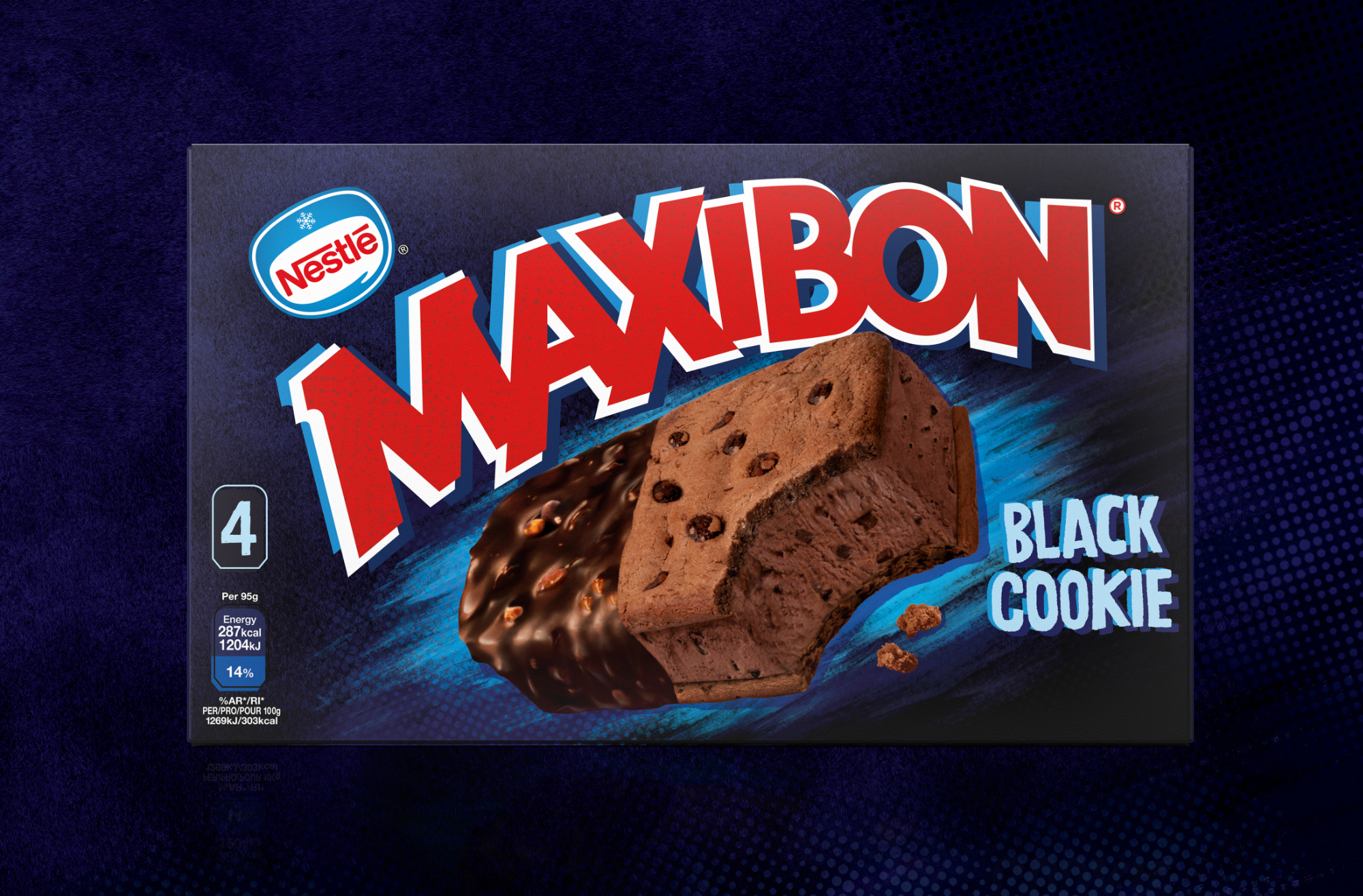
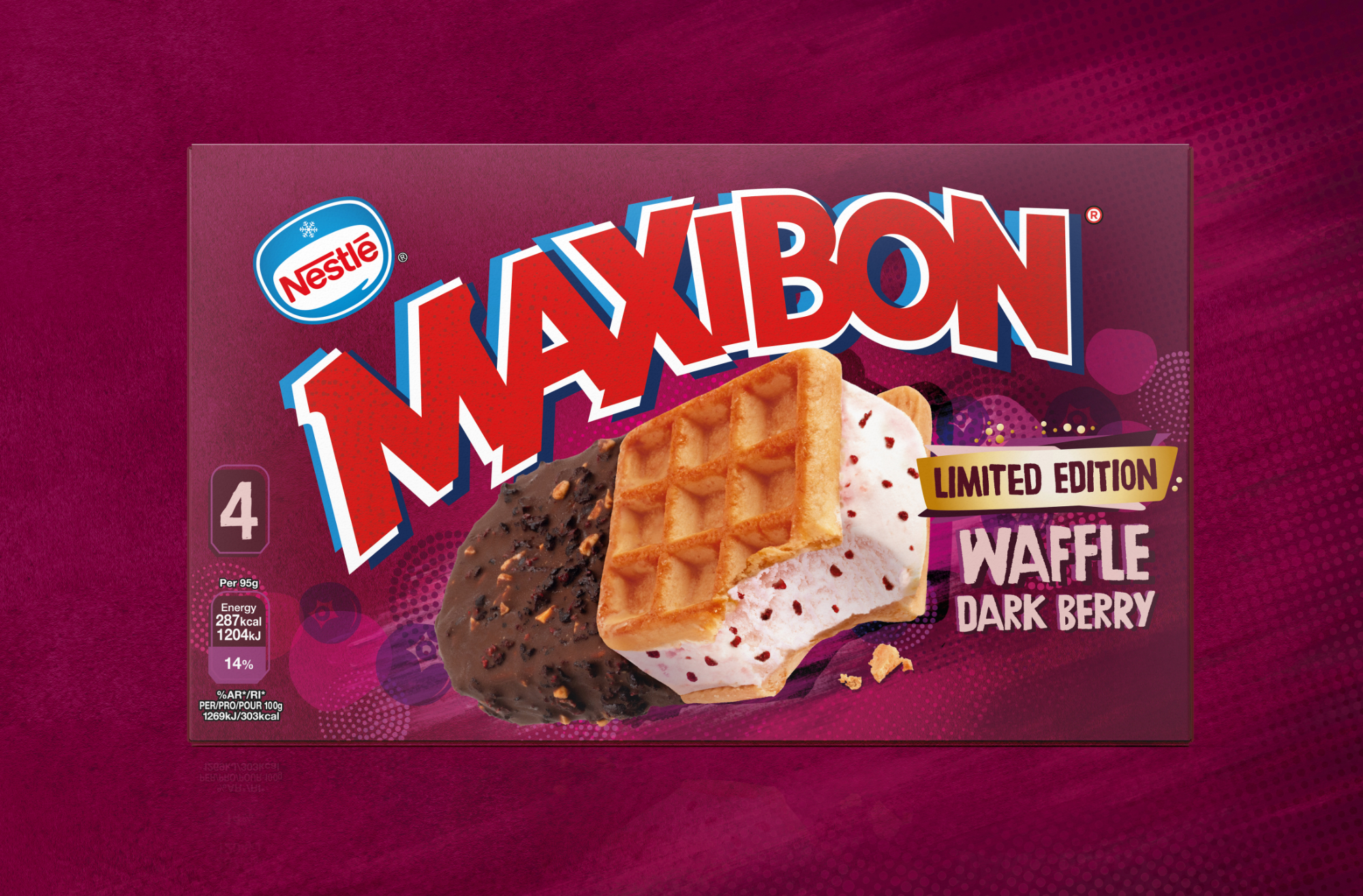
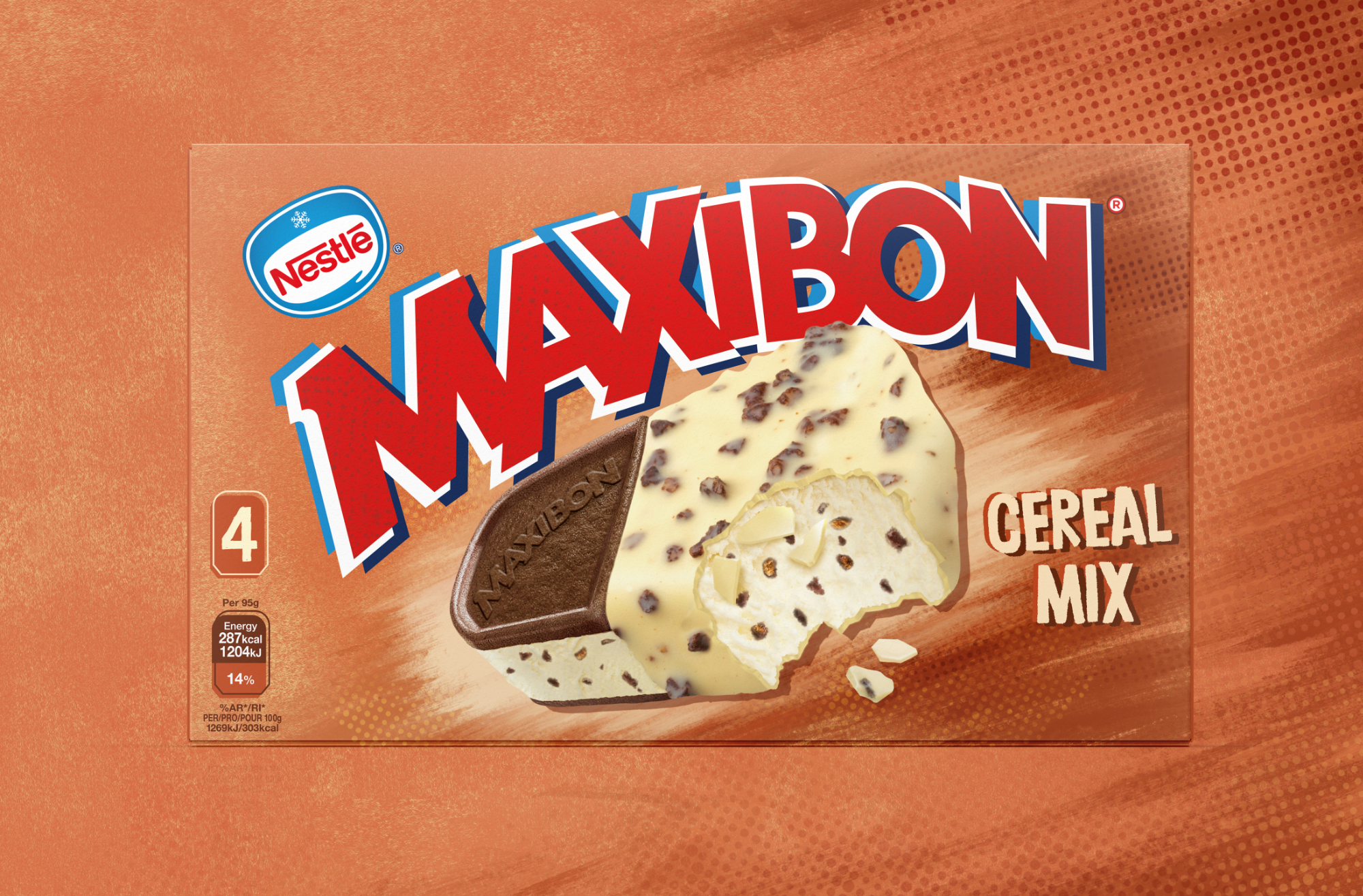
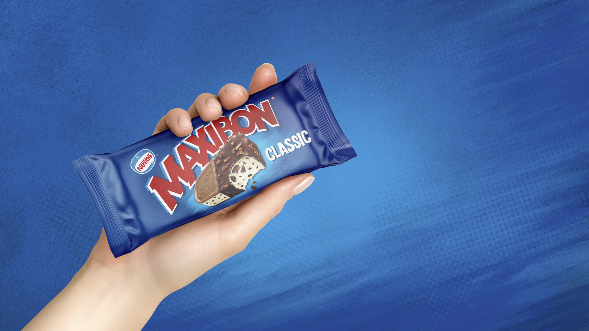
Red Tractor Header

MAXIBON

Simplify to Amplify

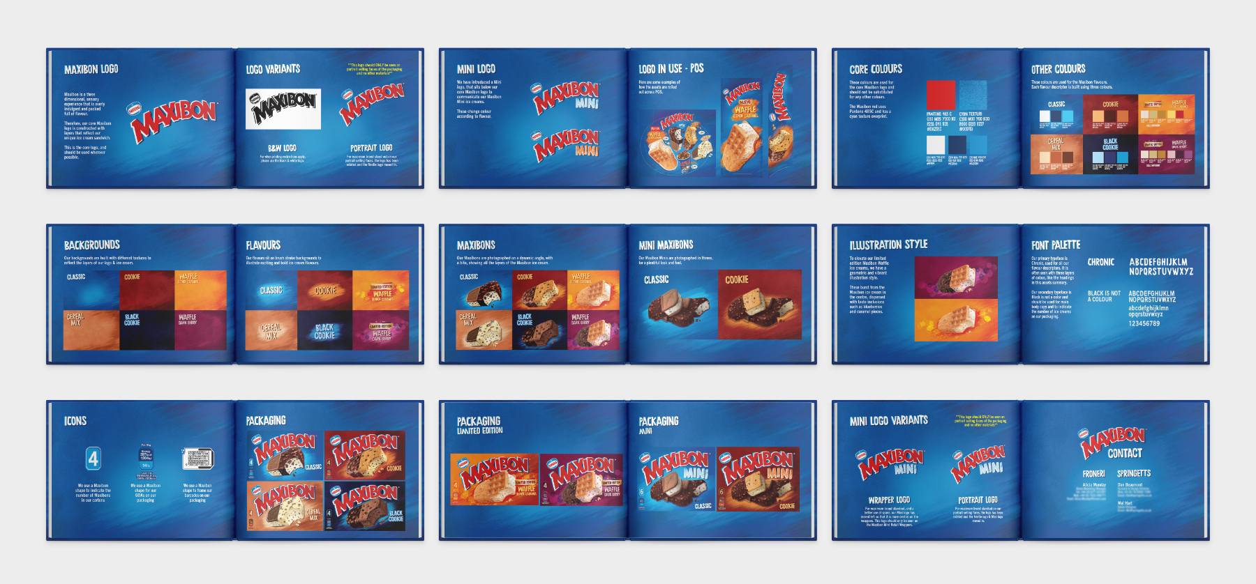
Froneri asked us to adopt the Australian approach to flavour navigation & personality for Maxibon, harmonising the brand at a global level and to simplify the branding and give the packaging a fresher, more youthful, and relevant look for today's audience.

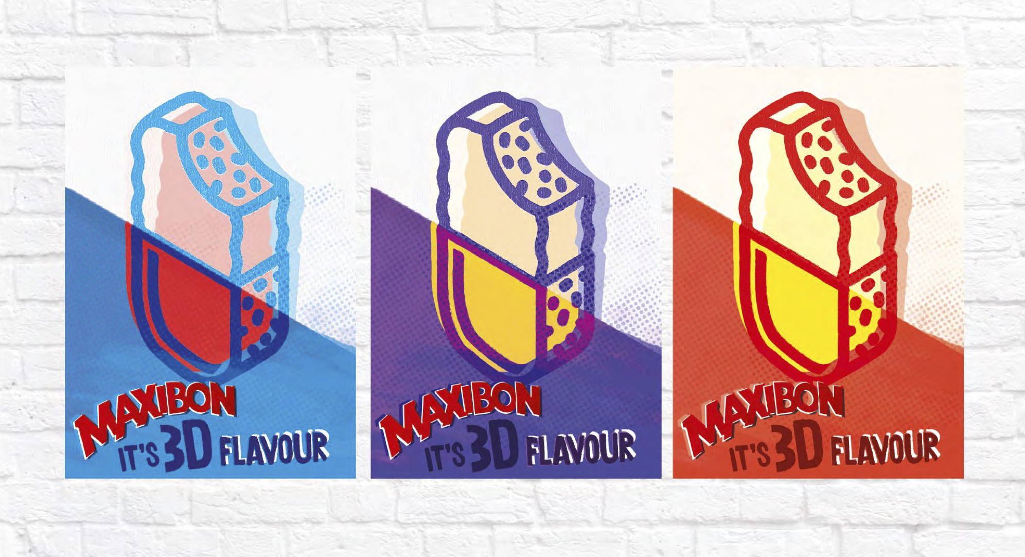
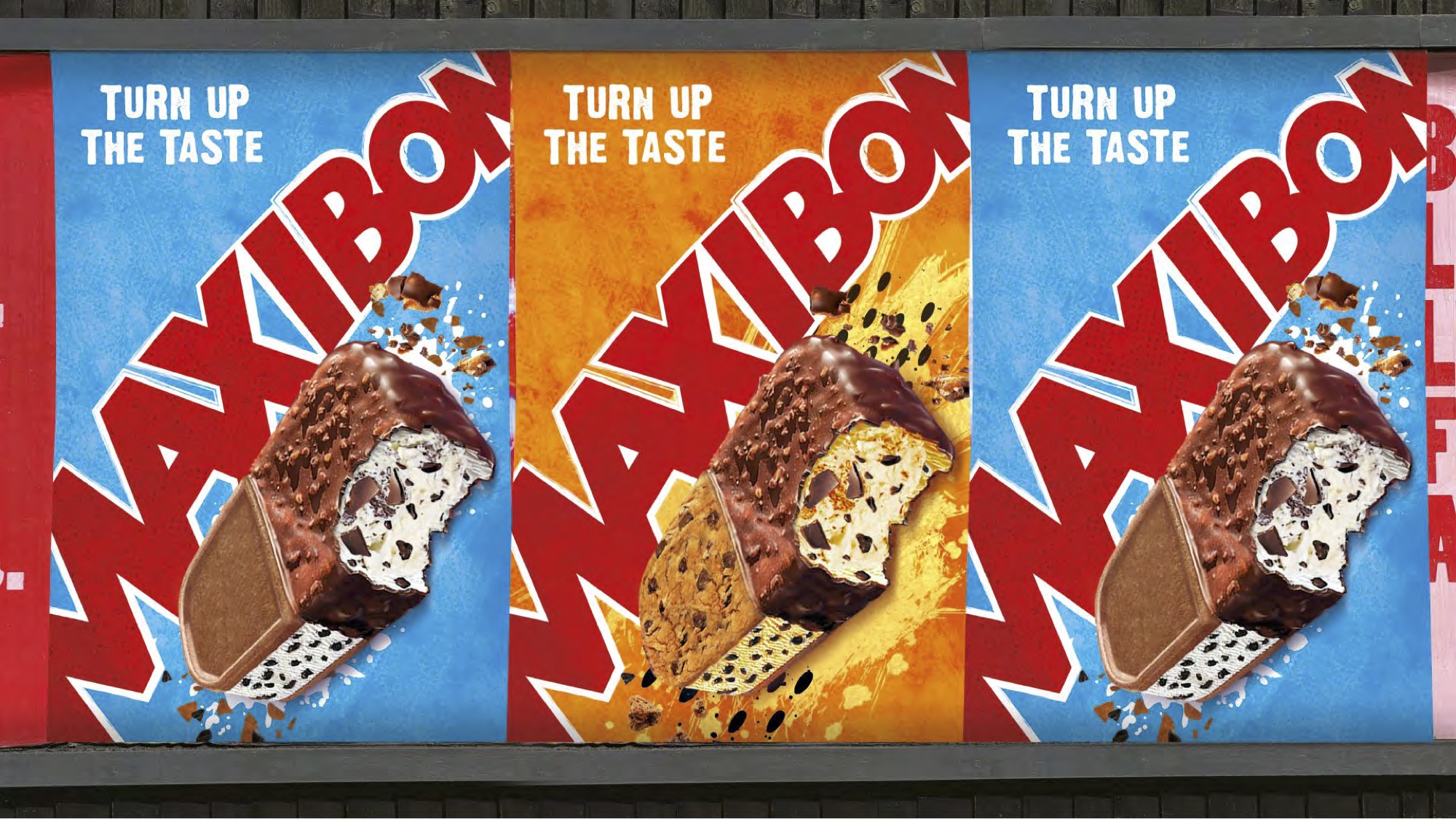
So, "Why Maxibon?". Maxibon is Unique, two experiences in one, more satisfying and exciting.

Maxibon logo before Maxibon Logo after

#UniqueAsYou

We set about defining a clear and simple message that would allow us to improve Maxibon's standout from the crowd, with a simple navigational system and a coherent portfolio.

We established a new brand proposition, "Made unconventional to embrace your uniqueness", and a tone of voice that was unconventional, sociable, imaginative, fun‐loving and wonder‐filled.

Maxibon_Classic_pack
Maxibon_Classic_Pack Maxibon_Cookie_Pack Maxibon_Blone_Waffle_Pack Maxibon_Dark_Cookie_Pack Maxibon_Dark_Berry_Waffle_Pack Maxibon_Cereal_Mix_Pack
Maxibon Brand World Personaility
CookieCrumb_Typography BlackCookie_Typography WildBerryWaffle_Typography GoldenWaffle_Typography
Maxibon posters
Maxibon App Filter
Maxibon Billboard
Maxibon Billboard
  • Photoshop
  • Illustrator
  • InDesign
  • Art Direction
  • Branding
  • Packaging
  • Digital Illustration
  • Retouching
  • Typography
  • Iconography
  • Graphic Design

My Role: Designer, Design Director & Account Director.
Team Credits: Springetts Brand Design Consultants: Emily Wallis ‐ Senior Designer. Mel Hart ‐ Designer.

Related Projects